12 Bathroom Paint Colour Ideas for a Fresh and Calming Space

The best bathroom paint colour ideas balance how a shade actually feels in daily use, the light your bathroom gets, and what’s already fixed in the room, your tiles, tub, and fittings, rather than just chasing whatever’s trending this year. Get that balance right and a bathroom goes from clinical to genuinely calming.
The real fear most people have isn’t picking an ugly colour, it’s picking one that looks completely different once it’s actually on the wall under bathroom lighting, or clashes with tiles you can’t easily change. Here are 12 bathroom paint colour ideas that hold up in real bathrooms, not just in photos.
1. Sage or Olive Green for a Calm, Spa-Like Feel
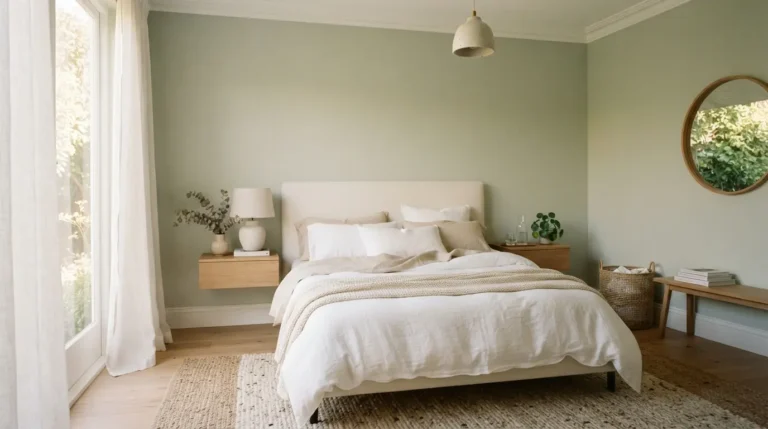
Sage green has become one of the most requested bathroom colours over the last couple of years, and it earns that popularity by working with almost anything, cream tiles, white sanitaryware, natural wood, and brass or brushed nickel fittings all sit comfortably against it. It reads as calming without feeling cold the way grey often can.
Olive, a slightly deeper and warmer green, suits a bathroom with more natural light and pairs especially well with warm wood tones and greenery. Both shades work equally well on walls, vanity units, or painted wood panelling if you want the colour to extend beyond a flat wall.
2. Warm Terracotta or Clay for a Grounded, Cosy Look
Terracotta and clay tones bring genuine warmth into a room full of cold, hard surfaces like tile and porcelain, and they’ve moved from being a bold statement colour to something closer to a warm neutral over the past couple of years. It works particularly well paired with matte black or brushed brass fittings for a slightly more modern edge.
If a full terracotta room feels like too much commitment, use it below waist height or in the shower zone only, then keep the upper walls a warm off-white. This gives you the cosy effect without covering every surface, and it’s an easier undo if you change your mind later.
3. Soft Blush or Dusty Pink for a Gentle Pastel
A soft blush or dusty pink, ideally one with a slightly muted, grey undertone rather than a bright bubblegum tone, brings warmth and softness without tipping into overly sweet or dated territory. This muted pastel approach is a noticeably different look from the brighter pastels bathrooms leaned on a decade or two ago.
Blush works particularly well in a smaller bathroom or en-suite, where the softness helps the space feel gentle rather than cramped. Pair it with warm metals and natural stone or marble-effect tiles rather than cool chrome, which can make a warm pink read as slightly clinical by contrast.
4. Warm Greige or Taupe for a Flexible Neutral
A warm greige, a blend of grey and beige with a soft brown undertone, gives you a genuinely flexible neutral that won’t fight with whatever tile or fixture colour you already have. It’s a safer long-term choice than a flat cool grey, which can read as sterile in a room that’s already full of hard, cool surfaces.
This is the colour to choose if you’re planning to change accessories, towels, or a shower curtain seasonally, since a warm neutral base adapts to almost any accent colour you bring in afterward. It’s also one of the more forgiving choices if you’re not fully confident about committing to a bolder shade yet.
5. Deep Navy for a Moody, Enveloping Bathroom
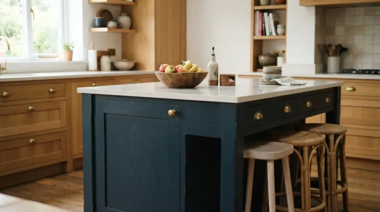
Navy brings genuine depth and a sense of cocooning to a bathroom, especially an en-suite or powder room used mainly in the evening, where a bright, airy palette isn’t really the point. It pairs beautifully with white sanitaryware and brass or gold fittings for a classic, slightly formal look.
Navy holds up well in a smaller bathroom too, provided the lighting is good, since a dark, saturated colour used confidently across the whole room can feel more intentional than a lighter colour used half-heartedly. Just make sure the room has decent artificial lighting to compensate for how much light a dark colour absorbs.
6. Charcoal or Deep Grey for Understated Drama
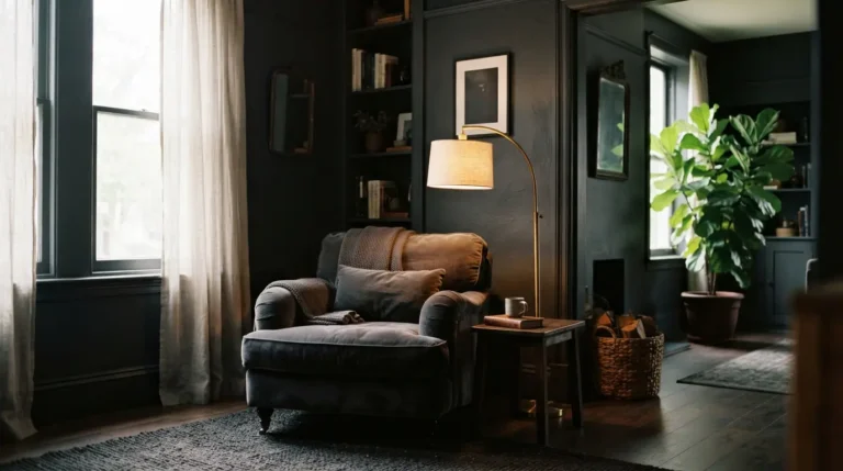
Charcoal gives a similar moody effect to navy but with a slightly more neutral, architectural feel, and it pairs particularly well with polished chrome or silver fittings for a sleek, modern look. It’s a strong choice for a bathroom you want to feel deliberately dramatic rather than accidentally dark.
A genuine practical upside worth knowing: darker paint colours hide minor wall imperfections, old filler marks, and slightly uneven plaster far better than a pale, flat colour does under bathroom lighting. If your walls aren’t perfectly smooth, a deep charcoal can save you some of the prep work a paler colour would demand.
7. Forest Green for a Bright, Naturally Lit Bathroom
Forest green is a deeper, richer green than sage, and it needs good natural light to really work, since a dark green in a dim room can start to feel heavy rather than rich. In a bathroom that gets decent daylight, it pairs beautifully with white sanitaryware, marble-effect tiles, and brass fittings.
This shade suits older or period-style bathrooms particularly well, where the depth of colour adds character without pushing the room into looking overly contemporary. If your bathroom is north-facing or has limited natural light, sage or olive is the safer, lighter alternative that gives a similar green feel without the risk of it reading as gloomy.
8. Pale Mint or Seafoam for a Small Bathroom
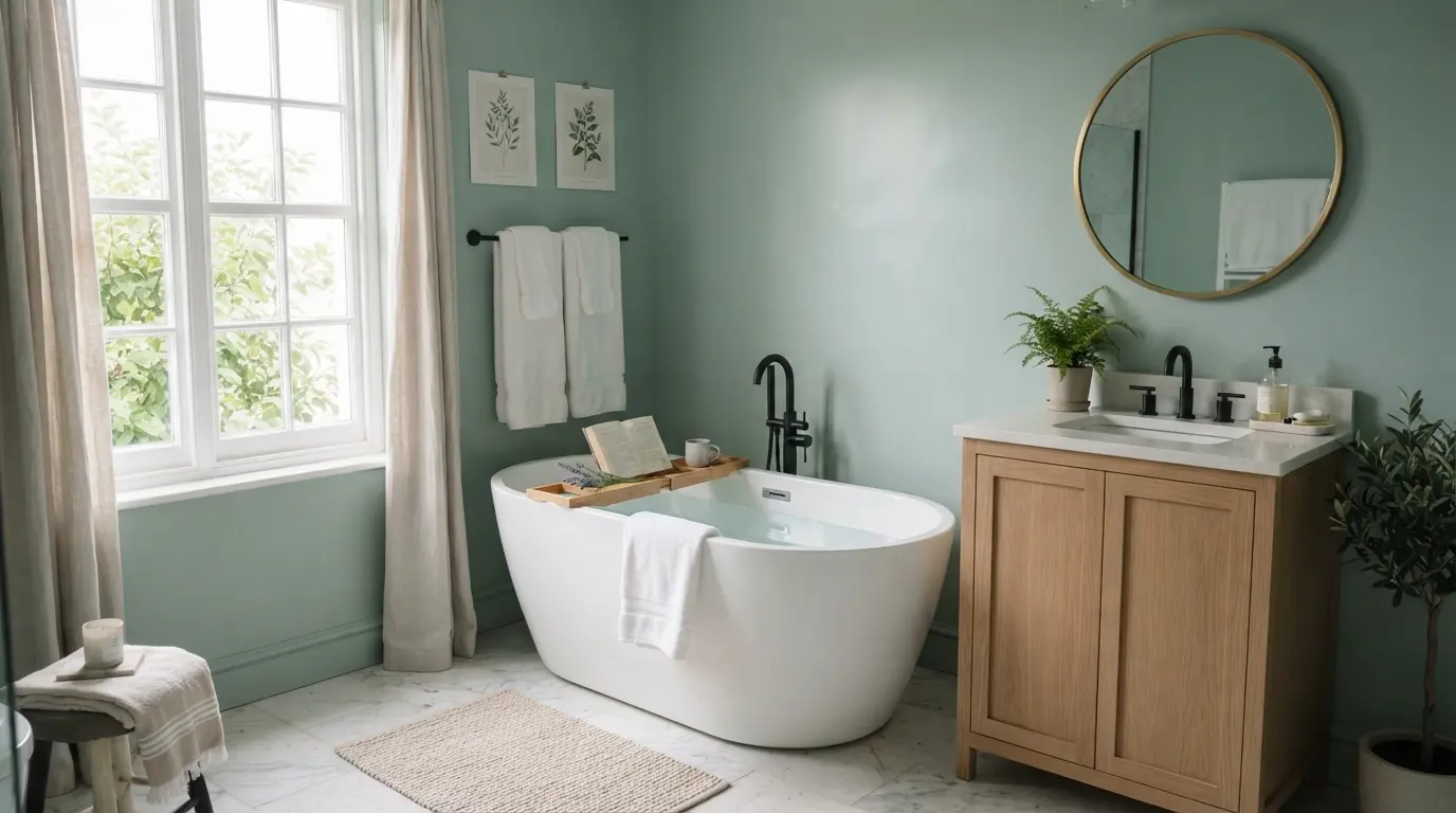
Pale mint or seafoam brings a cool, airy quality that genuinely helps a small or windowless bathroom feel more open, since light, cool greens reflect available light rather than absorbing it the way a dark colour does. It also carries a slightly retro charm without feeling like a dated throwback.
This is one of the more reliable colours for a small en-suite or downstairs cloakroom where floor space is limited and you want the room to feel as large as the walls allow. Keep the rest of the fittings light and simple so the mint stays the star of the room rather than competing with busy tile patterns.
9. Deep Plum or Aubergine as a Bold Accent Wall
Deep plum or aubergine gives you the drama of a moody colour with a bit more personality than navy or charcoal, and it works particularly well as a single accent wall behind a bath or vanity rather than across every surface. This keeps the boldness contained and easy to change later if your taste shifts.
Plum pairs well with warm brass or gold fittings, which soften what could otherwise feel like a very intense colour on its own. If you’re nervous about committing to a bold shade across a whole room, this is the lower-risk way to try it.
10. Warm Off-White for a Brighter, Airy Base
A warm off-white, with a hint of cream or beige rather than a stark, cool white, keeps a bathroom feeling bright and clean without the slightly clinical edge that pure brilliant white can bring, especially under artificial lighting in a windowless room. It’s the safest resale-friendly choice if you’re not planning to stay in the property long term.
This is also the ideal base colour if you want to bring in bolder colour through tiles, towels, or a single accent wall instead of committing the whole room to one strong shade. A warm off-white lets those accent choices do the visual work while the walls stay a flexible backdrop.
11. Colour-Drenching the Whole Room in One Hue
Colour drenching, painting the walls, ceiling, and even the woodwork in one consistent shade, creates a cocooning, immersive effect that a single wall in the same colour simply can’t match. It works especially well in a smaller bathroom or powder room, where the lack of contrast between surfaces actually helps the space feel bigger rather than boxed in.
Earthy tones like terracotta, deep clay, and muted plum are particularly popular for this treatment right now, paired with matching tile or sculptural accessories to keep the room feeling cohesive rather than flat. This is a bolder commitment than a single feature wall, so it’s worth testing the colour thoroughly before you commit the whole room to it.
12. Two-Tone Colour Blocking for Extra Depth
Splitting the wall horizontally, a deeper colour like sage or terracotta below waist height and a warm off-white above, adds visual dimension to a bathroom without the full commitment of colour drenching. It also gives you a practical way to protect the lower half of the wall, which takes the most splashes and contact, with a more washable finish if you choose different sheens for each band.
A painted ceiling in a soft complementary pastel is another version of this idea, adding a small surprise without overwhelming the room. Whichever version you choose, keep the split line consistent and level, since an uneven colour-block line is one of the fastest ways to make a considered idea look like an accident.
How to Test a Bathroom Colour Before You Commit
Bathroom lighting is genuinely different from the rest of your home, often mixing a small window, if you have one, with warm or cool LED spotlights, and that combination can shift how a colour reads more than in any other room. Always test a sample directly on the bathroom wall itself, not just under normal room lighting elsewhere in the house.
Paint a sample patch at least 30cm square in two or three spots around the room, and check it morning, evening, and with the extractor fan and lights running, since steam and humidity can also subtly affect how a matte versus a silk finish looks once it’s dry. Hold the sample up against your existing tiles or tub too, since even a small clash in undertone, a cool-toned tile against a warm-toned paint, becomes obvious once the whole wall is covered.
What Does It Cost to Paint a Bathroom?
Cost depends heavily on whether you’re doing it yourself or hiring a professional, and whether you choose a standard or premium paint brand, with moisture-resistant formulas costing more than standard emulsion either way.
| Job Type | Typical UK Cost (approx.) | Notes |
| DIY paint only, small bathroom | £30–£90 | Standard moisture-resistant emulsion, two coats |
| Professional paint job, small bathroom | £100–£350 | Labour plus standard paint, straightforward prep |
| Professional job with premium paint brand | £150–£450+ | Includes higher-end brands like Farrow & Ball |
| Repainting bathroom tiles | £200–£600+ | Specialist tile paint, more prep-intensive work |
Regardless of which colour you choose from this list, the paint formula matters as much as the shade itself in a room that deals with daily steam and splashes. Our guide on moisture resistant bathroom paint covers which finishes and formulas actually hold up long term.
Conclusion
The right bathroom paint colour comes down to matching the shade to your room’s actual light, your fixed tiles and fittings, and how the space genuinely gets used, not just whatever’s trending this year. Test any shade directly on your walls under real bathroom lighting before committing, and pick a formula built for humidity regardless of which of these twelve colours you land on. Get those two things right, and almost any colour on this list will make the room feel calmer than it did before.
FAQs
What is the most calming colour for a bathroom?
Sage green and soft, muted blues are generally considered the most calming choices, since they echo natural, spa-like tones without feeling cold. The right choice still depends on your room’s light and existing tile colours.
What colour makes a small bathroom look bigger?
Pale, cool shades like mint, seafoam, or a warm off-white reflect available light and tend to make a small or windowless bathroom feel more open than a dark, saturated colour would.
Can you paint a bathroom without a window a dark colour?
Yes, but it needs strong artificial lighting to compensate, since a windowless room already has less natural light for a dark colour to work with. Test the colour under the room’s actual lighting before committing to the whole space.
Do I need special paint for a bathroom?
Yes. A standard emulsion isn’t designed for the humidity and steam a bathroom deals with daily, so a moisture-resistant or specifically formulated bathroom paint holds up far better against mould and peeling over time.
What colours go with terracotta bathroom tiles?
Warm off-white, cream, and soft sage all sit comfortably alongside terracotta without competing with it. Brushed brass or matte black fittings tend to suit the warmth of terracotta better than cool chrome.
Is colour drenching a good idea for a small bathroom?
Often, yes. Removing the contrast between wall, ceiling, and trim colours can make a small room feel more cohesive and less boxed in than breaking it up with multiple colours or a stark white ceiling.