15 Interior Door Colour Ideas to Transform Your Home

Interior door colour ideas work because doors are genuinely one of the lowest-risk places in the whole house to experiment, a single door takes far less time, paint, and commitment to repaint than an entire wall or room if the colour doesn’t work out. The 15 ideas below cover the colour families and techniques worth considering, along with the real preparation steps that decide whether a bold colour change actually looks professional once it’s done.
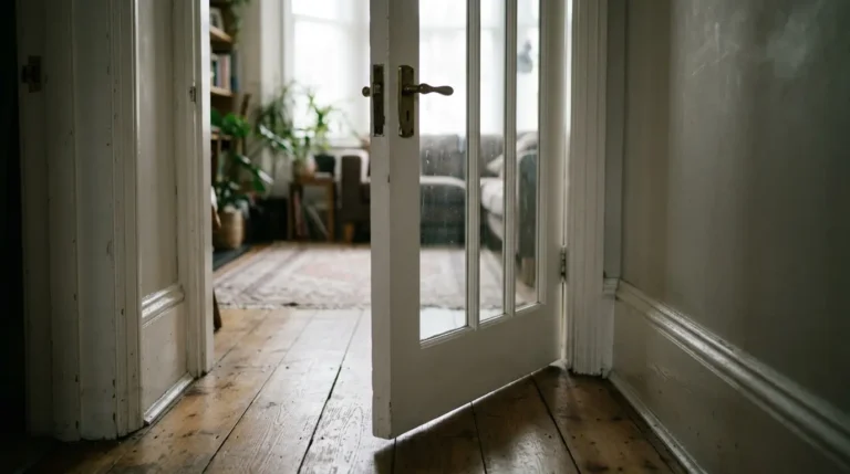
1. Muted Blue-Green for a Considered Pop of Colour
A soft, green-leaning blue brings genuine visual interest without dominating a room, and its character genuinely shifts depending on what surrounds it. Paired with warm neutrals, khaki, muddy brown tones, it reads moodier and more grounded, while set against crisp white and plenty of natural light, the same colour feels fresh and cool. This makes it a particularly versatile choice if you’re not entirely sure which direction the rest of your scheme is heading.
2. Deep Green for a Colour-Drenched, Maximalist Statement
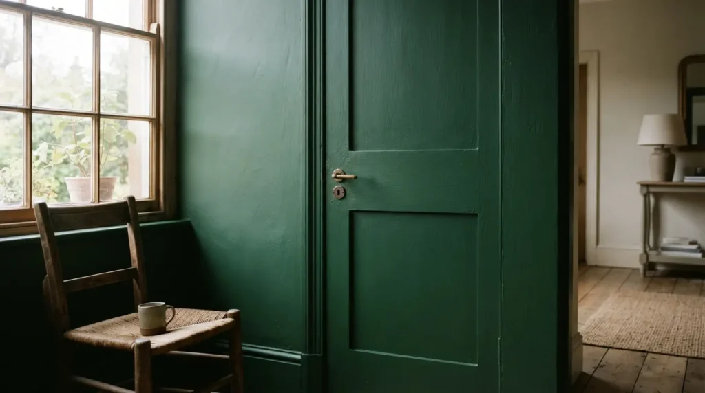
A confidently deep, saturated green delivers real impact when taken beyond the door itself, onto the surrounding frame and even the walls, in a full colour-drenched treatment. This works especially well paired with other rich blues in the same drenched scheme, since sharing a similar depth of colour while varying the undertone creates genuine harmony and contrast at the same time, rather than one flat block of colour.
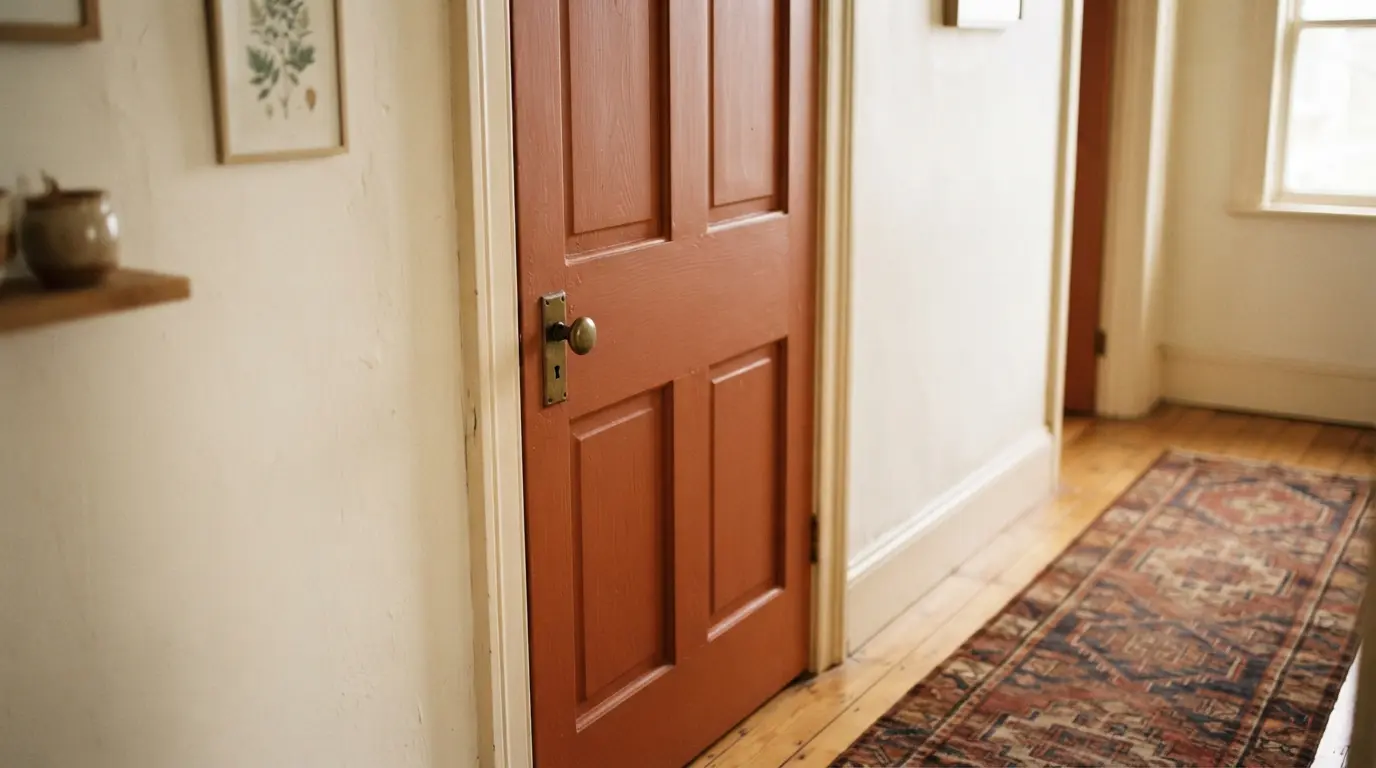
3. Rich Terracotta-Toned Brown for Warmth and Depth
A brown with warm terracotta-red undertones brings genuine depth and character that lighter, more neutral shades simply can’t match. This suits a room already leaning toward warm, earthy tones, and it holds its richness particularly well against natural wood and warm metal fixtures nearby.
4. Deep Tobacco Brown for Sophisticated Drama
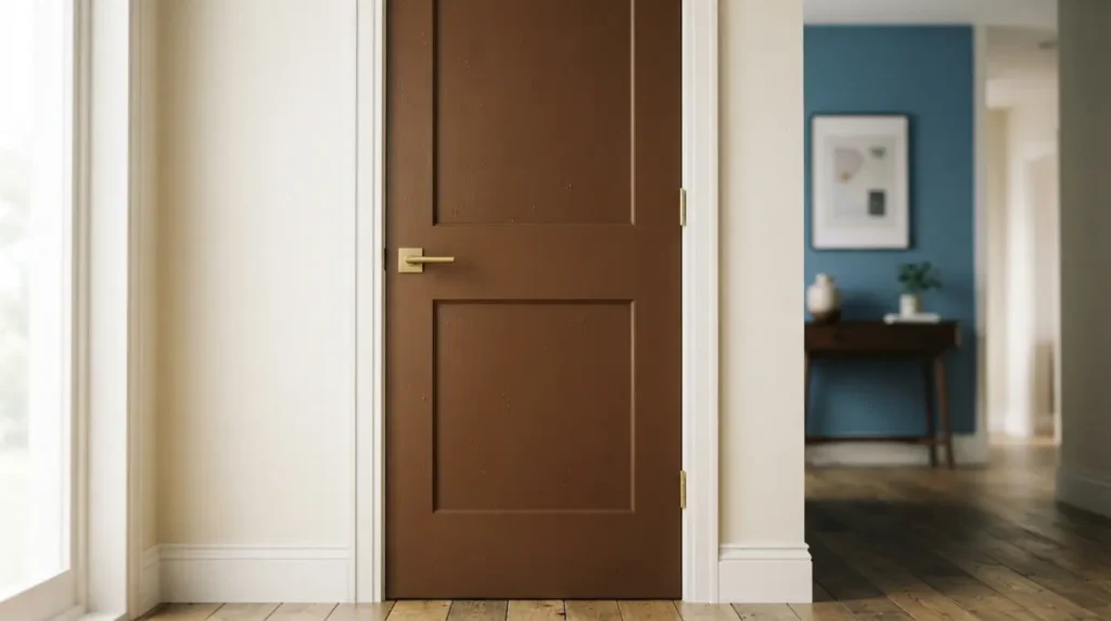
A darker, more tobacco-toned brown delivers real sophistication and works beautifully paired with mid-tone blues, warm off-whites, or a rich caramel elsewhere in the room. This is a genuinely enduring colour choice rather than a passing trend, and it suits both period and contemporary properties without looking dated in either.
5. Bright Yellow for a Mood-Boosting Accent in Busy Rooms
If committing an entire room to yellow feels like too much, painting just the door captures the colour’s genuinely uplifting, wakeful quality without overwhelming the space. This suits busy, high-traffic rooms particularly well, kitchens, utility rooms, entryways, playrooms, where a cheerful accent does real work lifting the room’s everyday mood.
6. Soft, Golden Yellow for a Traditional Interior
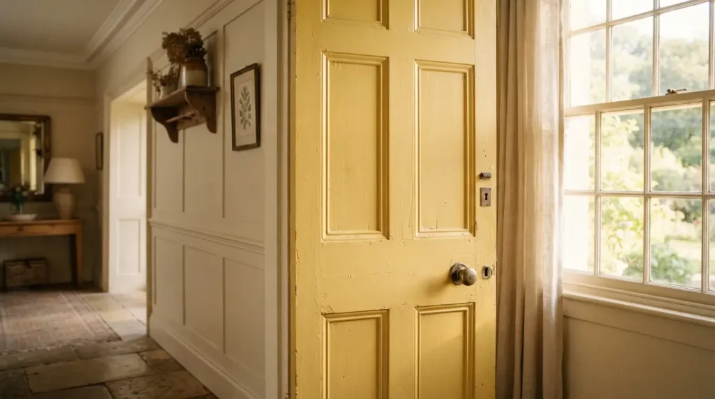
A more mellow, golden yellow reads as considerably more traditional and refined than a bright, saturated version, and it suits a period property or a classically furnished room particularly well. This softer end of the yellow spectrum brings warmth without the same attention-grabbing intensity a bolder yellow demands.
7. Soft Clay or Terracotta Red for Calming Warmth
A red with genuinely minimal pigment intensity, closer to clay or soft terracotta than a true red, delivers calming warmth rather than heat or drama. This suits a room where you want colour and character without anything visually loud, and it pairs particularly well with crisp white trim for a considered, artisanal feel.
8. Deep Crimson for Dramatic, Evocative Impact
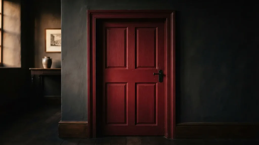
At the opposite end of the red spectrum, a genuinely deep crimson brings real drama and evocative depth, working well in both a moody, atmospheric scheme and a more formal, traditional setting. This is worth choosing deliberately for a door you want to genuinely command attention, rather than one that’s meant to recede into the background.
9. Soft Grey Used in Small, Purposeful Doses
Grey can feel cold or corporate as the dominant colour throughout an entire room, but used specifically on doors, trim, and woodwork rather than the walls themselves, it becomes a genuinely reliable, tasteful neutral. A softer, slightly blue-leaning grey in particular offers a calming alternative to plain white or off-white without tipping into the flatness a fully grey room can sometimes bring.
10. Luxurious Deep Purple in a Glossy Finish

A rich, dark purple brings genuine opulence that few other colours can match, and the finish matters as much as the shade itself here, a full gloss on the woodwork makes a deep purple door genuinely showstopping rather than simply dark. This suits a maximalist scheme or a room where you want one genuinely bold, luxurious statement rather than a subtle accent.
11. Two-Tone Doors With a Deeper Shade Than Your Walls

Rather than the conventional pale woodwork against coloured walls, flipping this entirely, a genuinely darker colour on doors and skirting against lighter walls, reads as considered and contemporary without chasing a specific trend. This adds a subtle but genuine layer of interest to a room and suits both an urban, modern property and a more traditional rural one equally well.
12. Use a Bold Door Colour to Zone an Open-Plan Space
In a genuinely open-plan layout, a confidently coloured set of internal doors can visually define one zone from another without needing an actual wall, injecting a real burst of personality into what might otherwise be a fairly neutral, undivided space. This works particularly well on a larger pair of doors or a room divider, where the colour genuinely has enough presence to do this zoning work convincingly.
13. Treat Doors as Your Lowest-Risk Way to Experiment With Colour
This is worth remembering if you’re hesitant about committing to a bold colour anywhere else in your home. A door is genuinely quick and straightforward to repaint if a colour doesn’t work out, considerably less commitment than an entire wall or room, which makes it the natural place to try a colour you’re curious about but not fully confident in yet. If it works, you’ve gained a genuine style statement, and if it doesn’t, correcting it is a minor, low-cost job rather than a major undertaking.
14. Prime Properly Before a Dramatic Colour Change
This is the technical detail that decides whether a bold colour change actually looks professional. If you’re making a significant jump, a very dark colour to a pale one or the reverse, prime the surface first rather than painting directly over the existing colour. Sand the door beforehand, fill any gaps or imperfections with wood filler, and apply your paint in strokes that follow the wood’s natural grain direction for the smoothest possible finish. Skipping primer on a dramatic colour change is one of the most common reasons a repainted door needs a second full round of coats to properly cover the original shade.
15. Choose One Colour Throughout or Vary Room by Room
Once you’ve settled on a direction, decide deliberately whether you want the same colour running through every internal door in the house for a genuinely cohesive scheme, or a different, considered shade in each room for more individual character room by room. Neither approach is more correct, a single consistent colour creates a calm, unified flow between spaces, while varying the colour lets each room develop its own distinct personality, so choose based on how connected or distinct you want your rooms to feel from one another.
Final Thoughts
The best interior door colours take advantage of the fact that doors are genuinely low-risk territory for real experimentation, letting you try a bold terracotta, a deep green, or a confident crimson without committing an entire room to the colour. Choose a shade that relates to your existing palette, prime properly for any dramatic change, and decide deliberately whether you want one consistent colour throughout or a different considered shade in every room, and your doors will do real, lasting work transforming the whole home.
FAQs
Is it OK to paint every door in the house a different colour?
Yes, genuinely, it’s a matter of personal preference rather than a fixed rule. Varying the colour room by room gives each space its own character, while one consistent colour throughout creates a calmer, more unified flow between rooms.
What’s the safest colour to start with if I’m nervous about a bold door?
A muted, considered shade like a soft blue-green or a gentle terracotta gives you real colour and character without the intensity of a fully saturated hue, making it a genuinely gentle entry point before trying something bolder.
Do I need to prime a door before painting a bold colour?
Yes, particularly for a dramatic change, a very dark colour going pale or the reverse. Sand the surface, fill any imperfections, and prime before your topcoat for the smoothest, most even coverage.
Can grey doors look good if I don’t like grey walls?
Yes, grey used specifically on doors, trim, and woodwork rather than as a room’s main wall colour reads as a genuinely tasteful, reliable neutral, avoiding the cold or corporate feel a fully grey room can sometimes bring.
What finish should I use for a colourful interior door?
A finish suited to wood and metal, rather than standard wall emulsion, is essential regardless of colour. For particularly rich or dark shades like deep purple, a full gloss genuinely enhances the colour’s drama and depth more than a flatter finish would.