10 Calming Paint Colour Ideas for a Stress-Free Home

Calming paint colours work because they give a room a genuine sense of ease the moment you walk in, not through any single “correct” shade but through a handful of colour families that consistently read as restful across different rooms and different light. The 10 ideas below cover those families, along with the honest detail most calming colour guides skip: dark doesn’t mean less calming, and the wrong undertone can turn an intended calming colour cold instead.
1. Soft Sage Green for an Easy, Universal Calm
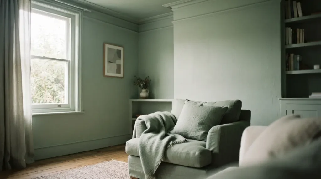
Green remains the colour most people feel instinctively comfortable with, since it’s the colour we’re surrounded by in nature far more than any other. A soft, muted sage brings that calming association indoors without demanding a bold design decision, and it works across nearly every room in the house, a bathroom, a bedroom, a home office, without needing much else to support it. This is the safest starting point on this list if you’re not sure where else to begin.
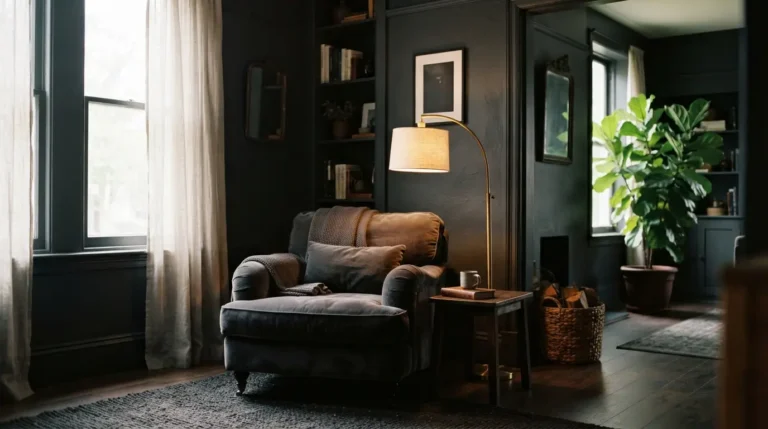
2. Deep Forest or Botanical Green for a Restorative, Enclosed Feel
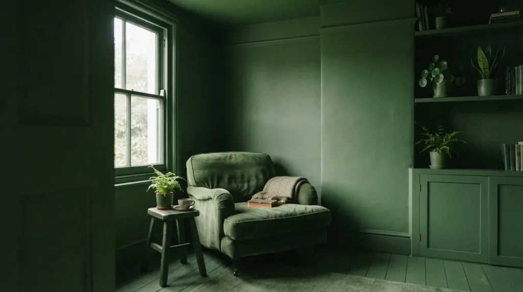
A genuinely deep, dark green brings the same nature-based calm as sage but with real depth and enclosure, closer to standing in a forest than looking at a lawn. This suits a room where you want a restorative, wrapped-in feeling rather than an airy one, and it works particularly well on woodwork or full panelling, where the depth of colour reads as intentional and rich rather than heavy. Pair it with natural foliage and botanical textures to reinforce the connection to nature the colour is already drawing on.
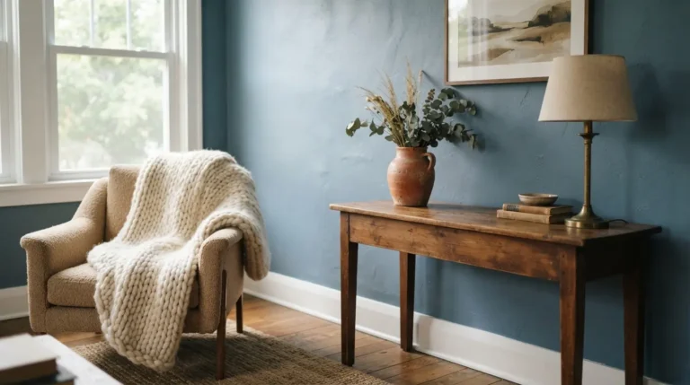
3. Muted Dusty Blue for a Gentle, Airy Retreat
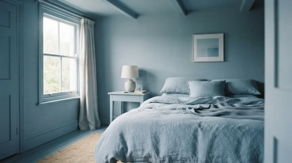
A soft, slightly greyed blue captures the sense of calm most people associate with looking up at an open sky, without tipping into the coldness a brighter, more saturated blue can sometimes bring. It suits a bedroom particularly well, and it’s one of the most forgiving calming colours to live with long-term, since it pairs easily with warm wood, brass, and most natural textiles without needing a carefully coordinated scheme around it.
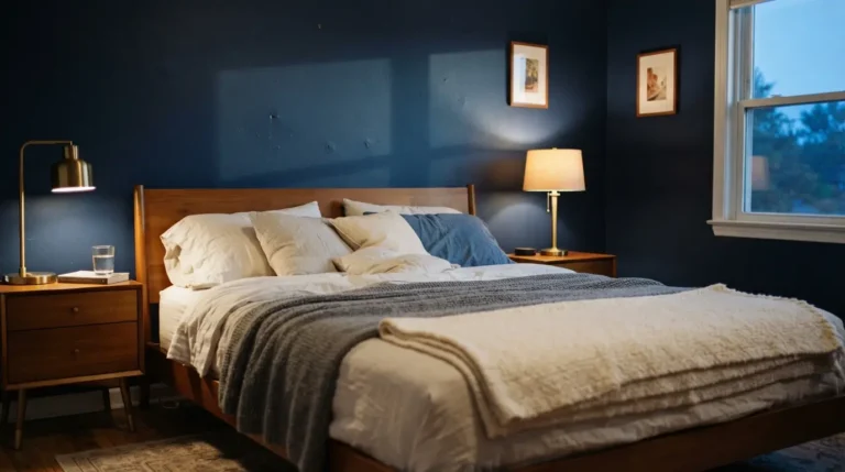
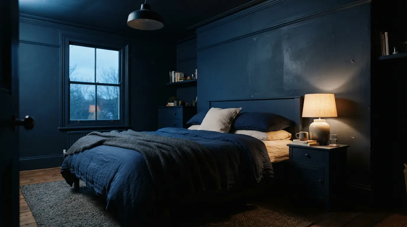
4. Deep Navy for a Genuine Evening Sanctuary
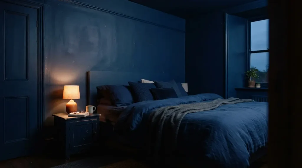
This is the detail most calming colour guides get wrong by assuming pale automatically means restful and dark automatically means the opposite. A confidently deep navy, used across an entire bedroom, genuinely reflects the quality of a midnight sky rather than feeling oppressive, and it creates a real sense of sanctuary specifically because a bedroom is used mostly after dark, when a deep, enveloping colour reads as protective rather than heavy. This works best committed to fully rather than used cautiously as a single accent wall, a half-hearted navy wall can look like an unfinished decision, while a full navy room reads as a deliberate, calming choice.
5. Warm Greige or Khaki-Green for an Enveloping Neutral
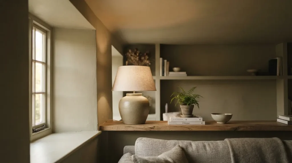
A muted, earthy shade that sits between grey and green, sometimes called khaki or greige, genuinely shifts in appearance depending on the light in the room, reading more grey at some times of day and more green at others. This built-in warmth makes it one of the easiest calming neutrals to use across every surface in a room, walls, woodwork, ceiling, without the scheme ever feeling flat or one-note, since the colour itself has enough natural variation to stay interesting.
6. Warm Off-White Instead of Stark White for Gentle Calm
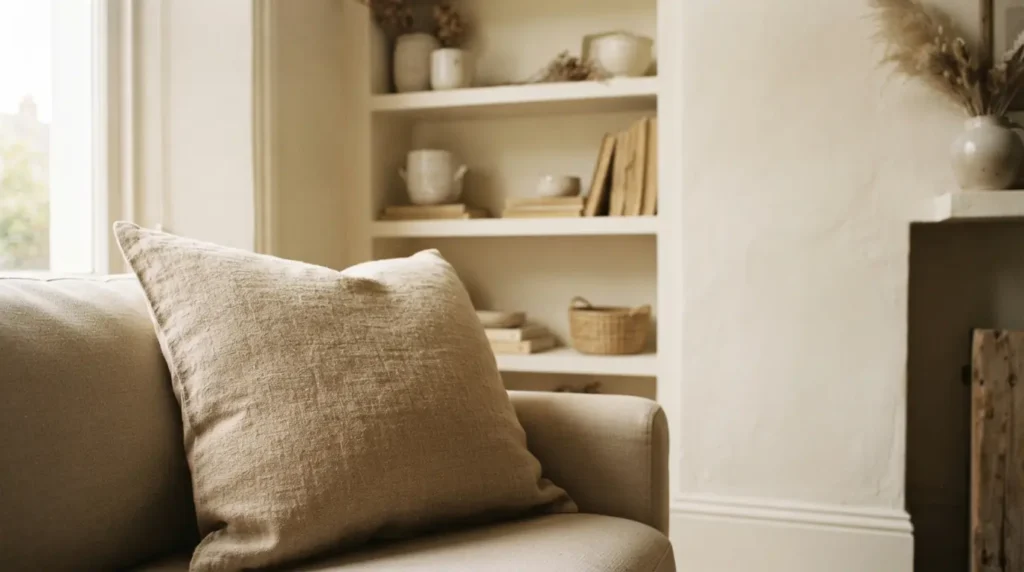
White is often the first colour people reach for when they want a calm, blank slate, but a cool, stark white can read as clinical rather than soothing, especially in a room without abundant natural light. A warm off-white, with a subtle yellow or cream undertone rather than a blue-grey one, gives you the same clean, fresh backdrop while feeling genuinely gentler to live with day to day. This is worth checking carefully against a real sample rather than assuming any white will do, since the undertone difference between two whites can be more noticeable in person than it looks on a small paint chip.
7. Soft Grey With the Right Undertone for Your Room’s Light
Grey is a genuinely reliable calming neutral, but it’s also the shade most likely to backfire if you choose it without checking your room’s light first. In a naturally dark or north-facing room, a grey with cool blue undertones can read as flat and cold rather than soothing, while a grey with a more balanced mix of warm and cool undertones holds its calm regardless of how much natural light the room actually gets. Test a genuine sample in your specific room before committing, grey is one of the colours where the undertone matters more than the base shade itself.
8. Earthy, Muted Pink for Warmth Without Sweetness
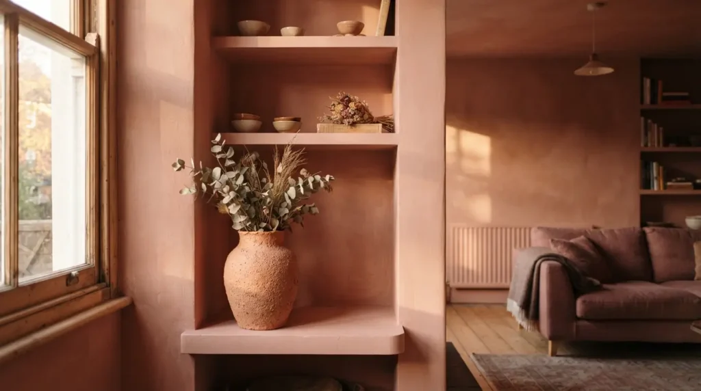
A pink with a genuine earthy, muted undertone, rather than a bright, cool-leaning pastel, brings real warmth and a sense of being nurtured without tipping into anything overly sweet or juvenile. This suits a living room or bedroom where you want colour and comfort in equal measure, and it coordinates easily with warm wood tones and natural fabrics for a considered, soothing scheme rather than a purely decorative pastel one.
9. Deep Aubergine or Plum for a Restful, Bold Statement
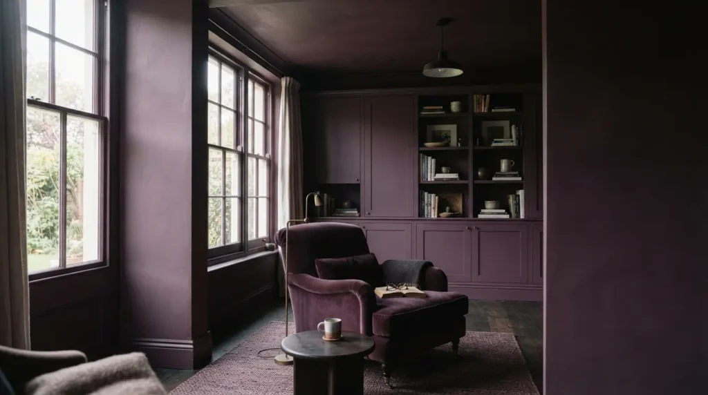
It’s entirely possible to build a genuinely calming room around a bold, dark colour, and a rich aubergine or plum is one of the clearest examples. Used across an entire room rather than as a cautious accent, this depth of colour creates a luxurious, cocooning atmosphere that suits a space dedicated to genuine rest and unwinding, a bedroom, a reading nook, a bathroom built for soaking rather than a quick shower. The key is full commitment: a single plum wall against three neutral ones reads as a style statement, while the same colour used everywhere reads as a deliberate, restful retreat.
10. Use Colour-Drenching to Make Any Calming Shade Feel More Enveloping
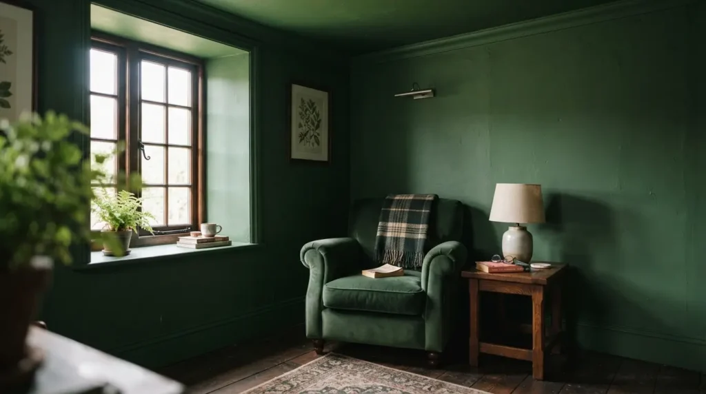
This is the technique that actually determines how calming any of the previous nine ideas feels in practice, and it’s worth understanding before you paint a single wall. Colour-drenching means applying one shade consistently across walls, ceiling, and woodwork, rather than stopping at the wall and leaving the ceiling a different white. Removing that visual break genuinely changes how a room feels, since the eye isn’t interrupted by a change in colour partway up, and the whole space reads as one considered, immersive environment rather than a coloured box with a white lid. This works with almost any calming shade on this list, but it matters most with darker colours specifically, a dark wall under a stark white ceiling can feel unfinished or even slightly heavy, while the same dark colour taken all the way up and across genuinely delivers the enveloping calm it’s capable of.
Final Thoughts
The best calming paint colours share a common thread: they’re chosen deliberately for the room’s light and function, and committed to fully rather than applied half-heartedly as a single cautious accent wall. Whether you land on a soft sage, a deep navy, or a rich plum, test the shade properly in your own space, consider colour-drenching for a genuinely enveloping effect, and the room will feel like a real retreat, not just a colour that looked calming on a paint chip.
FAQs
Are dark colours calming or do they make a room feel smaller?
Dark colours can be genuinely calming, particularly in a room used mostly in the evening, since the depth reads as protective and enveloping rather than oppressive. Whether a room also feels smaller depends more on how much natural light it gets and how fully the colour is committed to, a colour-drenched dark room often feels more considered than a room with just one dark accent wall.
What’s the most calming paint colour overall?
There isn’t a single correct answer, since the right calming colour depends on the room’s light, its function, and your own personal associations. Soft greens and muted blues are the most consistently recommended starting points, but a well-chosen deep navy or plum can be just as calming in the right room.
Should calming colours be warm or cool?
Either can work, but the undertone matters more than whether the colour is technically warm or cool. A cool grey or white in a naturally dark room can read as cold rather than calm, so check the undertone against your specific room’s light rather than assuming any shade within a “calming” colour family will automatically work.
What is colour drenching and does it help create a calm room?
Colour drenching means applying the same paint colour to walls, ceiling, and woodwork rather than stopping at the wall, removing the visual break a different-coloured ceiling usually creates. It genuinely increases the enveloping, immersive feeling of a room, particularly with darker or richer calming shades.
Can grey feel cold instead of calming?
Yes, particularly in a north-facing or naturally dark room, where a grey with strong cool undertones can read as flat and chilly rather than soothing. Choosing a grey with a more balanced undertone, and testing it properly in your own room’s light, avoids this common disappointment.