How to Use Colour Psychology to Choose the Right Paint for Every Room

Using colour psychology to choose the right paint means starting with the room’s actual function and light, not just a colour you’ve fallen for online. A shade that’s genuinely calming in one room can read cold or muddy in another, and the difference usually comes down to details most paint guides skip entirely: which way the room faces, what light bulbs you actually use, and whether you tested the colour properly before committing to a full wall.
Start With the Room’s Function, Not Just a Colour You Like
Before opening a single tin, decide what the room actually needs to do. A bedroom needs to support rest, a home office needs to support focus without becoming visually tiring over a full day, a dining room needs to support conversation and gathering. Cooler, muted tones generally suit rest-focused spaces, while a kitchen or dining room can carry more warmth and energy since that supports the sociable, active use those rooms actually get. This sounds obvious, but skipping it is the most common reason someone ends up loving a colour in a shop and regretting it once it’s covering their actual walls, the colour suited a mood, not the room’s real daily use.
Check Which Way the Room Faces Before You Choose Warm or Cool
This is a detail most colour psychology content leaves out entirely, and it genuinely changes which colours will work. A south-facing room already gets warm, intense natural light, and adding a warm paint colour on top of that can make the space feel stuffy or overheated rather than cosy, especially in summer. A north-facing room gets cooler, flatter light, which suits a cooler palette less than you’d expect, a blue or green chosen for its calming reputation can end up reading as genuinely cold rather than restful in a room that’s already short on warmth. As a general starting point, lean into a room’s existing light rather than fighting it, warmer tones for naturally cool, north-facing rooms, and a slightly cooler or more muted palette for rooms that already get strong, warm sun.
Pull Your Palette From What’s Already in the Room
Rather than choosing a wall colour in isolation, look at your existing furniture, rugs, and art, and pick out the three colours that dominate. A living room with a navy sofa, terracotta lamps, and dark wood shelving already gives you a genuine starting palette: blue, a warm red-orange, and brown. From there, use a colour wheel to find shades that either sit opposite your dominant colour for real contrast, or sit close to it for a softer, blended look. This approach does double duty: it applies colour psychology’s mood principles while guaranteeing the finished room actually coordinates with what you already own, rather than working backwards from a colour you loved on a swatch that clashes with everything already in the space.
Understand How Your Lighting Type Changes the Colour You See
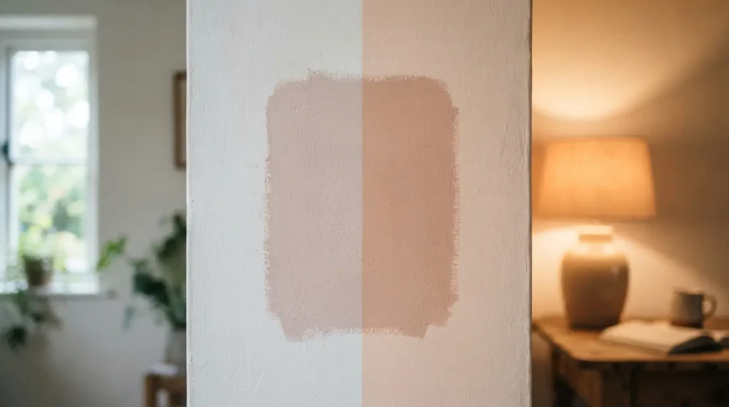
A paint colour never looks quite the same under every light source, and this matters more than most people expect when they’re trying to use colour deliberately. Natural light from a north-facing window tends to read cooler and slightly blue, which intensifies any cool undertone already in your chosen colour. Light from a south-facing window warms everything it touches, softening a cool colour and making a warm one feel even richer. Artificial lighting adds another layer: incandescent and warm-toned bulbs push colours toward orange and yellow, while cooler LED bulbs can drain warmth out of a colour and make it look flatter or slightly clinical. If your chosen mood depends on a specific colour reading a certain way, warm and calming, say, check it under the actual bulbs you’ll be using in the evening, not just in daylight.
Prime the Wall Before You Test Anything
This step gets skipped constantly, and it genuinely affects how accurately you can judge a colour. A primed wall gives you a true, even base to test paint against, rather than letting an old colour or an uneven, absorbent surface distort how the new shade actually reads. Primer also improves how the final paint adheres and prevents old colours bleeding through, which matters for the finished result, but for testing purposes specifically, it’s what stops you misjudging a colour because of what’s underneath it rather than the paint itself.
Test Properly Before You Commit to a Full Room
Paint a genuinely large sample patch, at least 60cm square, directly on the primed wall, and label it discreetly on the back or nearby so you don’t lose track of which colour is which. View it in daylight and again at night under your usual lighting, and check it against any furniture or fabric you’re planning to coordinate with. Live with the sample for at least 48 hours before deciding, colour perception genuinely shifts across different times of day and different light conditions, and a shade that looked perfect at 10am can read completely differently by lamplight at 9pm. This single habit, testing properly and waiting, prevents more paint regret than any amount of colour theory knowledge on its own.
Apply Colour Psychology Beyond the Walls
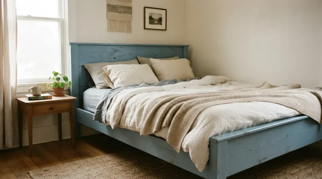
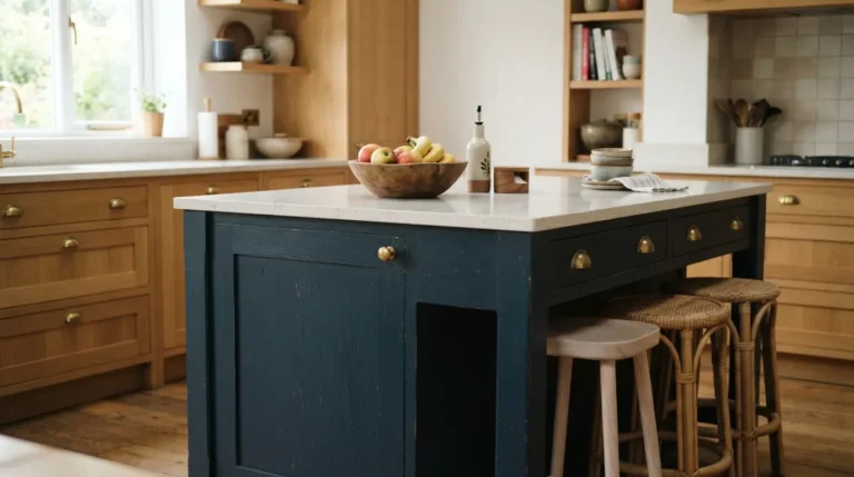
Walls aren’t the only place colour psychology can do real work. Painting a bed frame, a bookcase, or a wardrobe in a calming blue or green brings the same psychological principle into a bedroom without committing an entire room to one colour. A dining table or a set of kitchen cabinets in a warm terracotta or a stimulating red achieves the same sociable, energised feeling a full accent wall would, at a fraction of the commitment and cost. This is a genuinely useful route if you’re not ready to paint a whole room but still want to apply colour psychology deliberately somewhere in the space.
Balance Bold Colour With Neutral Rather Than Committing the Whole Room
The boldest, most psychologically loaded colours generally work best as an accent rather than a colour applied to every wall in the room. A single feature wall, a piece of furniture, or a considered accent, cushions, a lamp base, a piece of art, gives you the punch of a saturated colour without the risk of a whole room feeling overwhelming or visually tiring day to day. Keep the surrounding walls in a calmer, more neutral tone, and let the bold colour do its psychological work in a contained, deliberate spot rather than asking it to carry the entire room.
Final Thoughts
Using colour psychology to choose the right paint really comes down to grounding the theory in your actual room, its function, its light, its existing furnishings, rather than applying a generic rule from a colour chart. Test properly, check your lighting, and consider applying bold colour to furniture or an accent before committing a whole room, and the colour you choose will genuinely suit the space it’s going into, not just the mood you had in mind when you picked it.
FAQs
Should I choose paint colour before or after buying furniture?
After, generally. Pulling your palette from existing furniture, rugs, and art gives you a genuine starting point that guarantees coordination, rather than choosing a wall colour in isolation and hoping everything else matches later.
Does a north-facing or south-facing room need a different colour approach?
Yes. A south-facing room already gets warm, strong light, so a cooler or more muted colour often works better than adding more warmth on top. A north-facing room gets cooler, flatter light, and generally benefits from a warmer colour to avoid feeling cold.
How big should a paint test swatch be?
Aim for at least 60cm square, painted directly onto a primed section of wall. A small chip or a tiny painted square doesn’t give you enough surface to judge how the colour will actually read across a full wall.
How long should I live with a paint sample before deciding?
At least 48 hours, checking it in daylight and under your usual evening lighting. Colour perception genuinely shifts across different light conditions, and a longer test period catches this before you commit to a full room.
Can I use colour psychology on furniture instead of walls?
Yes, and it’s a genuinely practical option if you’re not ready to commit an entire room to one colour. Painting a bed frame, cabinets, or a dining table in a psychologically considered shade brings the same principle into the room at a smaller scale.