12 Dining Room Feature Wall Ideas to Create a Stunning Backdrop

Dining room feature wall ideas work because this is genuinely the one wall in the house guests spend real, sustained time looking at, seated for an hour or more rather than passing through on the way somewhere else. The 12 ideas below cover treatments worth considering beyond the usual paint-or-wallpaper choice, along with the honest restraint that decides whether the finished wall reads as a considered backdrop or a room trying to do too much at once.
1. An Oversized Single Piece of Art, Not a Gallery
A single, genuinely large piece of art, rather than a collection of smaller framed pieces, competes properly with everything else already claiming attention in a dining room, the table, the chairs, the chandelier, the people seated around it. Choose abstract or landscape work over anything figurative or portrait-based specifically for this room, a face looking back at you from the wall can create a genuinely uncomfortable sense of being watched through a meal, while abstract and landscape pieces build atmosphere without that awkwardness.
2. Full-Height Panelling With Shadow Lines That Shift Through the Evening
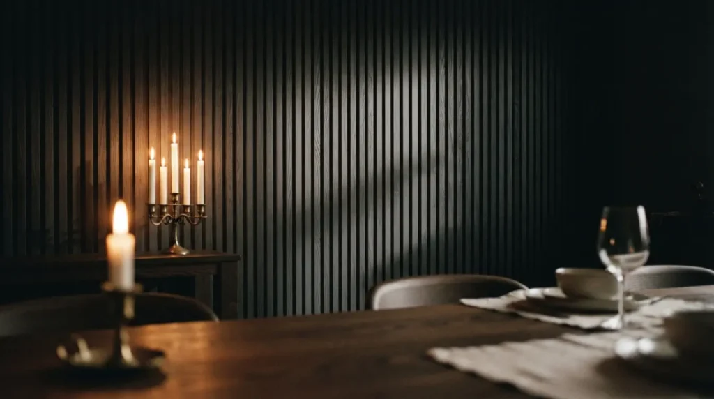
Architectural panelling, whether fluted, grid-moulded, or bespoke joinery, brings dimensional character that flat paint alone can’t replicate, and the shadow lines running along each panel’s profile genuinely respond to changing light in a way a plain wall never does. This matters more in a dining room than almost anywhere else, since the room is used mostly in the evening, and panelling under shifting candlelight and chandelier light reveals real depth and movement as the meal progresses.
3. A Deep, Saturated Paint Colour as the Feature Itself
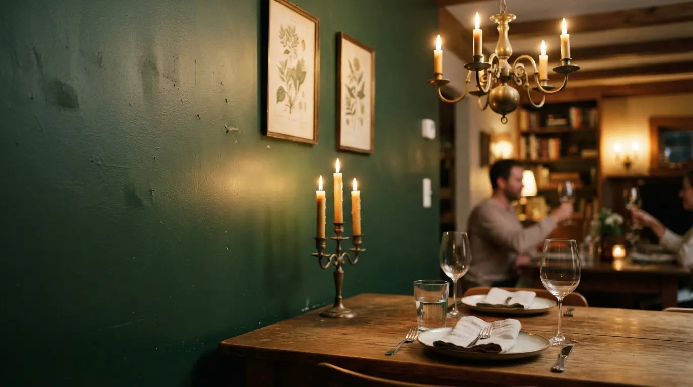
Sometimes the wall doesn’t need anything applied on top of colour to do its job. A confidently deep, saturated shade, forest green, ink navy, burgundy, charcoal, genuinely recedes into the background, letting the table, the food, and the people at it visually advance instead. Dark walls reflect candlelight and warm lighting very differently to white ones, creating a depth and warmth pale walls simply can’t produce under the same conditions, though the darker you go, the more the room depends on genuinely good, layered lighting to avoid tipping from atmospheric into oppressive.
4. A Vintage Map or Architectural Blueprint as a Considered Focal Point
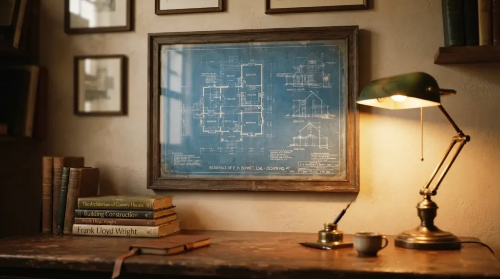
A large, framed vintage map or an old architectural blueprint brings a genuine sense of history and detail that rewards the kind of sustained, close attention a dining room guest actually has time for during a long meal. Source something with real age and provenance where you can, an original vintage piece carries a quality of line and a natural patina that a modern reproduction can approximate but never quite matches, and it’s worth getting the scale right, a map that’s too small for its frame reads as apologetic rather than considered.
5. An Indoor Climbing Plant Trained Across the Wall
A climbing plant grown against a simple timber trellis or wire grid fixed to the wall creates the most genuinely alive feature treatment on this list, and it’s also the most patient, this is a project measured in months rather than a single weekend. Suitable indoor climbers gradually fill in and change character with the seasons and the room’s light, which means the wall keeps evolving rather than staying static the way every other idea here does once it’s finished.
6. Limewash for a Wall That Changes Character With the Light
Limewash creates a genuinely different surface quality to standard paint, reading as two or three subtly different tones depending on the angle you’re viewing it from and how the light’s falling. Applied over a base coat a shade or two deeper than your intended final colour, then built up in thin layers with overlapping cross-strokes, this technique produces real visual movement and depth, and a warm terracotta limewash specifically comes alive under candlelight in a way flat paint simply doesn’t.
7. A Collection of Mixed Mirrors for Layered Light and Reflection
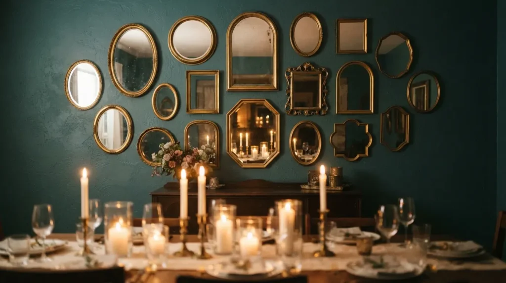
Rather than one large statement mirror, arranging several mirrors of different shapes and sizes, round, arched, octagonal, together on one wall creates genuine gallery-style richness while multiplying the light and reflection a single mirror provides. Keep the frame finish consistent across the collection, all gold, all black, all dark wood, since that’s the detail that stops a varied arrangement of shapes from reading as chaotic rather than curated.
8. Built-In Display Cabinetry as a Full Architectural Wall
Rather than a single sideboard against the wall, a full run of built-in cabinetry, mixing open shelving, closed storage, and glass-fronted sections, turns the entire wall into one considered architectural feature rather than furniture placed in front of a plain surface. Painting the interior of any open shelving sections in a contrasting deep colour makes displayed glassware and ceramics genuinely stand out against the backdrop, rather than blending into a uniform painted interior.
9. Wall-Mounted Sconces Doing Double Duty as Light and Decoration
Sconces positioned either side of a mirror, flanking a piece of art, or spaced evenly along the wall at roughly seated eye level do real double duty, providing genuine directional light while functioning as the wall’s decorative feature in their own right. Choosing a finish that relates to your main overhead fixture, matching metal, a similar design language, ties the two together as one considered lighting scheme rather than two unrelated purchases that happen to share the same room.
10. A Woven Textile Hanging for Warmth and Genuine Sound Absorption
A large, hand-woven textile hung from a simple rod brings real warmth and texture that no hard wall treatment can offer, and it does genuine practical work too, a dining room full of hard surfaces, table, chairs, flooring, reflects sound in a way that makes conversation harder at a larger table, and a substantial woven piece on the wall absorbs some of that reflected noise. This is worth considering specifically if your dining room already feels loud or echoey during a full table of guests.
11. Frame the Wall Around the Head of the Table Specifically
Rather than treating the whole wall as one undifferentiated surface, some of the most effective dining feature walls are positioned specifically behind the head of the table, the seat that naturally becomes a visual anchor point when the table’s fully set. This gives your chosen treatment, art, panelling, colour, a genuine spatial logic within the room, rather than simply covering whichever wall happened to be available.
12. Choose One Wall Treatment and Let the Other Three Stay Quiet
This is the detail that separates a genuinely stunning backdrop from a room that feels like it’s trying to do everything at once. Whichever idea from this list you choose, commit to it on one wall and keep the remaining three genuinely calm and complementary, a bold pattern or a dramatic colour on every wall in the room rarely reads as considered, it reads as a room that couldn’t settle on a single decision. One confident feature wall, properly supported by quieter surroundings, does more work than four walls all competing for the same attention.
Final Thoughts
The best dining room feature walls treat the surface with the attention it actually deserves, a backdrop guests genuinely sit and look at for the length of a meal, rather than a leftover space filled in after the furniture’s already arranged. Choose one treatment that suits how the room is actually used and lit in the evening, keep the rest of the room quiet around it, and the wall will do real, lasting work every time the table’s set, not just for a single photograph.
FAQs
What makes a good dining room feature wall?
A treatment that genuinely holds up to sustained, close viewing, since guests spend real time seated and facing it during a meal, positioned on a wall with a clear spatial logic, behind the table’s head, opposite the entrance, rather than chosen at random.
Should dining room feature walls be dark or light?
Either can work well, but dark, saturated colours genuinely come into their own in a dining room specifically, since the room is used mostly in the evening and dark walls reflect candlelight and warm lighting with a depth pale walls can’t match under the same conditions.
Is it better to use one large piece of art or a gallery wall in a dining room?
Both work, but for a genuine single focal point, one oversized piece competes more convincingly with the table, chairs, and chandelier than several smaller pieces can. A gallery arrangement suits a wall where you want a more layered, collected feel instead.
Does a textile wall hanging actually help with noise in a dining room?
Yes, genuinely. A dining room full of hard surfaces, table, chairs, flooring, reflects sound in a way that makes conversation harder at a full table, and a substantial woven textile on the wall absorbs some of that reflected noise.
How many feature walls should a dining room have?
Generally just one. Committing a single wall to your chosen treatment and keeping the remaining three calm and complementary reads as considered, while multiple competing feature walls in the same room tend to feel unsettled rather than genuinely striking.