How to Choose the Right Colour to Paint Your Interior Doors

Choosing the right colour for your interior doors starts with a few honest questions about the doors themselves, not a colour chart. Whether you want them to disappear into the wall or become a genuine feature, and how many doors are actually visible together in one sightline, both matter more to the final result than the specific shade you eventually pick.
Ask Yourself Whether the Door Deserves to Be a Feature or Disguised
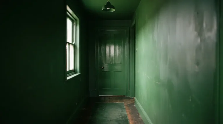
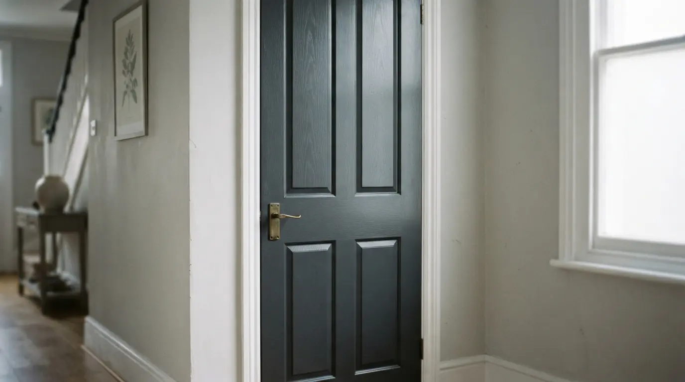
Before choosing any colour, decide honestly what job you want the door to do. If it’s a genuinely good quality door, solid timber with real grain and character, it might be worth leaving natural or highlighting rather than painting over, letting the trim and architrave do the framing work instead. If the door has no particular architectural merit, or you’re after a clean, contemporary look, painting it to blend with the walls lets it recede rather than draw attention. A confident, contrasting colour, black, charcoal, deep green, does the opposite deliberately, turning the door into a genuine style feature. None of these are wrong, but deciding which effect you actually want before you start narrows your colour options considerably.
Consider How Many Doors Are Visible Together Before You Choose
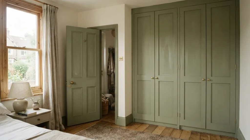
This is a detail that’s easy to overlook when you’re focused on a single door in isolation. A bedroom with wardrobe doors right beside the main door, or a hallway with several doors leading off it in quick succession, means whatever colour you choose gets repeated multiple times within the same sightline. This repetition can work in your favour, painting wardrobe doors the same tone as a bedhead or a nearby accent genuinely unifies the room, but it’s worth considering deliberately rather than by accident. The more doors visible together, the more that colour choice actually shapes the room’s overall character, so weigh a bold or unusual colour more carefully here than you would for a single door tucked away on its own.
Use a Quarter or Half Strength of Your Wall Colour for Subtle Contrast
If you love your wall colour but want the doors and trim to read as gently distinct rather than a flat, matched surface, ask your paint supplier for a quarter or half strength version of that same colour. This gives you a genuinely coordinated scheme, since it’s built from the identical base colour, but with enough tonal lift to create a soft, classic contrast rather than a stark one. This technique suits a more traditional room particularly well, and it avoids the slightly harder decision of picking an entirely unrelated colour that might not sit as comfortably alongside your chosen wall shade.
Link Your Door Colour to an Existing Accent in the Room
Rather than choosing a door colour in isolation, pull it from something already established in the room, an accent cushion, a piece of art, upholstery you’re not changing. This gives the whole scheme a considered, cohesive feel rather than treating the door as a separate decision made without reference to everything else. It’s a particularly useful approach if you’re decorating gradually rather than all at once, since a door colour tied to an existing accent will keep working even as other elements in the room change around it.
Check Whether Your Door Is Worth Painting at All
This is worth asking honestly before you commit to any colour. A genuinely good quality timber door, with real grain and craftsmanship, is sometimes better left natural or simply refinished rather than painted over, particularly if the surrounding trim and architrave are in similarly good condition. Painting is the right call for a lower-quality, mass-produced door, or a period door that’s already been painted multiple times and isn’t a candidate for stripping back, but it’s genuinely worth pausing on this decision for a door with real inherent character rather than assuming every door needs paint.
Choose the Right Finish for How the Door Actually Gets Used
A door sees more handling, knocks, and general contact than almost any other painted surface in the house, so finish matters as much as colour. A satin or eggshell finish is the common middle ground, durable enough to wipe clean and withstand regular contact while avoiding the higher-maintenance look of full gloss. A high-gloss finish gives real depth and a more formal, polished look, but it shows fingerprints, scuffs, and every surface imperfection considerably more readily than a satin finish does, worth knowing before committing an entire hallway’s worth of doors to it. Whichever you choose, use a paint genuinely formulated for wood and metal doors rather than standard wall emulsion, since it needs to handle a level of daily contact wall paint was never designed for.
Prep and Test Properly Before You Commit

Sand any existing gloss or uneven surface lightly so the new paint has something to grip, and apply a proper primer if you’re painting over a significantly different existing colour, particularly a dark one you’re covering with something pale. Test your chosen colour on a genuine sample patch on the actual door, not just a wall nearby, since a door’s surface and the way light hits it vertically can make a colour read slightly differently than the same shade on a flat wall. Check it morning and evening under your usual lighting before ordering enough paint for every door in the house.
Coordinate Doors With Adjacent Joinery in Open-Plan Spaces
In an open-plan layout, interior doors often sit close to kitchen cabinetry, a pantry door, or other built-in joinery, and it’s worth considering these together rather than choosing your door colour in isolation from what’s nearby. A door colour that clashes with an adjacent run of cabinetry stands out for the wrong reasons in an open space where both are visible at once, while a considered, related palette across doors and joinery reads as one continuous, planned scheme rather than several separate decisions bumping into each other.
Final Thoughts
Choosing the right colour for your interior doors really comes down to deciding what job you want each door to do, feature or disguise, then considering how many doors sit together in view and testing your chosen shade properly before committing. Get that sequence right, and the paint colour will feel like a genuine, considered decision rather than an afterthought picked from whatever tin was already in the shed.
FAQs
Should all the doors in my house be the same colour?
Not necessarily, though keeping doors within the same colour family creates a more cohesive flow, particularly in a hallway or open-plan space where several doors are visible together. A single statement door, a striking front door or a genuinely special piece, can reasonably be treated differently from the rest.
What is a quarter strength paint colour?
It’s a lighter tint of your main wall colour, mixed by the paint supplier to a specified fraction of the full strength. It gives trim and doors a subtle, coordinated contrast built from the same base colour rather than an entirely different, unrelated shade.
Should I paint over good quality wood doors?
Not necessarily. A door with genuine grain and craftsmanship is sometimes better left natural or refinished rather than painted, while a lower-quality or already heavily painted door is a more sensible painting candidate. Assess the door’s actual quality honestly before deciding.
What finish should I use for interior doors?
Satin or eggshell offers a durable, easy-to-clean middle ground suited to most interior doors, while high-gloss gives more depth and formality at the cost of showing fingerprints and scuffs more readily. Either way, use paint genuinely formulated for wood and metal rather than standard wall emulsion.
Do bedroom and wardrobe doors need to match?
Not strictly, but since they’re often visible together in the same sightline, a coordinated or matching colour tends to unify the room more effectively than treating them as unrelated decisions, particularly when wardrobe doors take up a large visual area.