Should Interior Doors Be the Same Colour as the Walls or Different?

Interior doors can genuinely work either way, painted the same colour as the walls or deliberately contrasting, and the right choice depends entirely on the effect you want, not a fixed design rule. Matching creates a seamless, enveloping feel and can make a small or awkward room feel larger, while contrasting adds definition and character. Neither is more correct than the other, which is exactly why this question keeps coming up rather than having a single settled answer.
Why Matching Doors to Walls Works
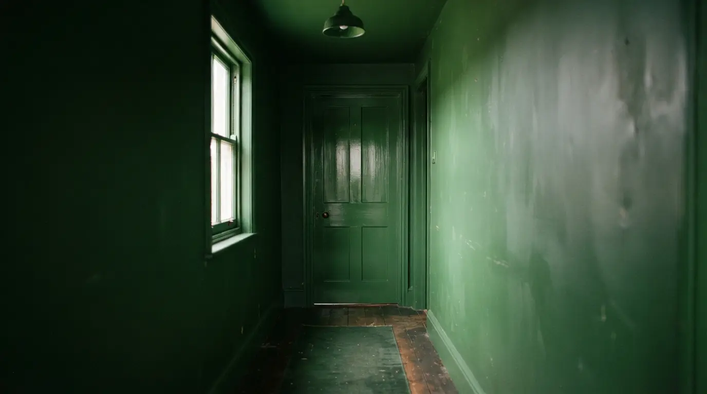
Painting doors the same colour as the surrounding walls, sometimes called colour drenching when it extends to the ceiling and trim too, creates a genuinely seamless look that removes the visual breaks a contrasting door usually creates. This blurring of edges is particularly effective in a small or irregularly shaped room, since it makes the boundaries of the space harder to read, which is why hallways and entryways, often small and oddly proportioned, are such a natural place to start. The same technique works well for disguising a door you’re not especially fond of, painting it into the wall colour rather than highlighting it in a contrasting shade lets it recede into the room rather than drawing attention to itself. Matching also suits rooms built around a sense of calm, bedrooms, bathrooms, nurseries, since removing the visual contrast between door and wall takes away a source of the eye jumping around the room.
Why Contrasting Doors From Walls Works
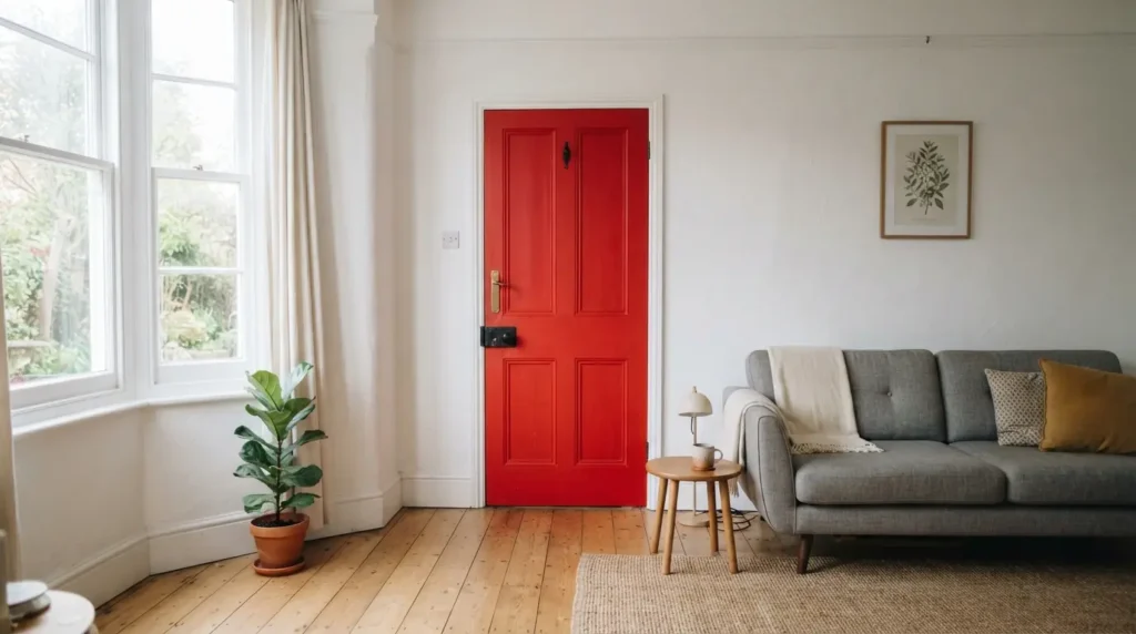
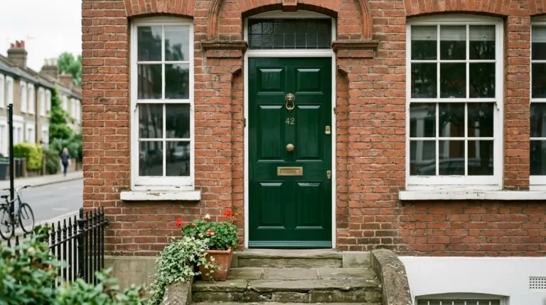
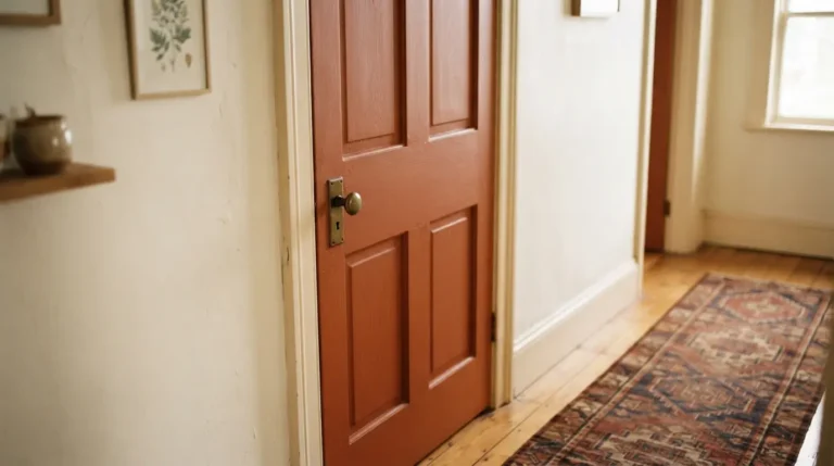
Painting a door in a different colour to the walls gives you genuine depth and dimension that a fully matched scheme doesn’t offer, and it turns the door itself into an architectural feature worth noticing rather than a surface to blend away. A tonal contrast, a lighter and darker shade from the same colour family, reads as elegant and harmonious without much risk of it feeling jarring. A bolder, more distinct contrast creates a livelier, more graphic result, genuinely striking against plain white walls specifically, where a single confidently coloured door becomes a considered accent rather than an accident. This approach suits a room where you want the door to do real visual work, marking a transition point, drawing the eye toward an entrance, rather than disappearing quietly into the scheme.
The Technical Detail Both Approaches Share
This is worth knowing regardless of which direction you choose, and it’s the detail most colour-matching guides skip entirely. Even when you’re painting a door the exact same colour as your walls, you generally can’t use the same tin of paint for both. Most doors are wood, and they need a proper undercoat and primer, followed by a paint genuinely formulated for wood and metal surfaces, rather than the wall or ceiling emulsion used elsewhere in the room. This isn’t a cosmetic preference, it’s about durability and finish, a door gets handled, knocked, and wiped down far more than a wall ever does, and wall paint simply isn’t built to withstand that level of contact.
Even “Matching” Colours Read Differently Because of Finish
Here’s a genuinely useful detail if you’re going for a fully seamless, colour-drenched look: even using the identical paint colour on both walls and door, the finish itself creates a natural, subtle contrast. Wall paint is typically a flatter, matte emulsion, while door and woodwork paint is usually a slightly glossier eggshell or satin finish, and that difference in sheen catches and reflects light differently even when the underlying colour is exactly the same. This means a fully colour-matched room never actually looks completely flat and uniform, there’s still a gentle visual distinction between wall and woodwork, just a much softer one than an outright contrasting colour would create. Worth knowing if you’re aiming for genuine seamlessness, since the finish alone provides enough definition that the door doesn’t visually vanish entirely, even at its most matched.
Where to Start If You’re Not Sure
If you’re undecided, entryways and hallways are a genuinely sensible place to experiment with matching doors to walls, since these spaces are often small, sometimes irregularly shaped, and visible from multiple other rooms at once, all reasons a single cohesive colour tends to work particularly well here. If your walls are already a plain white or a similarly neutral colour, a bold door colour is the lower-risk way to introduce real personality into the room without repainting every wall, a red, a deep pink, a bright yellow, all read as a genuine style statement against a neutral backdrop without needing you to commit an entire room to that colour. Whichever direction you lean, the overall feeling you want the room to have, calm and enveloping versus characterful and defined, is a better guide than any fixed rule about what doors are supposed to look like.
Match to Flooring Instead of Walls, a Genuine Third Option
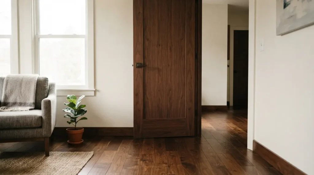
This is worth knowing as a genuine alternative to the matching-versus-contrasting question entirely. Rather than coordinating a door with the walls, some designers match it to the room’s flooring instead, a door in a similar tone to a dark wood floor, or one that echoes a cream carpet, creates its own kind of visual coherence, particularly effective in a living room where the floor is already a dominant, established element. This sidesteps the wall question altogether and gives the door a different, equally valid job: tying the vertical and horizontal planes of the room together rather than blending into or contrasting against the walls specifically.
Final Thoughts
Whether interior doors should match the walls or contrast really comes down to the feeling you want the room to have, seamless and enveloping, or defined and characterful, rather than any fixed rule either way. Whichever direction you choose, remember doors need their own properly formulated paint even when matching the wall colour exactly, and that finish alone creates enough natural contrast to stop even a fully colour-drenched room from reading as completely flat.
FAQs
Should doors be the same colour as walls or trim?
For a genuinely seamless, modern finish, doors, walls, and trim all in the same colour, the full colour-drenching approach, works well and can make a small room feel more spacious. Painting doors to match trim while contrasting with the walls is an equally valid, more traditional alternative.
What colour should I paint doors if my walls are white?
White walls are a genuinely flexible backdrop for almost anything, a bold, saturated colour for real impact, or a gentle, complementary neutral for a more discreet, elegant look. The right choice depends on whether you want the door to be a statement or a quiet supporting detail.
Should doors be darker or lighter than walls?
Either works, and it depends on the effect you want. A tonal difference, a lighter or darker shade within the same colour family, creates a gentle, elegant contrast, while a more distinctly different colour delivers a livelier, more graphic result.
Can I use the same paint for doors and walls?
Generally no, even when matching the exact colour. Most doors are wood and need a proper undercoat, primer, and a paint formulated for wood and metal, rather than the wall emulsion used elsewhere, since a door needs to withstand far more handling and contact than a wall.
What’s the most popular colour for interior doors?
White remains the most historically common choice for doors and trim, though painting doors to match the walls, colour drenching, has become a genuinely popular contemporary alternative in recent years.