15 Blue Paint Ideas for Every Room and Every Mood

Blue paint ideas work across genuinely every room in the house because the colour itself covers such enormous ground, a pale duck-egg reads as light and airy, while a deep indigo feels intimate and enveloping. The 15 ideas below cover that full spectrum, along with the honest testing and pairing advice that decides whether a blue actually suits your room or just looked right on the sample card.
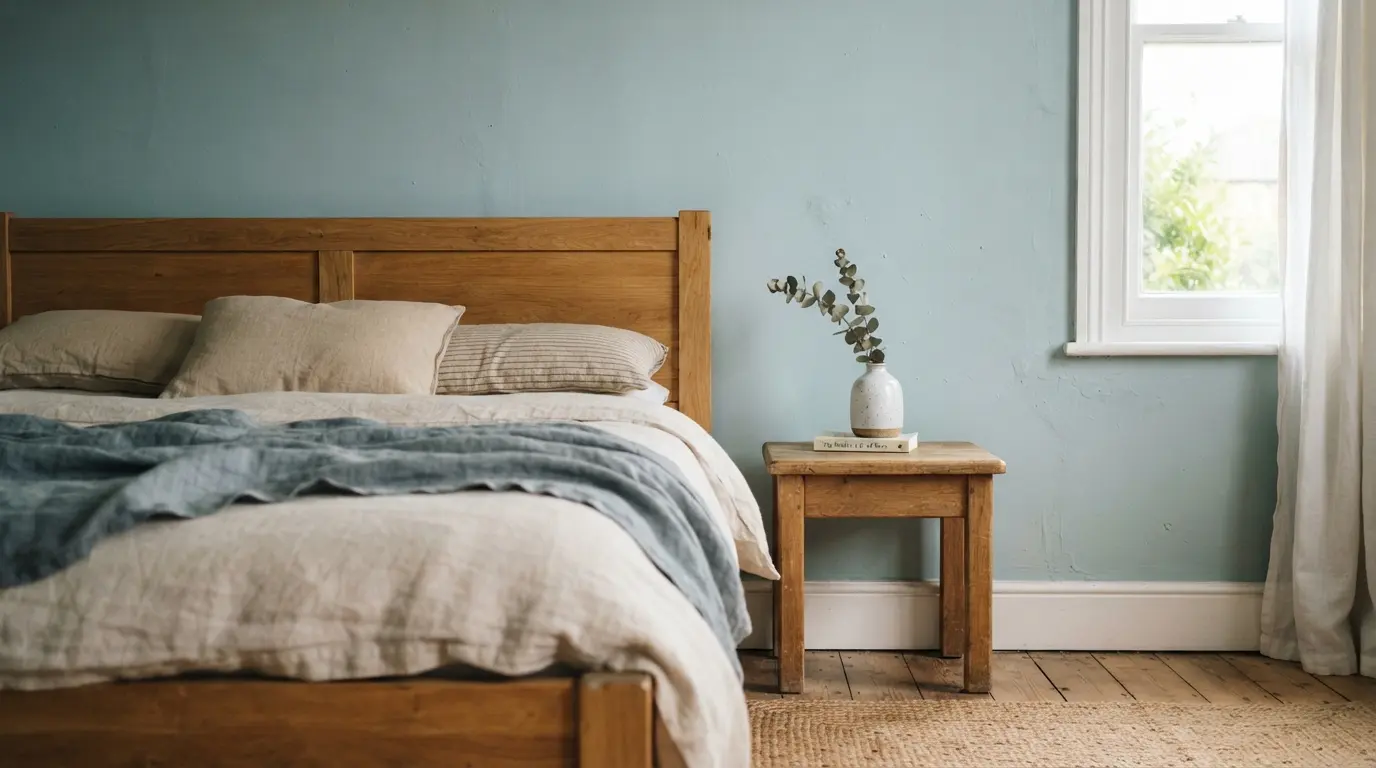
1. Pale Duck-Egg Blue for a Small, Light-Starved Room
A soft, pale blue genuinely makes walls appear to recede, which is exactly why it’s such a reliable choice for a small bedroom or a room that doesn’t get much natural light. It bounces daylight back into the space rather than absorbing it, lifting the whole room without needing a bold colour statement to do the work. This is worth trying first if you’re nervous about blue generally, since it’s the shade family least likely to disappoint. Pair it with light wood and simple white trim to keep the whole scheme feeling genuinely open rather than accidentally cold, since a pale blue on its own can occasionally read as slightly clinical without something warmer to soften it.
2. Dusty Cornflower Blue for an Everyday Calm Bedroom
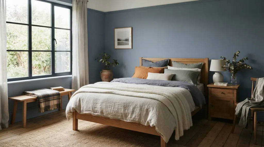
A muted, slightly greyed cornflower blue sits between a pale pastel and a fully saturated colour, giving a bedroom genuine calm without tipping into either childish or overly formal. It works well against most wood tones and pairs easily with warm or cool linens, which makes it a genuinely low-risk choice if you’re decorating a room you’ll live with for years rather than repaint on a whim.
3. Teal for a Warm, Energising Kitchen
Teal sits apart from most other blues because it leans on a blend of blue and yellow pigment rather than blue and green, which gives it a genuine, distinct warmth that a standard blue doesn’t carry. This makes it a particularly good fit for a kitchen or creative space where you want colour and energy without the coolness a straight blue can sometimes bring, and it holds up well against brass, wood, and warm white in equal measure. On cabinetry specifically, teal has become a genuine alternative to plain navy for anyone who wants a dark, confident colour without quite the same formality, and it photographs particularly well under warm kitchen lighting rather than washing out the way some cooler blues can.
4. Cobalt Blue as a Bold, Energising Accent
A genuinely saturated cobalt is one of the most confident choices on this list, and it works best used with intention, a single wall, a door, or a piece of furniture, rather than covering an entire room. It suits a space where you want real energy and impact, a home office, a hallway, a downstairs cloakroom, somewhere the boldness reads as considered rather than overwhelming.
5. Grey-Blue for a Contemporary, Neutral-Leaning Living Room
A grey-blue sits close enough to neutral that it works almost like a considered alternative to plain grey, while still bringing a genuine sense of colour and depth to a living room. It suits a contemporary scheme particularly well, pairing easily with black and white accents, and it has real historical pedigree too, several of the grey-leaning blues used in homes today echo shades that were considered a mark of status centuries ago. This is also one of the more forgiving shades to live with long-term, since it sits close enough to neutral that changing your cushions, art, or rug doesn’t risk clashing with the wall the way a more saturated blue sometimes can.
6. Indigo or Purple-Leaning Blue for an Intimate, Enveloping Snug
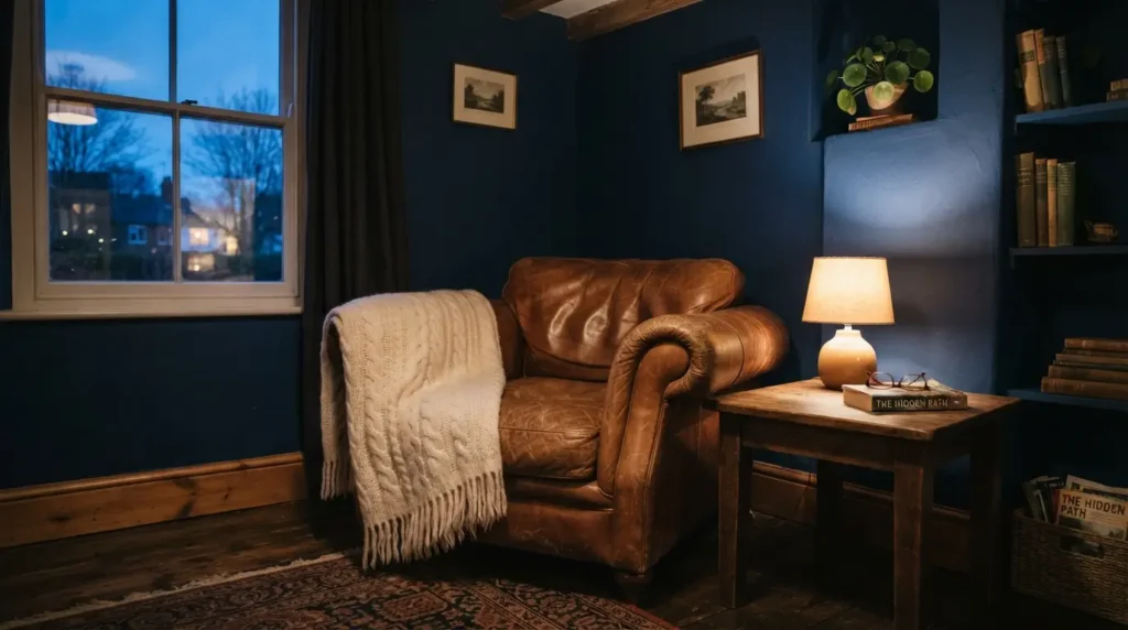
This is a genuinely different route to warmth than the green-undertone blues most warming guides focus on. A deep blue with a purple or indigo lean creates an intimate, enveloping feel of its own, less about lifting a room and more about wrapping it, which suits a snug, a study, or a bedroom where you want the space to feel like a genuine retreat rather than an airy, expansive room. Pair it with warm wood and soft, tactile textiles to lean into that cocooning quality rather than fighting against it.
7. Test the Same Blue Across Rooms With Different Light Before Committing Whole-House
This is worth doing properly if you’re planning to carry one blue through more than one room, since a shade that looks perfect in a bright, south-facing room can shift noticeably in a darker hallway or a north-facing bedroom. The genuinely useful shades are the ones that hold their character in both flat, low light and full sun, neither turning muddy in shade nor washing out in bright daylight. Paint a real sample in each room and check it across a full day before assuming one tin will suit your whole house equally well.
8. Layer Two Shades of the Same Blue Family for Depth
Rather than a single flat colour, pairing a mid-tone blue on the main walls with a deeper or lighter shade from the same family on trim, an alcove, or a chimney breast adds genuine depth without introducing a second, unrelated colour to balance. This reads as considered and tonal rather than simply matched, and it’s a particularly effective technique in a room with real architectural detail worth highlighting, like a fireplace recess or built-in shelving. Keep the shift between the two shades genuinely within the same family rather than reaching for a second, unrelated blue, the effect works because the eye reads it as depth, not as two separate decisions competing with each other.
9. Split a Wall Between Two Blues for a Considered, Zoned Look
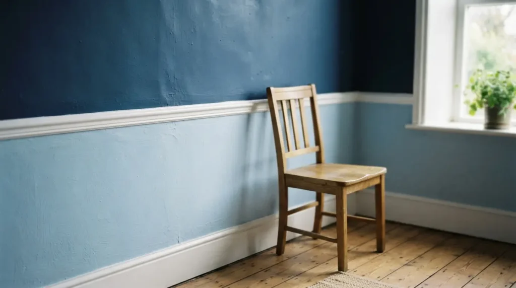
Rather than choosing between a pale and a deep blue, painting the lower portion of a wall in one and the upper portion in the other, divided at a dado rail or a simple painted line, gives you both in one considered scheme. This works particularly well in a room where you want some of blue’s grounding, cosy quality without losing all the lightness a paler shade brings, and it’s a genuinely underused technique compared with a single flat colour or a straightforward accent wall.
10. Pair Blue With Warm Terracotta or Mustard for Energy
Balancing a cool blue with a warm terracotta or mustard accent creates real contrast and energy, the kind of pairing that keeps a blue room from ever feeling flat or one-note. This works whether the warm tone comes through a rug, cushions, or a single piece of furniture, and it’s a genuinely reliable combination across almost any blue, from a pale sky tone to a deep navy.
11. Pair Blue With Blush Pink for a Softer Mediterranean Feel
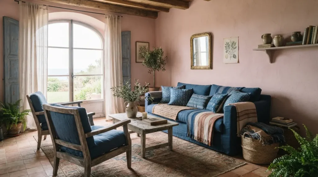
Blue and a soft, dusty pink together create a gentler, more romantic pairing than blue and terracotta, closer to a Mediterranean or coastal palette than a bold, graphic contrast. This suits a bedroom or a more relaxed living space particularly well, and it’s worth keeping the pink genuinely muted rather than bright, so the two colours feel like they belong to the same calm family rather than competing for attention.
12. Try Blue Through Wallpaper Pattern Rather Than Flat Paint
A patterned wallpaper, botanical, floral, or geometric, brings blue into a room with genuine texture and movement that flat paint can’t offer, and it’s worth considering specifically if you want the colour to read as a considered feature rather than a simple wall treatment. Choosing a paste-the-wall product makes this a considerably more manageable DIY project than older wallpaper types, worth knowing if you’re put off by wallpapering memories from years ago. A wallpaper also lets you introduce several tones of blue at once within a single pattern, giving you the layered depth of idea eight without needing to plan the paint shades yourself.
13. Start With Blue Accessories If You’re Not Ready to Commit to Walls
If painting an entire room feels like too big a leap, layering in blue through throws, rugs, and artwork lets you live with the colour before committing to it permanently. This is a genuinely practical way to test whether you actually want to live with blue day to day, and every piece can be swapped out easily if the colour doesn’t grow on you the way you expected.
14. Use a Bold Blue on a Single Piece of Furniture Rather Than a Wall
Painting an old side table, a chest of drawers, or a piece of upcycled furniture in a confident blue gives you a genuine style statement at a fraction of the cost and commitment of painting a whole wall. This is one of the most budget-friendly ideas on this list, and it’s a particularly good route if you’re not ready to commit to blue as a wall colour but still want it to feature somewhere in the room.
15. Match the Blue’s Warmth to the Room’s Actual Light Before You Choose the Shade
This is the detail that ties every other idea on this list together, and it’s worth treating as the final decision rather than an afterthought. A room with strong natural light can carry a cooler, more saturated blue without it feeling cold, since the light itself does some of the warming work. A room with limited or flat light benefits from a blue with a genuine warm lean, whether that comes from a green undertone or a purple and indigo one, since without that warmth, a cool blue in a dim room can read as genuinely chilly rather than calming. Check your chosen shade against a neutral white card in the room’s actual light before committing to a full wall, this single check prevents more blue-paint regret than any other single piece of advice.
Final Thoughts
The best blue paint ideas span the full range of what this colour can do, from a pale, space-expanding shade in a small room to a deep, enveloping indigo in a snug, matched carefully to the room’s actual light and mood rather than chosen from a swatch alone. Test properly, pair deliberately, and blue will earn its place as one of the most versatile colours in the house, working just as hard in a bright kitchen as it does in a quiet, intimate bedroom.
FAQs
Does blue paint make a small room look bigger?
Yes, particularly pale and mid-tone blues, since the colour visually makes walls appear to recede, creating a genuine sense of extra space. Very dark, saturated blues can have the opposite effect in a small room with limited light, so match the depth of colour to how much natural light the room actually gets.
What colours pair well with blue?
Warm terracotta and mustard create genuine energy and contrast, soft blush pink gives a gentler, more Mediterranean feel, and neutrals like crisp white or warm cream keep the pairing simple and airy. Green also pairs naturally with blue, echoing the tones you’d find in nature.
Is teal considered a type of blue?
Teal sits in its own space between blue and green, leaning on a blend of blue and yellow pigment that gives it a distinct warmth most straight blues don’t have. It’s worth treating as its own genuine shade family rather than simply a variation of blue.
Can I use the same blue in every room of my house?
You can, but test it properly first, a shade that looks perfect in one room’s light can shift noticeably in a room with different natural light. The most versatile blues hold their character reasonably well across both bright and flat light, but it’s worth checking rather than assuming.
What’s the warmest type of blue paint?
Blues with a green undertone are the most commonly cited warm blues, but a deep blue with a purple or indigo lean creates warmth through a different route, intimacy and enclosure rather than lift, which suits a cosy snug or study particularly well.