How to Use Blue Paint in Your Home Without It Feeling Cold

Using blue paint without it feeling cold comes down to choosing the right undertone, testing it properly in your room’s actual light, and pairing it with warm materials rather than cool ones. It’s one of the most common colour worries homeowners raise, loving the idea of blue but fearing it’ll leave a room feeling flat or chilly, and it’s almost always solvable with the right combination rather than avoiding blue altogether.
Understand Why Blue Feels Cold in the First Place
Blue affects mood more mentally than physically, lighter blues tend to read as calming and soothing, while darker blues feel more stimulating and dramatic. The “cold” feeling people worry about doesn’t come from blue itself, it comes from a specific type of blue: one with grey or black undertones, viewed in a room with limited natural light or paired with cool metals and stark white trim. Blue isn’t the problem. The undertone, the light, and what surrounds it are.
Spot a Warm-Based Blue Before You Buy
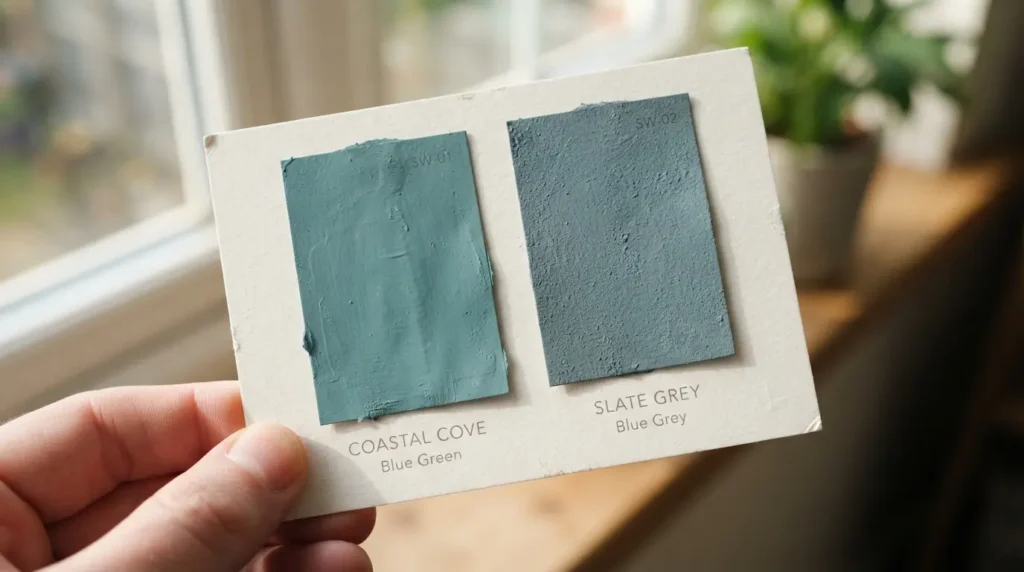
This is the single most useful check before choosing any blue paint. Hold the sample next to a genuinely neutral white or grey card and look for a hint of green in the undertone, a warm-based blue leans slightly toward teal or green rather than sitting flat and cool. A blue with a touch of green lifts a room rather than flattening it, while a blue with strong grey or black undertones is the one most likely to read as chilly, particularly in a room that doesn’t get much direct sun. If you’re choosing between two blues that look nearly identical on a swatch, this green-versus-grey undertone check is usually what separates the one that will feel warm from the one that won’t.
Test the Colour in Your Room’s Actual Light
A blue that looks warm and inviting in a bright, sunlit showroom can read completely differently in a room with limited natural light. In a darker or north-facing room specifically, earthy undertones in a warm blue tend to deepen and intensify through the day rather than disappear, which is actually a point in its favour, but it’s worth seeing this happen on your own wall before committing to a full room. Paint a genuine sample patch and check it at different times of day, morning, midday, and evening under artificial light, since a blue tested only once under one lighting condition is the most common reason people end up disappointed with a colour that looked completely different in the shop.
Pair Blue With Warm Wood Tones
Warm wood, cherry, walnut, teak, or a similarly rich-toned timber, does more to prevent a blue room feeling cold or flat than almost any other single styling decision. The wood grain and warmth counteract blue’s naturally cooler quality, and it draws the eye through the room rather than letting the wall colour sit as one flat, isolated block. This matters even more in a tonal blue scheme, where the wall and furnishings share the same colour family, without a warm material to break it up, an all-blue room can start to feel monotonous rather than calming.
Use Complementary Contrast to Make Blue Feel Warmer
Blue and orange sit opposite each other on the colour wheel, and pairing them doesn’t clash, it makes both colours read as more vivid and true to themselves. A warm, dusty blue paired with terracotta is a particularly effective combination for exactly this reason, the contrast keeps the room feeling grounded and characterful rather than cool. Red, pink, mustard, and green all work as similarly effective warming partners for blue if orange and terracotta aren’t your style, the underlying principle is the same: a warm accent colour elsewhere in the room stops the blue from carrying the whole space alone.
Go Tonal Rather Than Flat
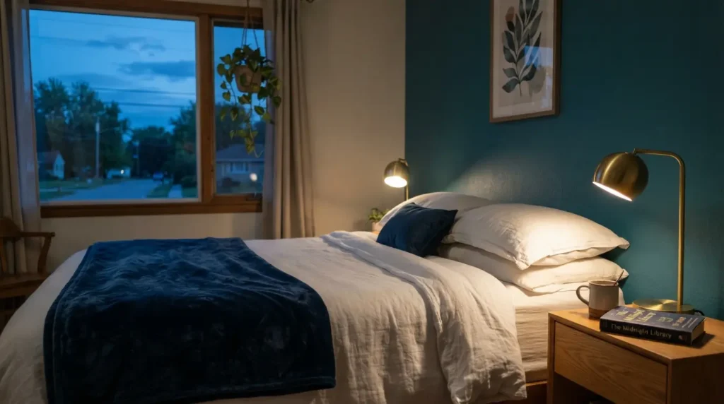
Rather than one single shade of blue across walls and furnishings, layering lighter and darker versions of the same blue, a mid-tone teal wall with a richer navy on upholstery, for instance, adds genuine depth without introducing an entirely different colour family. This tonal approach reads as considered and calming rather than cold, provided it’s paired with at least one warm material, wood, brass, a natural fibre rug, so the scheme doesn’t end up entirely cool-toned from floor to ceiling.
Choose Warm Metals and a Warm White Instead of Cool Ones
Brass, aged bronze, and warm gold-toned metals sit far more comfortably against blue than chrome or brushed nickel, which can push an already cool colour further into feeling chilly. The same logic applies to your trim and ceiling colour: a stark, cool white next to blue amplifies the coolness, while a warm cream or off-white softens the contrast and keeps the whole room feeling more inviting. This is a small swap, but it’s one of the most overlooked reasons a blue room ends up feeling colder than intended.
Layer in Texture and Warm Lighting
Texture does real work against a smooth, flat blue wall, a chunky knit throw, a jute or wool rug, linen curtains, all add tactile warmth that colour alone can’t provide. Lighting matters just as much: warm-toned bulbs (lower on the colour temperature scale, closer to candlelight than daylight) make a genuine difference to how blue reads in the evening, when a cooler bulb can leave even a warm-based blue looking flat and clinical. Layered lighting, a floor lamp and a table lamp alongside any overhead light, softens the room further than a single central fitting ever will.
Final Thoughts
Using blue paint without it feeling cold really comes down to choosing a warm-based undertone, testing it properly in your room’s actual light, and surrounding it with warm wood, metal, and texture rather than cool, stark finishes. Get those details right and blue becomes one of the most versatile, calming colours available, not the cold, clinical choice people worry about before they’ve actually tried it.
FAQs
How do I know if a blue paint is warm or cool?
Check the undertone against a neutral white or grey card: a warm-based blue leans slightly toward green, while a cool-based blue leans toward grey or black. This check matters more than the colour name on the tin.
Does blue paint make a room feel smaller?
Not inherently, this depends more on the depth of colour and how much natural light the room gets than on blue as a colour itself. A pale, warm-based blue can feel just as open as a neutral, while a very dark blue in a low-light room will read as more enclosed, which some people want and others don’t.
What colours pair well with blue to make it feel warmer?
Warm woods (cherry, walnut, teak), brass or aged bronze metals, and complementary warm accents like terracotta, orange, mustard, or a soft brown all help balance blue’s naturally cooler quality.
Should I avoid blue in a north-facing room?
Not necessarily, but choose a warm-based blue with a genuine green undertone rather than a grey-based one, and test it properly in the room’s actual light before committing, since north-facing rooms show undertone shifts more noticeably than south-facing ones.
What’s the difference between light blue and dark blue for warmth?
Lighter blues tend to read as calming and soothing, while darker blues feel more dramatic and stimulating, neither is inherently colder, but a dark blue in a poorly lit room needs warm materials and lighting around it more than a pale blue does to avoid feeling heavy.