What Is Colour Psychology and How Does It Apply to Interior Design

Colour psychology is the study of how colour influences human emotion, mood and behaviour, and in interior design it’s used to shape how a room feels rather than just how it looks. The tricky part is that most colour psychology content treats this as a fixed system, red always energises, blue always calms, when the reality is that the same colour can produce completely different effects depending on the light, material and room it sits in.
That gap between the simple version and the working version is exactly where most people get stuck redecorating. You pick a “calming blue” for a bedroom from a paint chart, apply it, and it reads cold rather than restful once it’s actually on the wall. Understanding why that happens is more useful than memorising a colour-emotion chart.
Is Colour Psychology an Exact Science?
Colour psychology is not an exact science, and treating it as one is the most common mistake homeowners make when choosing paint colours. Genuine, peer-reviewed research supports colour’s effect on perceived temperature, spaciousness and time, but individual response varies by lighting, culture, personal association and the materials surrounding the colour.
Even the specific physiological claims get repeated more confidently than the evidence supports. Blue is widely cited as lowering blood pressure and heart rate, and red as raising it, and while there’s research behind these associations, the effect size and consistency across individuals is far less absolute than most colour guides suggest. Treat these as tendencies worth working with, not guarantees.
Why Does the Same Colour Look Different in Different Rooms?
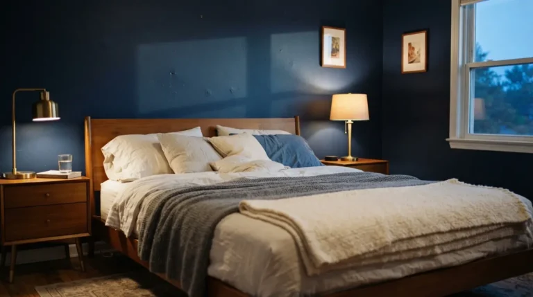
The same colour looks different in different rooms because of three things working together: the direction and quality of natural light, the colour temperature of any artificial lighting, and the material the colour sits on. A “restful” pale blue chosen from a swatch under shop lighting can read as flat or cold once it’s on a north-facing bedroom wall lit by cool white bulbs in the evening.
North-facing rooms receive cooler, more diffused light throughout the day, which tends to mute colours and can make blues and greens look duller than expected. South-facing rooms get warmer, more direct light, giving you more flexibility, including cooler tones that would otherwise feel chilly elsewhere in the house. A good rule of thumb is testing a genuinely large paint sample, at least A2 size, directly on the actual wall rather than on card, and checking it at more than one time of day, including after dark under whatever bulbs you actually use in that room.
How Does Artificial Light Change Colour Psychology?
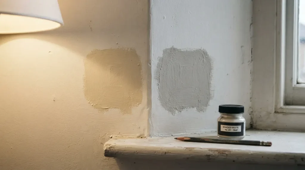
Artificial lighting changes how a colour reads through its colour temperature, measured in Kelvin, with warmer bulbs around 2700K softening and enriching warm and neutral tones, while cooler bulbs at 4000K or above sharpen blues and cool greys but can make warm tones look flat or slightly grey. Choosing a colour without testing it under your actual bulbs is one of the most common reasons a paint colour disappoints once the room is finished.
This matters more than most colour guides acknowledge, because the same warm grey that looks considered and cosy under midday daylight can feel cold and clinical under a standard cool white LED at six in the evening. If a room’s lighting can’t easily be changed, it’s worth specifying the paint colour and the bulb temperature together rather than treating them as separate decisions made at different points in a project.
Does Colour Choice Depend on the Material It’s Applied To?
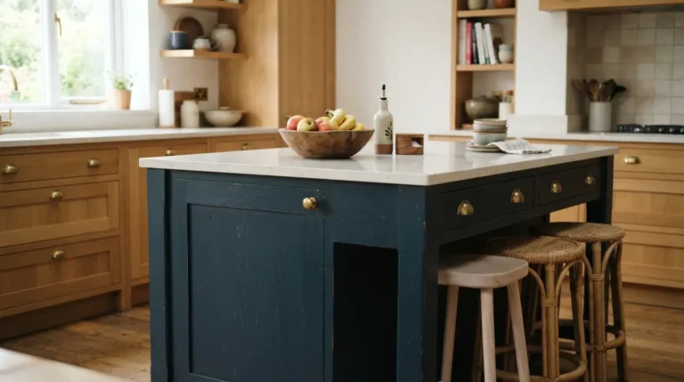
Yes, a colour’s psychological effect depends heavily on the material and finish it sits on, since matte surfaces read as quieter and more grounded while glossy finishes feel more active and reflective, and natural materials like real timber, stone or lime plaster anchor a colour in a way that manufactured surfaces don’t. The same warm beige can look convincingly natural on linen or plaster and noticeably artificial on vinyl or laminate.
This is worth remembering before blaming a colour choice itself when a scheme doesn’t feel right. A warm neutral paired with cheap, glossy surfaces can feel plastic and flat, while the identical paint colour paired with genuine wood, wool or stone reads as considerably warmer and more expensive, without changing the colour at all.
What Emotions Do Different Colours Typically Evoke?
Warm colours like red, orange and yellow tend to create energy, sociability and warmth, while cool colours like blue, green and purple tend to support calm, focus and relaxation, though the specific shade, saturation and context all shift how strongly this holds true in any given room.
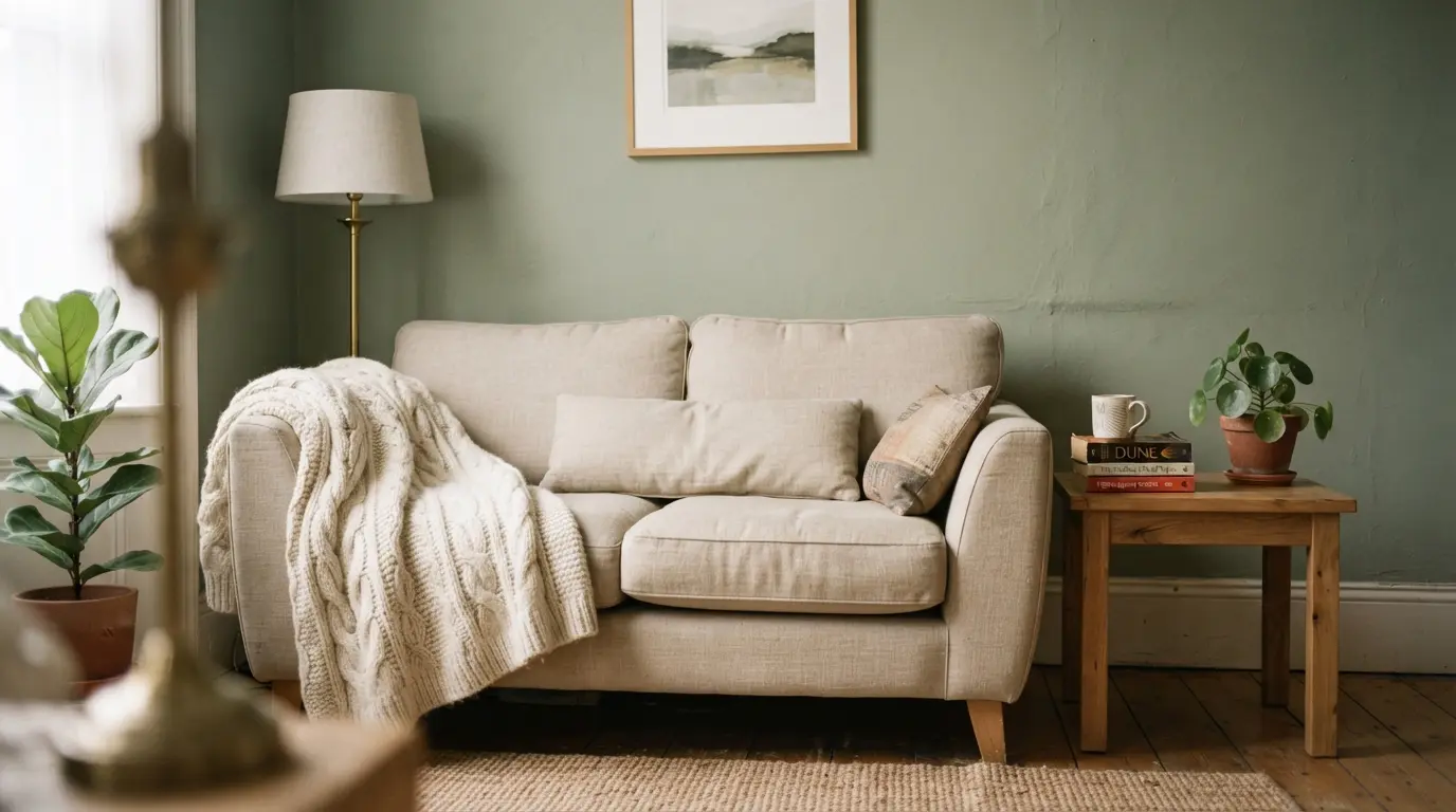
Green is consistently associated with balance, restoration and reduced stress, largely through its connection to the natural world, making it a popular choice for living rooms and spaces meant for winding down. Blue supports calm and concentration, with soft blues suiting bedrooms and darker navy or teal suiting a home office where focus matters more than relaxation. Red raises energy and stimulates appetite, which is why it turns up in dining rooms and social spaces, but its intensity means it’s usually more successful used as an accent than as a dominant wall colour in a room meant for rest. Yellow lifts mood and stimulates mental activity in smaller, controlled doses, though an overly saturated or acidic yellow used at scale can tip toward feeling overstimulating rather than cheerful.
How Do You Apply Colour Psychology to Different Rooms?
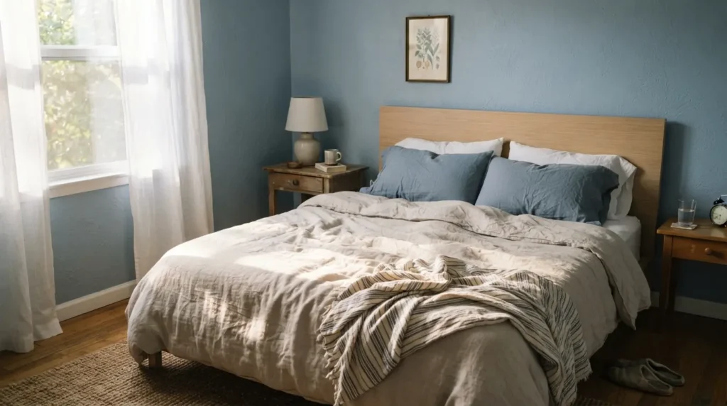
Applying colour psychology to a specific room starts with defining what that room needs to support, whether that’s rest, focus, or social energy, then choosing saturation and warmth to match rather than picking a colour purely because it’s associated with the right emotion in the abstract.
A bedroom generally benefits from lower saturation, moderate warmth, and soft, tactile materials, since the goal is genuine restfulness rather than visual excitement. A home office needs a more careful balance, enough colour to support alertness without tipping into overstimulation, which is why moderate blues and greens with a warm undertone tend to outperform either very cool or very saturated choices. A kitchen or dining space can generally handle warmer, more energetic colours since the social, appetite-driven function of the room works with that energy rather than against it. A living room used for both relaxation and gathering is genuinely harder to get right in one flat colour choice, and often benefits from a dominant calmer neutral paired with a bolder, warmer accent rather than committing the whole room to one end of the spectrum.
What Does Colour Psychology Get Wrong or Overpromise?
Colour psychology cannot fix a poorly proportioned room, weak natural light, or cheap materials, and it can’t override a personal negative association with a specific colour no matter how strong the general theory behind that colour is. A shade that reminds you of an unhappy memory won’t feel restful just because colour theory says it should.
A common mistake is expecting colour to do the work of good lighting or decent materials on its own. Colour psychology works best as one part of a coherent decision, alongside genuine natural light, honest material choices and lighting specified to suit the colour, not as a standalone fix applied after everything else about the room has already gone wrong.
Conclusion
Colour psychology genuinely does shape how a room feels, but it works through light, material and context rather than through the colour alone. Test any serious colour choice directly on your own wall, under your own lighting, at more than one time of day, before committing to a full room. Pair the colour with materials and lighting that support the mood you’re actually trying to create, and colour psychology becomes a genuinely useful design tool rather than a chart you’re hoping holds up once the paint dries.
FAQs
Does colour psychology mean a colour always has the same effect on everyone?
No. The effect depends on the light it’s viewed in, the material it sits on, its saturation, and personal or cultural association, which is why the same colour can read calming in one room and cold in another.
What is the difference between colour psychology and colour symbolism?
Colour psychology refers to the largely unconscious emotional and physiological responses colour can trigger, while colour symbolism is the culturally learned meaning attached to a colour, such as white representing purity in some cultures and mourning in others.
What is the best colour for a small room according to colour psychology?
Pale, cool colours with lower saturation tend to make a small space feel more open, though the effect depends on pairing that colour with genuine natural light and honest materials rather than the colour alone.
Why does the same paint colour look different in my house than in the shop?
Shop lighting, your room’s natural light direction, and your specific bulbs all shift how a colour reads, which is why testing a large sample directly on your own wall at different times of day matters more than trusting a swatch under different lighting.
Is colour psychology backed by real science?
Yes, in part. Research supports colour’s influence on perceived temperature, spaciousness and mood, but the effect size varies by individual, culture and context, so it’s better treated as a genuine tendency than a fixed rule.
Can colour psychology help you focus in a home office?
Moderate blues and greens with a warm undertone tend to support focus without feeling flat, though the room’s actual lighting and materials matter just as much as the wall colour itself.