Navy Blue Paint Ideas for a Bold and Sophisticated Interior

Navy blue paint ideas work because navy behaves more like a rich neutral than a bold statement colour, dark enough to feel dramatic, versatile enough to sit behind almost any style. The 10 ideas below cover the rooms and surfaces where navy earns its place, along with the practical checks around light, finish, and coverage that most colour roundups skip.
1. A Navy Front Door for Instant Kerb Appeal

A navy front door is one of the lowest-commitment, highest-impact uses of the colour, a single door rather than a full room, and it reads as considered and classic rather than trend-led. It pairs naturally with brass or black hardware and works on nearly every house style, from a period terrace to a modern new-build, without needing to coordinate with anything inside. Because exterior doors face genuinely different weather exposure to an interior wall, it’s worth choosing a paint specifically formulated for exterior wood or metal rather than assuming an interior tin in the same shade will hold up the same way outdoors.
2. Navy Kitchen Cabinetry for a Bold Alternative to White
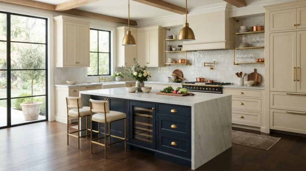
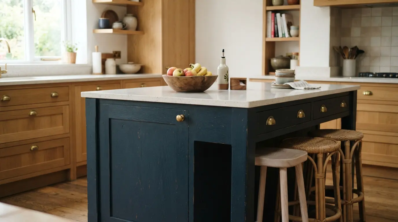
Navy cabinetry brings genuine depth and sophistication to a kitchen without the stark, clinical feel an all-white scheme can sometimes have. It’s particularly effective on a kitchen island specifically, kept as the one navy element against paler surrounding cabinetry, since this gives the room a clear focal point rather than committing every surface to the same dark tone. Pair it with a light stone or wood worktop to keep the room from feeling heavy, and brass or unlacquered hardware for warmth against the cool base colour. Cabinetry paint needs to be genuinely durable rather than a standard wall formulation, since kitchen units take daily knocks, splashes, and cleaning that a wall never sees, so it’s worth asking specifically for a hard-wearing, kitchen-rated finish rather than assuming any navy paint will hold up the same way on cupboard doors.
3. Navy Dining Room Walls for Evening Drama
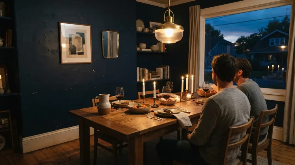
Dining rooms are used mostly in the evening, which makes them one of the best candidates in the house for a genuinely dark, dramatic colour. Navy walls under warm, layered lighting create an intimate, enveloping atmosphere that a paler colour simply can’t match after dark, and the depth of colour reads as considered rather than gloomy precisely because the room isn’t relied on for all-day brightness the way a kitchen or living room is. Pair it with a pale-coloured table, wood or a light stone, since the contrast between a dark wall and a lighter surface at the room’s centre is one of the most reliably effective combinations in this kind of scheme.
4. A Navy Home Office or Study for a Focused, Handsome Feel
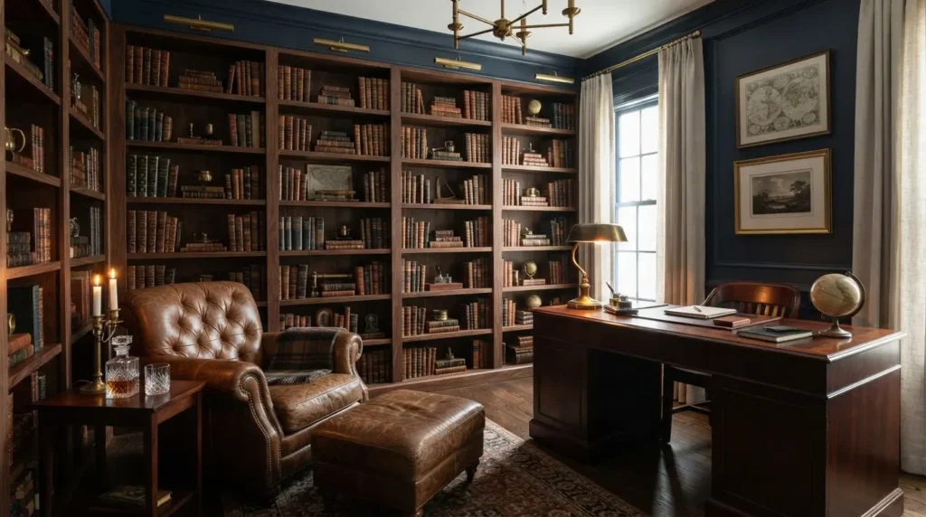
Paired with leather furniture, rich wood shelving, and warm brass details, navy walls give a home office or study a genuinely handsome, focused character, closer to a traditional library than a standard spare room. This suits a smaller room particularly well, since a space used for concentrated, single-purpose work benefits from feeling enclosed and considered rather than open and airy the way a living space does. If the room genuinely needs to double as a space for video calls, check how the colour reads on camera under your usual working light before committing, a very dark wall directly behind you on screen can need a bit more front-facing light than a paler background would.
5. Navy on the Ceiling for a Cocooning Fifth Wall Effect

Taking navy up onto the ceiling, sometimes called the fifth wall, removes the visual break a lighter ceiling usually creates and makes a room feel genuinely enveloping rather than boxed in by a stark white cap overhead. This works particularly well in a room with a lower ceiling, where a bright white ceiling can otherwise draw unwanted attention to the height, while a matching dark ceiling tends to disappear into the overall scheme instead. Ceiling paint is worth choosing specifically for the job too, a flat or matt ceiling-rated formulation resists the flashing and roller marks a wall paint can sometimes show when applied overhead under changing light.
6. A Navy Accent Wall as a Low-Commitment Starting Point
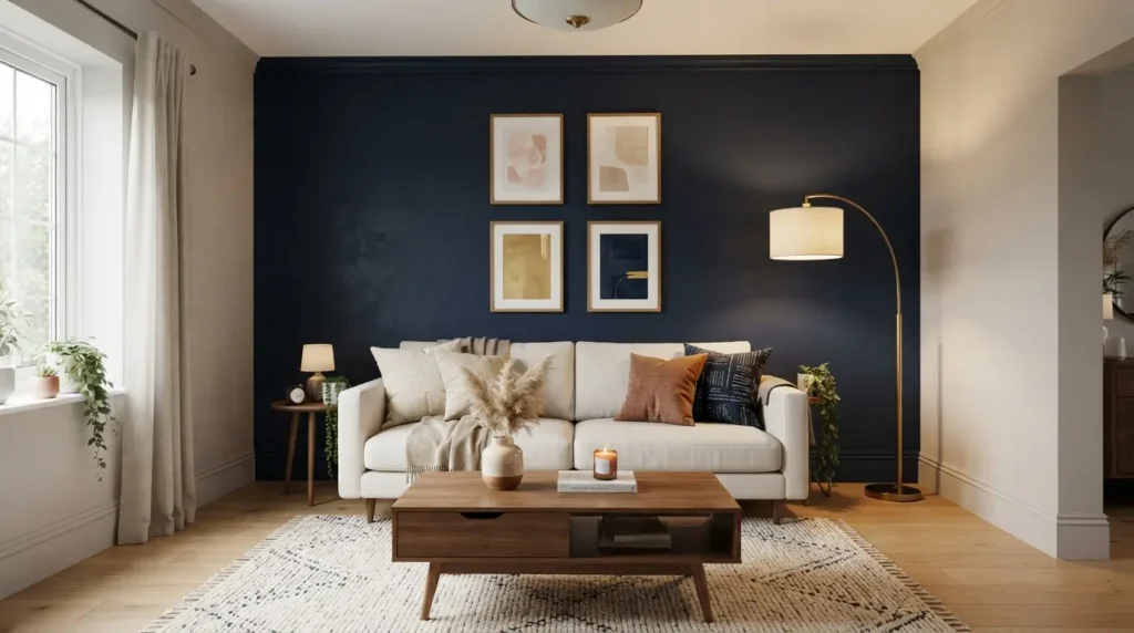
If a full room in navy feels like too big a leap, a single accent wall lets you test the colour’s effect without repainting everything. This is worth remembering if you’re hesitant: paint genuinely is one of the easier things in a home to change again, so a navy wall that doesn’t work out is a far smaller undertaking to reverse than most other design decisions. Choose the wall behind the bed in a bedroom, or behind a sofa in a living room, for a genuine focal point rather than a wall that gets partially hidden by furniture. Living with a genuine sample patch for a week or two before committing to the full wall is worth the small delay, since navy in particular can look noticeably different once it’s actually up compared with how it read on a small swatch card.
7. Navy Built-In Bookshelves or Panelling for Depth

Painting the back of built-in bookshelves, or a full run of panelling, in navy rather than a matching wall colour adds genuine depth and makes displayed books and objects stand out far more than they would against a flat white or neutral backdrop. This is a particularly effective way to introduce navy into a room without committing the whole wall to it, the surrounding wall stays lighter, and the navy does focused, contained work within the shelving or panelled section. It’s also one of the more forgiving ways to try the colour if you share the space with someone less convinced, the effect is genuinely striking, but it covers a fraction of the total wall area a full room would.
8. A Navy Staircase or Hallway With White Trim Contrast
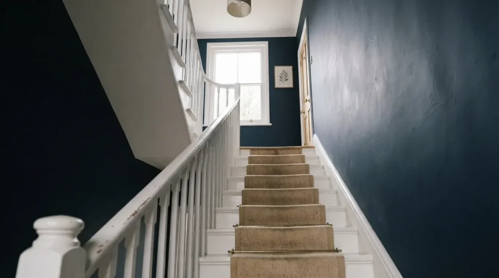
Navy walls paired with crisp white staircase spindles, skirting, and trim create a genuinely striking, classic combination in an entryway or stairwell, a space that’s typically seen only in passing rather than lived in for hours, which makes it a good candidate for a bolder colour choice than you might commit to in a main living space. The white trim keeps the architectural detail of the staircase legible against the dark wall rather than letting it disappear into the colour. A stairwell also tends to get more general wear from hands, bags, and pushchairs brushing past than a typical wall, so a wipeable, more durable finish on the lower portion is worth considering even if the rest of the wall stays matt.
9. Navy in a Powder Room or Small Cloakroom
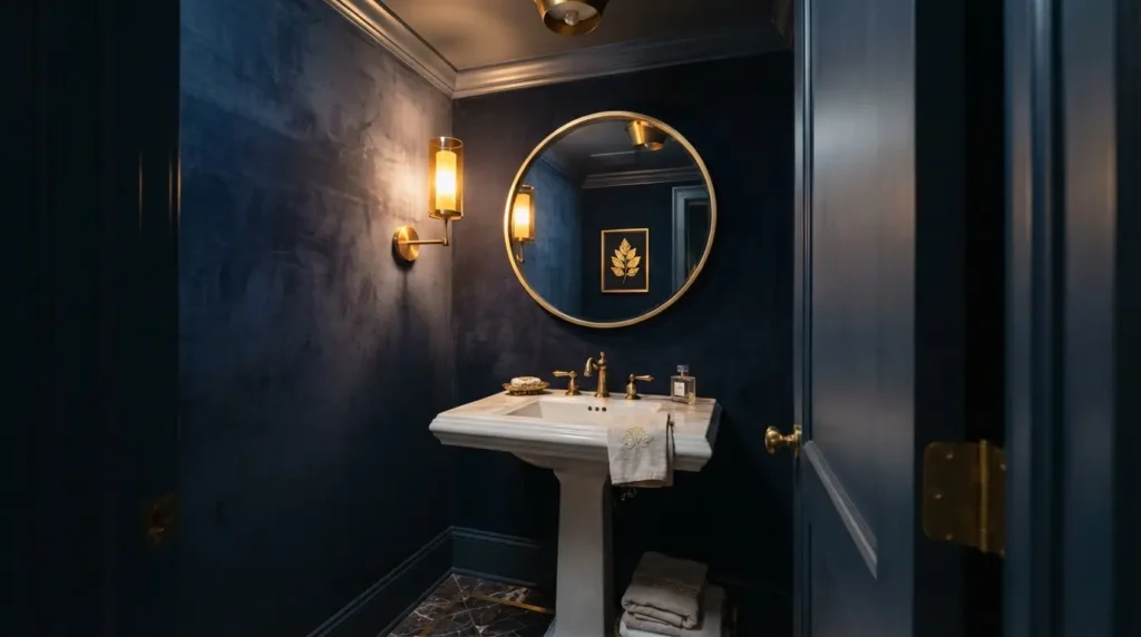
A small, enclosed room like a downstairs cloakroom is one of the most forgiving places in the house to go genuinely bold, since the limited scale means even a very dark, saturated colour doesn’t overwhelm the way it might in an open-plan living space. Navy in a powder room reads as luxurious and considered rather than cramped, particularly paired with a statement mirror or brass fittings that catch what light the room does get. Because a cloakroom often has little or no natural light of its own, good artificial lighting matters more here than almost anywhere else on this list, a single dim overhead bulb will make navy read flat and heavy, while a well-placed mirror light or wall sconce brings out the depth the colour is actually capable of.
10. Check Your Light and Finish Before Committing to a Full Room
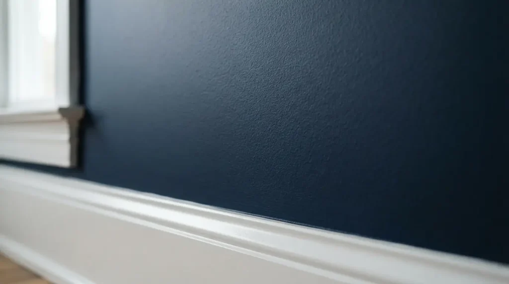
This is the detail every purely visual navy roundup skips, and it decides how the colour actually performs once it’s on the wall. A room with genuinely good natural light handles a dark navy far better than a north-facing or naturally dim room, where the same colour can read flatter and heavier than it did on the swatch. Painting over a much paler existing colour typically needs more coats than a straightforward repaint in a similar tone, budget for at least two full coats and possibly a third for genuinely even coverage, since a patchy dark colour is more visible and harder to touch up invisibly than a patchy pale one. On finish, a matt or soft matt generally suits navy walls best, giving a rich, non-reflective depth, while a slight sheen on trim and woodwork picks up light in a way that keeps the room from feeling flat. A dark, low-sheen paint also tends to hide minor wall imperfections better than a pale, glossier one, a genuine practical upside worth knowing if the wall you’re painting isn’t perfectly smooth to begin with.
Final Thoughts
The best navy blue paint ideas treat the colour as a genuine design decision, matched to the room’s light, its finish, and how it’s actually used, not just a bold choice applied for drama’s sake. Start small with a door or an accent wall if you’re unsure, check your room’s natural light and budget for proper coverage if you’re going all in, and navy will earn its place as one of the more timeless, sophisticated choices in the house rather than a passing trend. Whichever surface or room you choose from this list, the same underlying principle holds: navy rewards a little extra planning around light and finish far more than most colours do, and that small effort is what separates a navy room that feels considered from one that just feels dark.
FAQs
Does navy blue paint need more coats to cover?
Often yes, particularly over a much paler existing colour. Budget for at least two full coats, sometimes three, for genuinely even coverage, since a patchy dark colour shows more than a patchy pale one.
What’s the best paint finish for navy blue?
A matt or soft matt finish generally suits navy walls best, giving a rich, non-reflective depth. A slight sheen on trim and woodwork helps pick up light and stops the room feeling flat.
Does navy blue go out of style?
Navy behaves more like a neutral than a fleeting trend colour, its popularity has stayed consistent rather than spiking and fading the way some bolder or more unusual shades do, which makes it a genuinely safer long-term choice than many bold colours. It also ages well against changing trends in flooring, cabinetry, and hardware finishes, since navy pairs readily with warm and cool tones alike rather than locking you into one specific supporting palette.
Can navy blue work in a small room?
Yes, and small, enclosed spaces like a cloakroom or powder room are actually some of the most forgiving places to use it, since the limited scale means the depth of colour reads as considered rather than overwhelming.
What colour trim goes best with navy walls?
Crisp white is the classic, reliable pairing, giving strong contrast and keeping architectural detail like skirting and staircase spindles clearly legible. A warmer off-white softens the contrast slightly if stark white feels too clinical for the room.