Bedroom Paint Colour Ideas for Every Style

Bedroom paint colour ideas work differently to any other room in the house, since a bedroom is the one space you see almost exclusively in dim evening light and soft morning light, rarely full daylight. The 15 ideas below cover the shades and combinations worth considering, along with the one practical step most colour guides skip: testing a colour in the actual lighting you’ll be falling asleep and waking up under.
1. Soft Sage Green for an Easy, Universal Calm

Sage remains one of the safest, most consistently calming choices for a bedroom, reading as close to a neutral while still bringing a genuine connection to nature into the room. It works with wood, brass, and white without a fight, and it’s forgiving of most lighting conditions, making it a sensible starting point if you’re not certain which direction to take the room in. Because it sits so close to neutral, it’s also one of the easiest colours here to build a scheme around gradually, adding bolder accent colours through cushions or a headboard later without ever needing to repaint the walls first.
2. Warm Greige as a Safe, Adaptable Backdrop

A soft greige, somewhere between grey and beige, gives a bedroom a genuinely flexible backdrop that reads warm in some light and cooler in other light, without ever tipping fully into either. This is a particularly strong choice if your bedding or furniture is already a strong colour or pattern, since a greige wall lets those pieces do the visual work rather than competing with them.
3. Dusty Blue or Teal for a Restful, Nature-Led Feel
Blue is consistently one of the most recommended bedroom colours, and a dustier, muted blue or teal avoids the slightly cold, clinical feel a brighter sky blue can bring. It suits both modern and traditional bedrooms, and it pairs easily with white, wood, and brass fittings without needing a complicated supporting palette.
4. Deep Navy for a Cocooning, Luxurious Night Feel

A confidently dark navy wall makes a genuine style statement and suits a bedroom particularly well, since the room is used mostly at night anyway, when a darker colour reads as enveloping rather than heavy. Pair it with warm wood tones and brass or gold accents to stop the room feeling cold, and keep bedding and soft furnishings in lighter tones to balance the depth of the wall colour. Because navy is such a strong, defining choice, it’s worth living with a sample patch for at least a few nights before committing, since a colour this confident is one of the more expensive and time-consuming to change again if it turns out darker or moodier than you expected once it’s covering every wall.
5. Warm Taupe for a Genuine Cocoon Effect
Taupe, particularly a version with a slight warm or purple undertone rather than a flat grey-brown, creates a genuinely wrapped-up, cocoon-like feeling that suits a bedroom’s purpose better than almost any other neutral. It’s an easy colour to build a scheme around, since it pairs naturally with both warm and cool accent colours without ever feeling like the wrong choice underneath them.
6. Soft Blush Pink Paired With a Deep Contrast Colour

Pink in a bedroom works far better as a considered, grown-up choice than people expect, provided it’s paired deliberately rather than left to stand alone against more neutrals. A cooler-leaning, softer pink avoids reading as sweet or juvenile, and pairing it with a genuinely deep, saturated colour elsewhere in the room, navy, black, or a rich terracotta, keeps the scheme feeling sophisticated rather than one-note. Avoid pairing pink with another soft neutral as the only supporting colour, without that contrast, even a genuinely sophisticated pink can start to feel flat or overly sweet, the depth needs to come from somewhere in the room.
7. Forest Green for a Grounded, Retreat-Like Mood
A deeper forest green brings the same calming, nature-led quality as sage but with considerably more depth and drama, suiting a bedroom meant to feel like a genuine escape from the rest of the house. It works particularly well in a room with good natural light during the day, since the depth of colour that feels enveloping at night doesn’t tip into feeling gloomy come morning.
8. Warm Terracotta or Clay for an Earthy, Enveloping Feel
Terracotta and warm clay tones bring genuine warmth into a bedroom without needing a bright or saturated colour to do it, and they pair naturally with linen, wood, and rattan textures. This is a confident choice worth testing carefully, since terracotta shifts noticeably between daylight and warm artificial lighting, exactly the kind of colour that benefits most from being checked under your actual bedside lamp before committing to a full wall. It also tends to pair better with warm metal finishes, brass or aged bronze rather than chrome or nickel, since a cooler metal tone can fight against the warmth the colour is trying to create.
9. Charcoal or Soft Black for a Genuine Night-Time Retreat

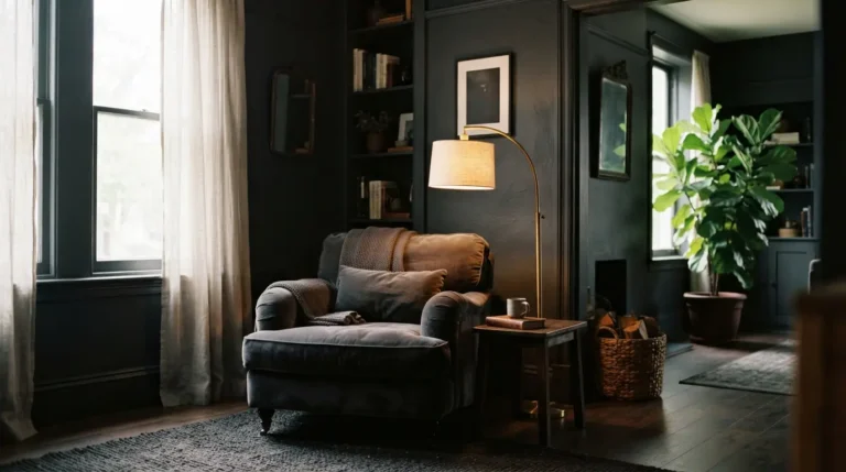
A charcoal or soft black wall is one of the boldest choices on this list, and it genuinely suits a bedroom’s role as the room used mainly after dark, an intensity that would feel oppressive in an all-day living space reads as intimate and enveloping once the lights are low. Balance it with pale bedding, warm wood furniture, and layered lighting rather than overhead light alone, so the room doesn’t feel like a single flat block of colour. A charcoal or black wall also shows dust and marks less readily than a very pale colour does, a small but genuine practical upside on top of the mood it creates.
10. Blue-Green for a Colour That Genuinely Shifts With the Light
Some blue-green, teal-grey shades genuinely change character through the day, reading more green in bright daylight and more blue in dimmer evening light. This isn’t a flaw to avoid, it’s a feature worth choosing deliberately if you want a bedroom that feels different, and interesting, at different times rather than one flat, unchanging colour regardless of when you’re in the room.
11. Warm Cream or Off-White for a Bright, Timeless Base

A warm cream rather than a stark, cool white keeps a bedroom feeling bright and airy without the slightly clinical edge pure white can bring, especially under warm bedside lighting in the evening. It’s one of the most flexible, resale-friendly choices here, and it’s easy to update the room’s mood later through bedding and accessories rather than repainting.
12. A Tonal Colour Scheme Within One Hue for Depth
Rather than pairing your wall colour with a completely different accent, using varying shades of the same colour, a pale grey-blue wall with deeper blue bedding and textiles, for instance, gives a bedroom real depth without introducing a second colour family to balance. This is a genuinely calming approach, since the eye isn’t asked to reconcile two different hues, just different intensities of the same one. It’s also a forgiving way to buy accessories over time, since anything in a similar hue family will slot into the scheme naturally, rather than needing to be matched precisely to one specific accent shade.
13. Grey and Cream Combined for a Layered Neutral Scheme

Pairing soft grey walls with cream furnishings, or the reverse, gives a bedroom a cosy, layered neutral scheme that suits both traditional and contemporary properties. This combination is worth considering specifically if you want a calming, resale-friendly room that still feels considered rather than plain, since the two neutrals genuinely read as different tones against each other rather than blending into one flat colour. Test both shades together before committing, since a grey and cream that look distinct on individual swatches can sometimes read as too close in tone once they’re actually side by side on real walls and furnishings.
14. Choose the Right Finish for Walls, Trim, and a Child’s Room
Matt finish suits bedroom walls well, giving a soft, non-reflective look that hides minor surface imperfections better than a shinier finish would. Woodwork, skirting boards, and trim generally take a silk, satinwood, or eggshell finish better, giving a slight sheen that’s easier to wipe clean than matt on high-contact areas. If the room belongs to a child, a washable, tough matt formulation designed to withstand pens, crayons, and general wear is worth the small extra cost over standard matt, since it saves a full repaint the first time the walls become an accidental canvas. Ceilings almost always suit a matt or flat finish regardless of what you choose for the walls, a slight sheen overhead tends to highlight every imperfection in a way it simply doesn’t on a vertical wall surface.
15. Test Every Colour in Your Bedroom’s Actual Evening Light

This is the step every purely visual bedroom colour guide skips, and it’s the one that matters most in this specific room. A bedroom gets seen mostly in dim evening light and soft morning light, not the bright daylight most paint testers and colour swatches are viewed in, so a shade that looks perfect on a chip under a shop’s lighting can read completely differently once it’s on your wall under a bedside lamp at night. Paint a genuine sample patch and check it specifically in the evening, under whatever lighting you’ll actually be using, before committing to a full room, this single check prevents more repainting regret than any other single piece of bedroom colour advice. Check the same patch again first thing in the morning too if you can, a colour that reads beautifully under a warm bedside lamp at night should still feel right in the flatter, cooler light of early morning, since you’ll be seeing it in both.
Final Thoughts
The best bedroom paint colour ideas balance genuine mood and style with the one detail most guides skip: how the colour actually reads in the evening light you’ll spend most time under. Choose the shade and combination that suits your style, test it properly at night before committing to the whole room, and the colour will still feel right long after the first coat has dried.
FAQs
What is the most calming colour for a bedroom?
Sage green, soft blue, and warm taupe are consistently among the most calming, forgiving choices, working in most lighting conditions and pairing easily with natural materials like wood and linen.
Should a bedroom be a light or dark colour?
Either can work well, since a bedroom is used mainly at night, when darker, more enveloping colours read as cosy rather than heavy. Lighter colours suit a room that also gets significant daytime use or lacks strong natural light.
What paint finish is best for bedroom walls?
A matt finish generally suits bedroom walls best, giving a soft, non-reflective look and hiding minor imperfections. Woodwork and trim usually take a slight sheen, silk, satinwood, or eggshell, better than matt.
Does bedroom colour affect sleep quality?
Colour itself doesn’t directly cause better or worse sleep, but a calming, considered scheme genuinely supports the mood of the room, and testing your chosen colour in evening light specifically helps avoid a shade that feels wrong once you’re actually using the room to unwind.
Can pink work in an adult bedroom?
Yes, provided it’s a considered, cooler-leaning shade paired with a genuinely deep contrast colour elsewhere in the room, navy, black, or terracotta, rather than left to sit alone against more neutrals, which is what tends to read as overly sweet or juvenile.