How to Choose the Right Paint Colour for Your Living Room

Choosing the right paint colour for your living room comes down to three things: the light the room gets, the mood you want, and the fixed elements you cannot change, such as flooring or a fireplace. Narrow your shortlist with those, then test large samples for about a week before you commit.
Most people pick from a tiny swatch under shop lighting, then watch it turn into a different colour on their own wall. If you are unsure how to choose paint colour from hundreds of options, the fix is a repeatable process rather than better taste.
How Does Light Change a Paint Colour?
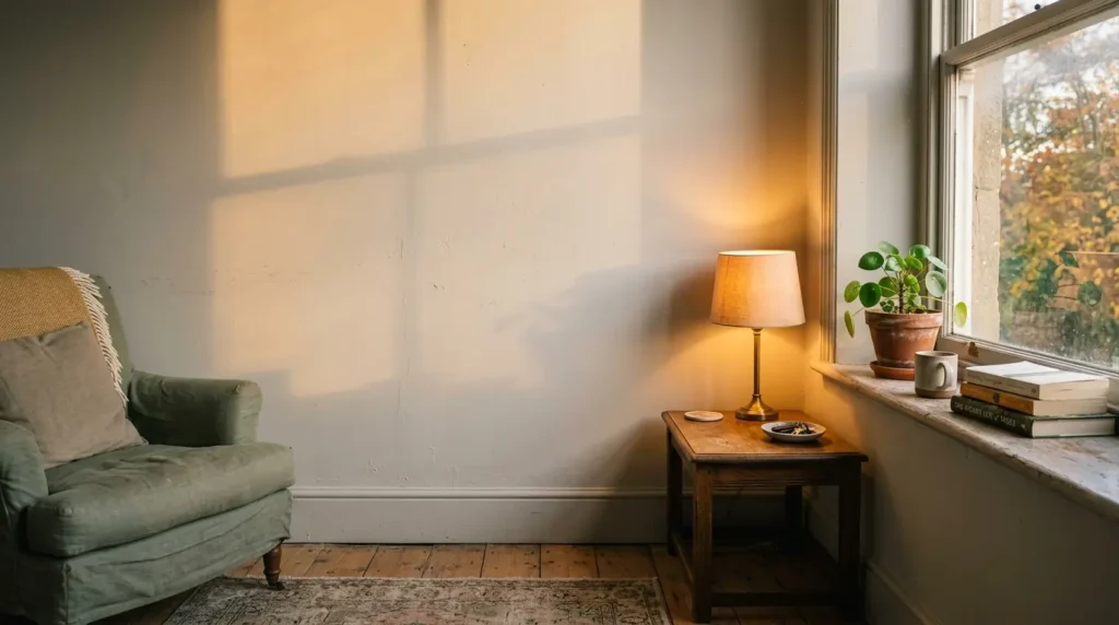
Light changes everything about a paint colour. Natural light shifts through the day, and bulbs add their own warm or cool cast, so one shade can look creamy at noon and grey by evening. Judge a colour in your own room, at several times of day, never from a swatch alone.
Which way your windows face matters most. The table below assumes the northern hemisphere, so flip north and south if you live in the southern one.
| Window aspect | Typical light | What tends to work |
| North-facing | Cool, flat, slightly blue | Warm neutrals, earthy tones, soft creams. Cool greys can turn dull and gloomy |
| South-facing | Warm, bright, strong | Almost anything, including cooler blues and greens that might feel chilly elsewhere |
| East-facing | Warm and bright in the morning, cooler later | Colours you want to look good early in the day, such as soft yellows and fresh neutrals |
| West-facing | Dim in the morning, golden in the evening | Colours that stay calm in orange evening light, as reds and warm pinks can intensify |
Your light bulbs count too. Warm white bulbs push paint towards yellow, while cooler bulbs can flatten warm colours. A good rule of thumb is to test under the bulbs you actually use in the evening.
Many paint ranges also publish a Light Reflectance Value, or LRV, on a scale from 0 (black) to 100 (white). A low number means the colour absorbs more light. That is worth checking before you put a deep shade in a dim room.
Deep colours do look magical in the evening, but they can feel heavy in a gloomy room used mostly by day. They suit living rooms where the real action happens after dark.
What Mood Do You Want the Room to Have?
Decide the mood first, because it narrows the colour family quickly. Soft neutrals and muted greens calm a room, deep blues and browns wrap around you, and warm yellows lift the energy. Match the mood to when you use the room most, whether that is daytime family life or evening unwinding.
Pale shades tend to make a room feel larger, while darker shades create a cocooning effect. Painting walls and woodwork in one colour, often called colour drenching, makes a room feel enveloping and edgeless.
Designers have also been moving away from cool, grey-based neutrals towards warmer, earthy ones, so a living room painted in clinical grey can look dated faster than you would expect.
Bright white walls are often recommended for enlarging a space. In practice, pure white in a poorly lit room can read cold and flat. A softened white or pale warm neutral usually looks bigger and kinder.
Feature walls need one honest check. An accent wall works when there is a natural focal point, like a chimney breast, and tends to look random on a wall with no reason to be special.
How Do You Read a Paint’s Undertone?
Undertone is the faint hue hiding beneath a colour, such as pink, green, yellow or blue inside a neutral. Hold swatches against pure white paper and against each other. The undertone shows up in that comparison, and it decides whether the colour clashes with your floor and furniture.
This is where most “mystery” colour failures come from. A grey with a violet undertone turns lilac next to a green sofa. A beige with a pink undertone can look salmon against honey-toned oak.
Neutrals with a balanced mix of pigments are the most forgiving. They sit comfortably in most rooms without looking too warm or too cool. If you are choosing living room paint for a room with mixed woods, metals and fabrics, this is the safest route.
Which Fixed Elements Should You Work Around?
Start from what stays: flooring, fireplace, any kitchen units visible from the living room, and a sofa you are keeping. Pick a paint that sits comfortably with their undertones. Treat the sofa as a partner, not a match, because a tonal or contrasting pairing looks more designed than an exact copy.
Open-plan layouts need extra thought. Where one space flows into another, tones of similar intensity look connected, while a sudden jump in strength can look jarring.
Carrying the wall colour over skirting boards and chair rails can add a sense of height and softness. The trade-off is wear. Skirting takes knocks from vacuums and shoes, so use a tougher finish there rather than the same flat paint as the walls.
How Do You Test Paint Samples Properly?

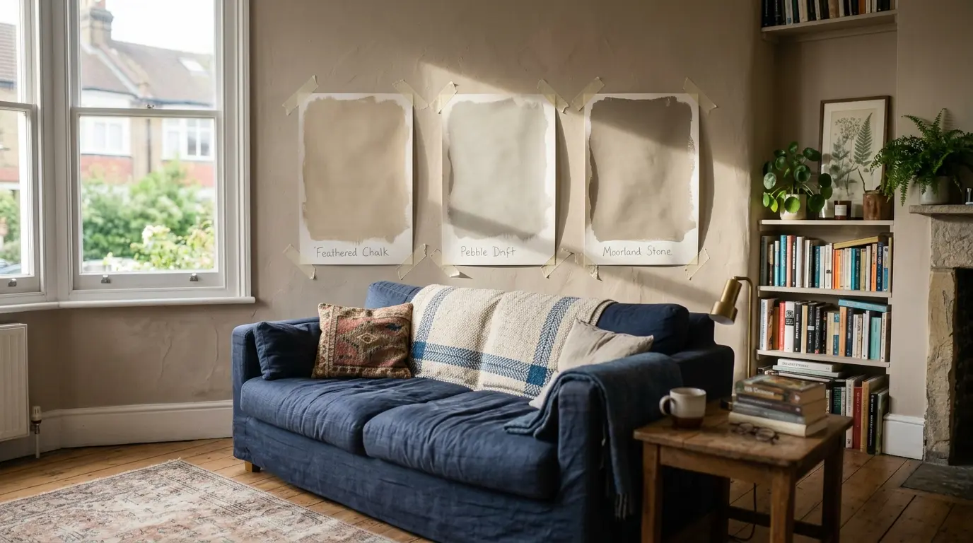
Paint large swatches, at least A3 size, on lining paper or board, and move them around the room. Check them in the morning, at midday and in the evening, beside the floor and curtains and under your lamps. Give it five to seven days. If a colour still looks right on day seven, it is a strong candidate.
- Shortlist no more than three colours. More than that and you will start comparing differences too small to matter.
- Buy sample pots, which are usually small tester tins of about 100ml, for each one.
- Apply two coats to your boards, leaving a white border around each patch.
- Tape the boards to at least two different walls, including the darkest corner.
- Look at them at three times of day and at night, then eliminate anything that turns muddy, too pink, or too cold.
Painting small patches straight onto the existing wall is less reliable, because the old colour shifts how the new one reads.
Which Finish, Ceiling and Trim Colour Should You Use?
Flat or matt emulsion suits living room walls because it hides imperfections and looks rich. Use a tougher eggshell or satin on woodwork, where it wipes clean. For the ceiling, a lighter tint of the wall colour feels calm, while a contrasting ceiling adds drama.
Maintenance is where the finish choice shows. Standard matt marks easily, especially near sofas, light switches and door frames, so a washable or scrubbable matt is a better call for family homes. Deep colours in flat finishes show scuffs and dust, and touching them up often leaves a visible patch unless you repaint the whole wall.
How Much Does It Cost and How Long Does It Take?
For an average living room, expect roughly £60 to £200 in paint and supplies if you do it yourself, or around £250 to £700 in labour if you hire a decorator. Allow about a week for testing, then two to four days for painting. These are approximate figures and vary a lot by country.
| Item | Approximate cost (GBP) | Typical timeline |
| Sample pots (three colours) | £10 to £25 | 5 to 7 days of testing |
| Paint for a medium room, two coats (about 5 to 6 litres) | £40 to £150 | Dry 2 to 4 hours between coats |
| Filler, masking tape, rollers, brushes | £20 to £60 | 1 day of prep |
| Extra coat for dark or dramatic colours | £20 to £50 | Add half a day |
| Professional decorator (labour only) | £250 to £700 | 2 to 4 days |
| Full paint cure before scrubbing | No cost | Often 2 to 4 weeks |
Going from a dark colour to a pale one usually needs a primer or an extra coat, so budget for that if you are making a big change.
What Mistakes Do People Make When Picking Paint Colour?
The most common mistakes are choosing from a tiny swatch, testing only once, ignoring undertones, and copying a showroom photo taken in totally different light. Each is avoidable with large samples, repeat checks, and a colour that suits your room’s aspect rather than someone else’s.
Some warnings worth repeating:
- Dark walls tend to look great in photos shot in perfect light. In a north-facing room with one window at 4pm, they can go flat and heavy.
- Very bright or trendy shades date faster than quiet, muted ones.
- Painting before the flooring and soft furnishings are chosen often means repainting later.
- Skipping prep, such as filling cracks and sanding, shows through especially on deeper colours and higher sheens.
Conclusion
To choose the right paint colour for your living room, start with your light, then pick a mood, check undertones against what stays, and test large samples for a week. Treat this paint colour guide as a filter, not a rulebook. Picking paint colour well is mostly patience, and a week of testing costs far less than repainting.
FAQs
What is the most popular colour for a living room?
Neutrals are the safest and most common choice, usually soft greys, beiges and creams, because they work with many furnishings. Warm, earthy versions currently feel fresher than cool greys. Muted greens are a popular alternative that pairs well with wood and art.
What is the most relaxing colour for a living room?
Soft blues and muted greens are widely seen as the most calming, along with gentle warm neutrals. Keep the saturation low, since very bright versions of any colour feel energetic rather than restful.
Should living room walls match the furniture?
No. Matching exactly tends to look flat. Aim for a tonal or complementary relationship instead, such as a warm cream wall with a deeper navy sofa, so the furniture still stands out.
What colour works best in a north-facing living room?
Warm neutrals and earthy tones counter the cooler light. Avoid cool greys and icy whites, which can look flat. If you love a deep shade, test it carefully, since it will read darker here than on the swatch.
Can dark colours work in a small living room?
Yes, if you commit. A small room painted deep on walls and woodwork feels cocooning rather than cramped. The risk is a half-hearted dark colour on only one wall, which can make the room look smaller and chopped up.
How many colours should I use in a living room?
Two or three is a good rule of thumb: a main wall colour, a secondary tone for trim or ceiling, and a small accent. A common guide is roughly 60 per cent main colour, 30 per cent secondary and 10 per cent accent.
How many coats of paint does a living room need?
Two coats is typical. Dark colours, strong changes in shade, or bare plaster may need a third coat or a primer, so buy a little extra to avoid running short.
Should I paint the ceiling the same colour as the walls?
It can work well in small or dark rooms, where one colour creates a wrapped look. In bright rooms, a lighter tint on the ceiling keeps things airy.