15 Dining Room Colour Ideas to Create the Perfect Atmosphere

Dining room colour ideas work best when they’re chosen for how the room is actually used, not just how it photographs. A dining room gets short, intense bursts of use, often in the evening, often with candles or a pendant light doing the heavy lifting, and that changes what actually works on the walls. Fifteen years of specifying colour schemes has taught me that most people either play it too safe with a beige they don’t love, or go bold without thinking about how the room actually behaves once the sun goes down.
Below are fifteen genuinely different directions for a dining room colour scheme, covering both the colour itself and the techniques that make a colour choice actually work in a room built for hosting.
1. Warm Terracotta and Sand Neutrals
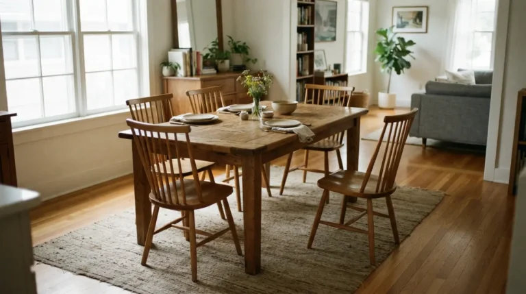
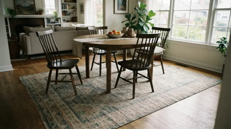
Beige has an unfair reputation for being boring, but a good warm neutral, whether that’s a golden tan, a khaki with grey undertones, or a putty with a faint green cast, does something a lot of bolder colours can’t: it works with almost any wood tone, flooring or artwork you already own. A golden tan with honey-orange undertones is particularly good if you have hardwood floors or wooden dining furniture you want to bring forward rather than compete with.
The trade-off is that this direction relies more heavily on texture and accessories to feel finished. A flat beige room with nothing else going on will read as unfinished rather than calm, so pair it with warm and earthy accents such as terracotta, tan or soft green in the seat fabric or table linen to give it depth.
2. Rosy Pink for a Flattering Glow
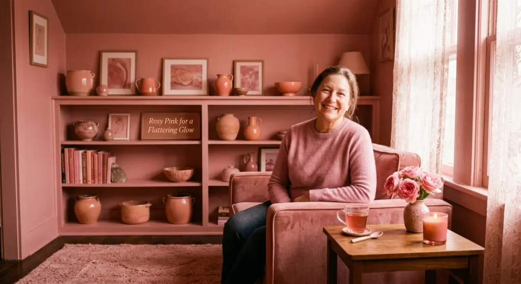
A warm, rosy pink is one of the more underrated dining room colour ideas, and the reasoning behind it is genuinely practical rather than just aesthetic: pink reflects warmly off skin tone, so people around the table tend to look better lit under it than they do under a cooler colour. It also has a naturally calming effect rather than the childish or overly sweet connotation it sometimes gets tarred with.
This works particularly well against wood furniture, which grounds the pink and stops it feeling too soft. If you’re nervous about committing to pink on all four walls, introducing it through wallpaper on a single wall or through table linen and lampshades gives you the same warmth without the full commitment.
3. Deep Teal for Drama and Depth
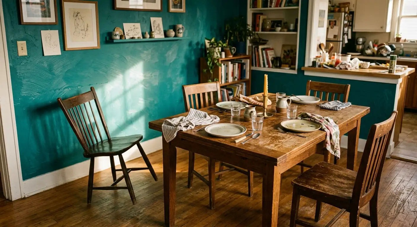
Teal sits between blue and green, and it’s one of the few colours genuinely capable of doing two jobs at once: it reads as bold and jewel-toned in artificial light, and it has a real, physical effect on how a room feels, since darker colours make a space feel like it recedes rather than closes in. This is why teal, along with other dark jewel tones, is repeatedly recommended for small dining rooms specifically, not despite their size but because of it.
If you’ve got unusually high ceilings and want the room to feel cosier, painting the ceiling in the same deep teal as the walls (rather than leaving it white) pulls the height down and makes the room feel more intimate. Pair teal with natural fibres, brass and lighter blues to stop it feeling too heavy.
4. Zesty Orange to Spark Conversation

Orange is the colour most likely to divide opinion in the room, but it earns its place here because of what it actually does at a dinner table: it’s associated with stimulating appetite, activity and conversation, which is fairly close to the entire point of a dining room. It works best in its more muted, tangerine-adjacent forms rather than pure fire-engine orange, and it pairs surprisingly well with grey, turquoise or blue as a counterbalance.
A common mistake with orange is going too saturated on all four walls in a room with little natural light, where it can start to feel oppressive rather than energising. If you’re unsure, test it on the wall that gets the least daylight first, since orange tends to hold up better under warm artificial lighting than you’d expect.
5. Classic Blue for Timeless Elegance
Blue is possibly the single most reliable entry on this list, largely because it spans such a wide range without ever feeling wrong. A strong, dark blue such as a petrol-toned navy pairs beautifully with white trim and wood furniture, and it’s a genuinely good pick for a dining room that has to multitask as a home office or study during the day, since it reads as focused rather than purely decorative.
If you want the drama of a dark navy without it tipping into gloomy, paint the ceiling and any dado rail or skirting board in white. This keeps the room feeling fresh during the day while letting the lower half of the walls go properly dark, and it’s at night, with candlelight, that a dark blue dining room genuinely comes into its own.
6. Green That Brings the Outdoors In
Green is one of the most versatile dining room colour scheme options because of how many undertones it comes in. A cooler, bluish celery green feels soft and sophisticated, particularly if your dining room looks out onto a garden, while a warmer, more mustard-adjacent green leans rustic and cosy. Green also has a genuine restorative quality that makes it a strong choice for a room where people are meant to linger.
If a full green room feels like too much of a leap, painting just a band of colour above a picture rail (or at picture rail height if you don’t have one) keeps the light-reflecting benefit of white walls below while still injecting real colour into the room. Add black accents in furniture or lighting to stop this softer approach feeling washed out.
7. Red as a Bold Statement
A fully red dining room is genuinely intense, and most people, myself included, would suggest treating red as an accent rather than an all-over colour unless you’re confident you love it. Red is associated with stimulating both appetite and conversation, so even a smaller dose, whether that’s a red chandelier, a set of red dining chairs, or a red rug, brings real energy to the room without the commitment of four red walls.
If you do want red on the walls, going one or two shades darker than the boldest option on the paint chart softens the effect considerably while keeping the warmth. Dimmable wall lights and a few well-placed candles do a lot of work here too, since red genuinely changes character between daylight and warm evening lighting.
8. Sophisticated Grey, Light or Dark
Grey has become the default “safe but not boring” neutral, and it earns that reputation because it pairs with almost everything, doubling as a backdrop for light artwork or a base for darker accessories. But grey doesn’t have to mean playing it safe. Deeper, more saturated shades create real drama and a genuine cocooning effect in a small dining room, which is a direction worth considering if you want depth without introducing an obvious colour.
Layering different tones of grey, a darker wall with paler grey furniture and near-white trim, gives you contrast and depth without the room ever feeling flat, and it’s one of the easier schemes to accessorise since almost anything, from warm wood to cool metal, sits comfortably against it.
9. All-Over White or Warm White
White gets dismissed as unadventurous, but a genuinely warm white, rather than a stark, clinical brilliant white, gives you a classic look that won’t date and works particularly well in a room with limited natural light, where a darker colour risks feeling gloomy rather than atmospheric. Keeping the whole room white, including furniture and accessories, also works well in small dining rooms specifically, since the lack of contrast keeps the space feeling open.
The honest trade-off with an all-white scheme is that it relies entirely on texture and a few well-chosen accessories to avoid feeling sterile. A splash of natural colour through shells, glassware or a single piece of art keeps it from tipping into feeling like a blank canvas rather than a finished room.
10. Two-Tone Colour to Protect Busy Walls
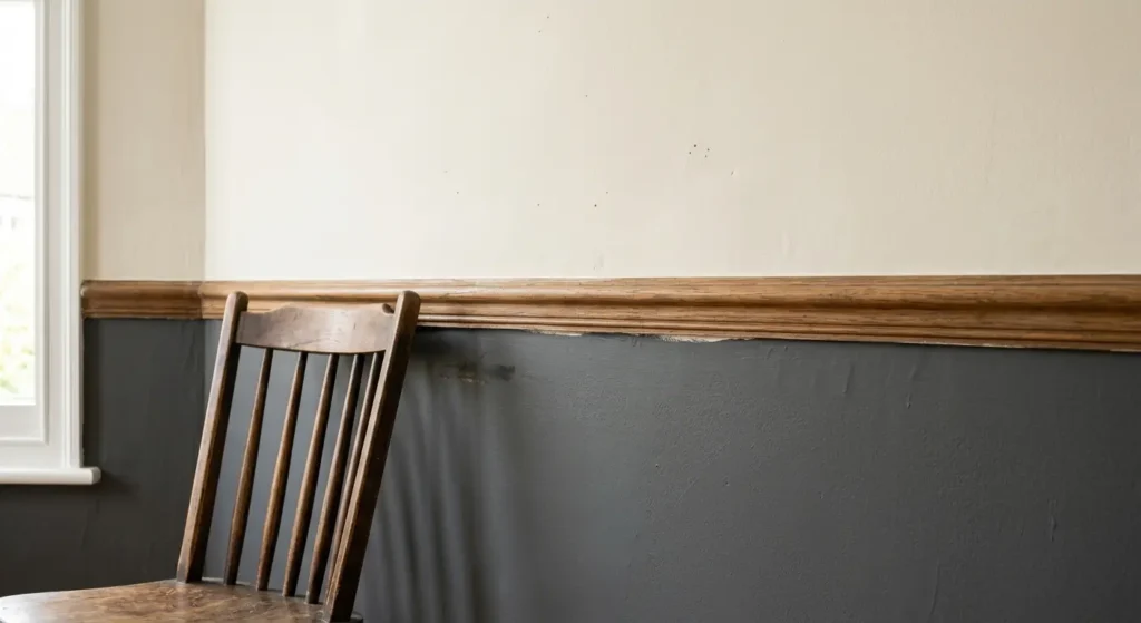
Painting the lower half of the wall (roughly to dado rail height) in a stronger, darker colour and the upper half in a lighter neutral is one of the more practical dining room colour ideas on this list, not just a stylistic one. Dining rooms see more contact with walls than most rooms, whether that’s chairs being pushed back, coats brushing past, or the occasional spill, and a darker lower half genuinely hides marks and scuffs better than an all-light wall does.
This is a genuine weekend project for most people rather than a full redecoration, and using a good quality masking tape designed to give a clean line, rather than standard tape, is worth the extra cost given how visible a wobbly line is at eye level in a room people sit and stare at for an hour at a time.
11. A Painted Ceiling as the Fifth Wall
Painting the ceiling in a bold colour, whether that matches the walls or contrasts with them, is one of the more dramatic and often overlooked dining room colour ideas. A sunny yellow ceiling in a breakfast room genuinely changes how the whole space feels first thing in the morning, and colour on the ceiling draws the eye upward, which creates the illusion of extra height in a room with a lower ceiling.
If you’re nervous about a fully coloured ceiling, painting just the coving or a border around the top of the wall in an accent colour gives a similar height-boosting effect with a much smaller area to commit to.
12. Colour Drenching for a Cocooning Effect
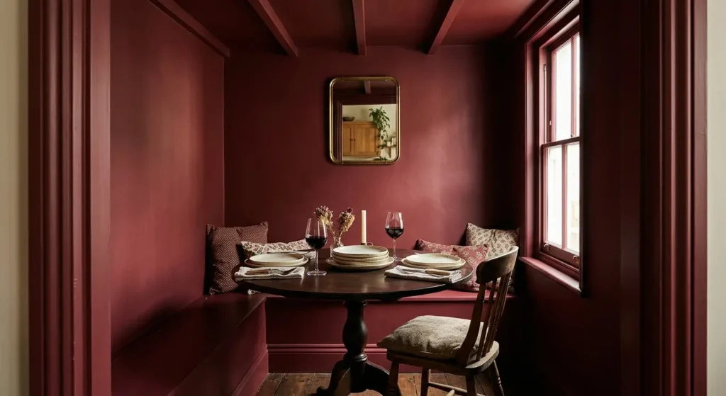
Colour drenching, painting walls, ceiling, woodwork and trim all in the same shade, is the technique behind most of the truly dramatic dark dining rooms you’ll see in magazines, and it works precisely because it removes the contrast lines that usually break a room up visually. This is genuinely one of the better approaches for a small dining room specifically, since a single enveloping colour reads as deliberately cosy rather than cramped, which is the opposite of what most people assume dark colour does to a small space.
Budget for more paint and more time than a standard repaint if you’re drenching a room, since covering woodwork and trim properly, especially if you’re going from white to a saturated dark colour, typically needs a specialist undercoat and at least two full coats to avoid patchiness.
13. Ombre for a Handmade, Graduated Look
An ombre effect, graduating a colour from dark at skirting board level up to pale near the ceiling, is a genuinely striking dining room colour scheme, particularly in a large room where there’s enough wall height to let the transition breathe. In a room with a lower ceiling, the same technique can work in reverse, since the lightening effect toward the top gives an impression of extra height.
This is a technique worth practising on a spare board or an inconspicuous section of wall first. Getting the gradient smooth and the brushwork consistent takes a bit of trial and error, and rushing it on the actual wall is the single most common way this idea goes wrong.
14. Stripes and Stencils for Pattern Without Wallpaper
If you love the idea of a patterned dining room but don’t want to commit to wallpaper, painted stripes or a stencilled motif deliver a similar visual effect for a fraction of the cost and with far more flexibility if you want to change it later. Wide stripes are considerably quicker to execute than narrow ones, and marking your lines carefully with a pencil and ruler before taping is worth the extra ten minutes, since a wobbly stripe is much harder to fix after painting than to prevent beforehand.
A simple stencil, such as a fern or leaf motif, works particularly well in a smaller dining room where a full wallpaper pattern might feel busy, and testing it in a pale, low-contrast colour combination first means any mistakes are far less visible than they would be in a bold, high-contrast palette.
15. Dark, Uniform Colour for Maximum Impact
Closing with the boldest option on this list: a single, dark, saturated colour taken across the entire room, walls, shelving and all, creates real drama and a genuine sense of occasion once the lights go down. The common misconception is that this only works in large, light-filled rooms, but the reality is more about light quality than room size. As long as the room gets a reasonable amount of natural or well-planned artificial light, a dark scheme will work its magic regardless of square footage.
| Colour Direction | Best Room Type | Effect Created |
| Warm neutrals (terracotta, sand) | Any size, especially wood-heavy rooms | Calm, effortless, easy to accessorise |
| Pink | Rooms used mainly for entertaining | Flattering light, warm and inviting |
| Teal or deep jewel tones | Small dining rooms | Cocooning, makes the room recede |
| Orange | Rooms with warm artificial lighting | Energetic, appetite-stimulating |
| Blue | Multitasking rooms (office/dining) | Timeless, calming, versatile |
| Green | Rooms with garden views | Restful, invigorating |
| Red (accent) | Any room wanting drama without full commitment | Bold, conversation-sparking |
| Grey (dark) | Small rooms wanting drama | Sophisticated, cocooning |
| Warm white | Rooms with limited natural light | Fresh, classic, won’t date |
| Colour drenched dark | Small or large rooms with decent lighting | Enveloping, dramatic, intimate |
Which colour should you avoid in a dining room?
Stark, clinical white with no warmth to it tends to feel uncomfortable to sit around in for a long meal, since it can read as cold rather than inviting. It’s also worth resisting the urge to use too many colours at once. A dining room built around two or three tones, layered through walls, furniture and accessories, tends to look far more considered and sophisticated than one where every surface is a different shade.
Does dark paint make a small dining room feel smaller?
Not necessarily, and it often does the opposite. Light quality matters more than room size when it comes to dark dining room colour ideas, and a dark scheme, particularly when the colour is taken across the whole room rather than left as a single feature wall, tends to create a cosy, cocooning effect rather than making a small space feel cramped.
What colour paint makes a dining room look bigger?
Light, reflective neutrals such as pale grey, tan or classic white bounce more light around a room, and choosing a finish with a slight sheen rather than a completely flat matt adds to that effect, since sheen reflects light more effectively than a chalky, matt finish does.
How much does it typically cost to repaint a dining room?
Costs vary a lot by country, room size and whether you’re doing the work yourself or hiring a decorator, but as a general guide, a standard-sized dining room repainted in a light to mid-tone colour with two coats is usually a straightforward weekend job for a confident DIYer, while darker or more saturated colours, and techniques like colour drenching or an ombre effect, typically need more paint and more time, since full coverage on a dark colour going over a lighter wall often needs three coats rather than two. Getting a couple of local quotes for your specific room size is the most reliable way to budget if you’re hiring help.
Conclusion
The best dining room colour ideas are rarely about chasing a single “correct” shade. They’re about matching the colour and the technique to how your room is actually lit, how big it is, and how it’s genuinely used, whether that’s nightly family dinners or occasional entertaining. Whether you land on a warm neutral that lets your furniture do the talking, a fully colour-drenched dark scheme, or a practical two-tone wall built to survive daily wear, the strongest dining room colour scheme is the one that still looks good once the candles are lit and the room is doing its actual job.