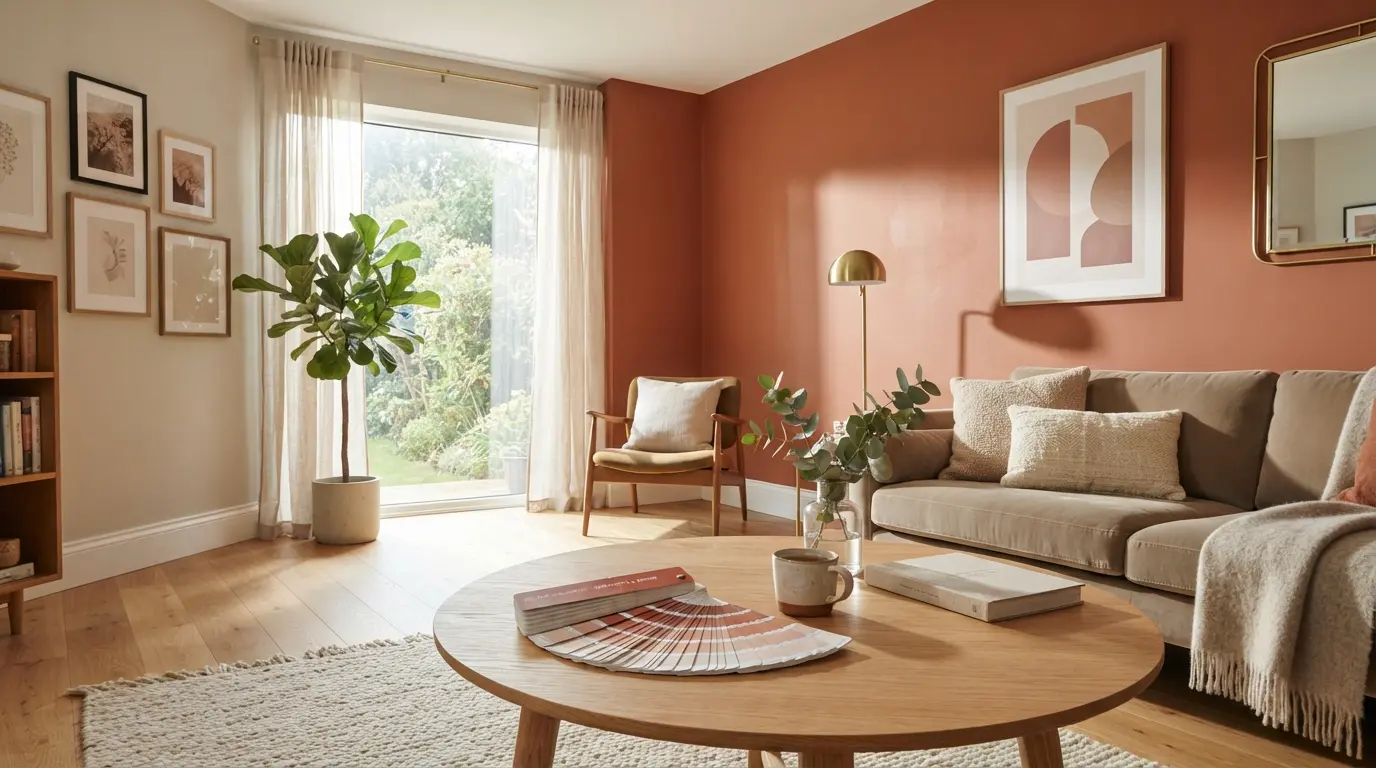
Paint & Colour Ideas: The Complete Guide to Choosing the Perfect Colour for Your Home

Colour is the single most powerful tool in interior design. It costs relatively little, requires no structural change, and can transform the atmosphere of a room more quickly and completely than any other intervention. A confident colour choice can make a small room feel larger, a dark room feel cosier, a plain room feel deeply personal, and a tired space feel entirely new.
Yet for many homeowners in the UK, choosing a paint colour is one of the most stressful decisions in a home project. The choice feels enormous, the consequences of getting it wrong feel expensive, and the paint chip in the shop looks completely different to the colour on the wall in real life.
This guide removes that anxiety. Whether you are choosing a first colour for a new home, refreshing a room, or considering your first venture into dark and bold paint, everything you need is here — from how colour actually works to the most popular shades in the UK right now, the paint brands worth knowing about, the finishes that suit each room, and the techniques that make a painted room look genuinely professional.
What Makes a Great Paint Colour Choice?
A great paint colour choice is one that works in your specific room, with your specific light, with your specific furniture — and that you will still love in five years. Trends come and go in interior design, and while keeping an eye on what is current is useful, the most confident interior choices are those made on the basis of what genuinely appeals rather than what currently appears most frequently on social media.
The factors that determine whether a colour works in a room are: the quantity and quality of natural light, the colour temperature of the artificial lighting, the size and proportion of the room, the existing furniture and floor colours, and the orientation of the room. A colour that looks beautiful in a south-facing room may look flat and cold in a north-facing one.
The most important advice in paint and colour is also the simplest: always test before you commit. Buy a tester pot, paint a patch of at least 30 centimetres square on two or three different walls, and observe it over at least 48 hours in both natural daylight and artificial evening light before making a final decision.
How to Choose the Right Paint Colour
Start with What You Already Have
The most effective starting point for choosing a paint colour is the furniture, flooring, and fabrics already in the room. Colours that reference something already present — picking up the green of a botanical print, the warmth of a timber floor, or the blue of an existing piece of artwork — are almost always safer and more successful than colours chosen in isolation.
Understand Paint Undertones
Every paint colour has an undertone — a secondary hue that influences how it reads in different lights. White paint may have undertones of pink, yellow, blue, or green. Grey may be warm (leaning towards yellow, brown, or red) or cool (leaning towards blue or purple). Understanding the undertone of a colour before you buy it is the key to avoiding the most common paint mistake: choosing a grey that turns blue on the wall, or a white that looks yellow under artificial light.
Warm undertones yellows, oranges, reds create a cosy, welcoming atmosphere. Cool undertones blues, greens, purples create a calm, restrained atmosphere. Matching the undertone of your paint to the undertone of your furniture, flooring, and fabrics creates coherence.
Use the 60-30-10 Rule
The 60-30-10 rule is one of the most reliable frameworks in interior colour planning. Sixty percent of the room typically the walls and ceiling is the dominant colour. Thirty percent furniture, large rugs, curtains is the secondary colour. Ten percent cushions, throws, accessories, artwork is the accent colour. The rule is not rigid, but it provides a structure that prevents any one colour from overwhelming the space.
Test in Different Lights
The same paint colour looks different at every hour of the day and under every light source. A warm sage green may look fresh and organic in morning daylight and rich and moody under warm artificial light in the evening. A cool blue-grey may look sophisticated in natural light and cold under downlights in the evening. Always test your paint in the actual room, observe it over 48 hours, and look at it under both natural and artificial light before committing to a full repaint.
The Most Popular Paint Colours in the UK
Grey Paint Ideas
Grey has been the dominant colour in British interiors for over a decade and continues to be the most widely chosen interior paint colour in the UK. The appeal of grey is its versatility — it works with warm and cool colour palettes, suits traditional and contemporary furniture, and provides a sophisticated neutral backdrop that allows other elements of the room to speak.
The key to a successful grey paint is choosing one with the right undertone. Warm greys Farrow and Ball’s Elephant’s Breath, Dulux’s Warm Pewter, Little Greene’s French Grey have yellow, brown, or green undertones and create a welcoming, nuanced neutral. Cool greys with blue or purple undertones can feel cold and institutional under artificial light, particularly in rooms with limited natural light.
White and Neutral Paint Ideas
White is the most misunderstood paint colour in the range. There is no universally good white there are hundreds of whites, each with a distinct undertone and character, and the right white for one room may look wrong in another. Pure, cool whites suit contemporary rooms with cool-toned furniture and good natural light. Warm, creamy whites suit traditional rooms with warm oak floors and period furniture.
Off-white, cream, and greige (a blend of grey and beige) are the most versatile of all neutral paint colours. They provide the warmth and approachability that pure white sometimes lacks while retaining the lightness and simplicity that makes neutral colours so liveable long-term.
Green Paint Ideas
Green is the most significant interior paint trend of the last five years in the UK and shows no signs of retreating. The appeal of green is its extraordinary range from the palest, most barely-there sage through to deep, jewel-like bottle green and forest and its connection to the natural world, which gives green-painted rooms a quality of calm and organic warmth that few other colours can match.
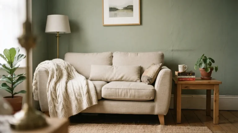
Sage green muted, greyed, and warm is the most widely used green in UK interiors right now. It works in every room of the house, suits both period and contemporary architecture, and is forgiving of different light conditions. Darker greens forest, bottle, deep teal work particularly well in rooms where a dramatic, intimate atmosphere is the goal.
Blue Paint Ideas
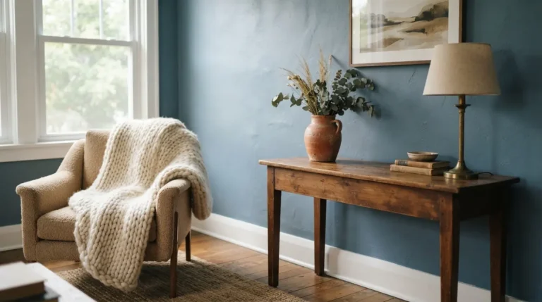
Blue is one of the most emotionally complex paint colours it can feel serene and calming in a soft powder blue, bold and confident in a deep navy, or warm and enveloping in a rich teal. In the UK, navy blue and deep blue-green have been among the most popular paint choices for kitchens, dining rooms, and bedrooms for several years.
Duck egg blue a soft, grey-green blue remains a perennially popular choice in bathrooms and bedrooms for its association with calm and water. Powder blue and sky blue work particularly well in rooms with good natural light, where they feel airy and optimistic rather than cold.
Dark and Moody Paint Ideas
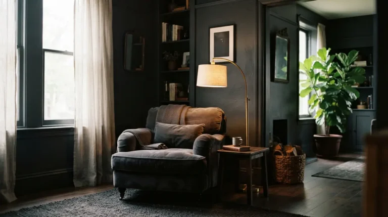
Dark paint colours deep navy, charcoal, forest green, near-black have moved firmly into the mainstream of British interior design. A room painted in a dark colour, when done well, feels intimate, sophisticated, and deeply personal. The key is commitment: using a dark colour across all four walls and the ceiling the technique called colour drenching creates an immersive atmosphere that is the dark room at its most effective.
Dark colours require good lighting to succeed. In a dark-painted room, all lighting should be warm-toned, positioned at low level rather than relying solely on overhead fittings.
Room-by-Room Paint Colour Guide
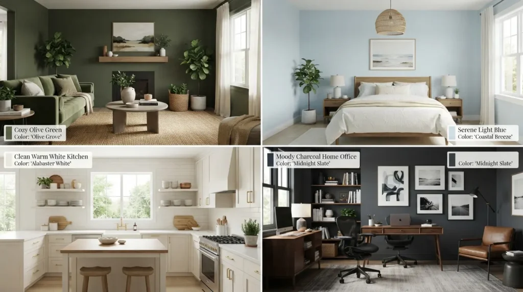
Living Room Paint Ideas
The living room is the room in which colour most directly affects the quality of everyday life. A warm neutral creates a calm, sociable backdrop that works well for families and rooms used for a wide range of activities. A bold dark colour navy, forest green, charcoal creates a more dramatic atmosphere. A fresh, light colour off-white, pale sage, warm cream makes the room feel generous and welcoming at any time of day.
Bedroom Paint Ideas
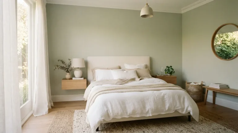
The bedroom is the room where bold colour tends to work best, because the relationship between colour and rest is significant and personal. Dark colours deep navy, forest green, midnight blue create a cocooning quality that many people find genuinely conducive to sleep. Soft, muted tones sage green, warm linen, dusty rose create a gentle, restful atmosphere. Cool whites and greys work best in bedrooms with abundant natural light.
Kitchen Paint Ideas
Kitchen paint needs to be practical as well as beautiful the kitchen is a humid, greasy environment and a paint that cannot be wiped clean will deteriorate quickly. An eggshell or satinwood finish is the appropriate choice for kitchen walls. Colour-wise, a deep navy or forest green kitchen with warm brass hardware and a marble-effect quartz worktop is one of the most widely aspirational kitchen looks in the UK right now.
Bathroom Paint Ideas
The bathroom presents similar practical demands to the kitchen. A moisture-resistant emulsion or an eggshell finish prevents paint from peeling or developing mould in the damp environment. Bold colours work well in bathrooms precisely because the room is small a dramatic shade that might be overwhelming in a living room feels contained and purposeful in a bathroom.
Hallway Paint Ideas
The hallway sets the tone for the entire house it is the first interior space a visitor sees and the first space you see when you arrive home. Because hallways often receive limited natural light, dark colours can work surprisingly well. A deep, rich colour forest green, navy, warm terracotta in a hallway creates a dramatic first impression and a sense of arrival that a pale or neutral hallway rarely achieves.
Feature Wall and Colour Drenching Ideas
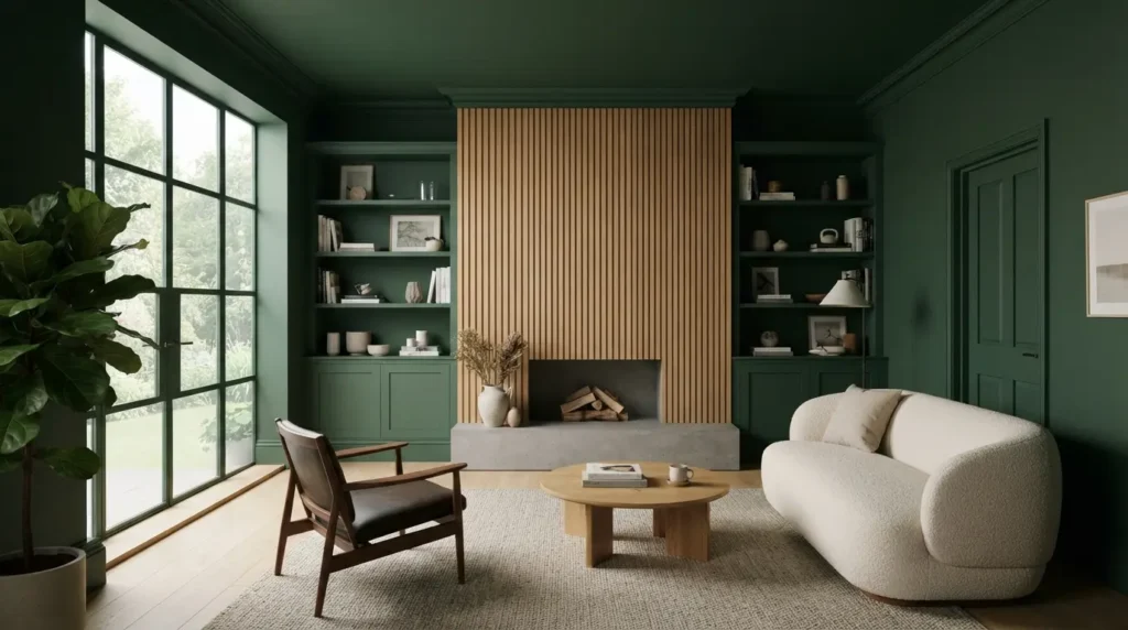
Feature Wall Ideas
A feature wall painting one wall in a contrasting or bolder colour while keeping the remaining walls lighter is the most commonly used technique for introducing colour into a room without full commitment. It works best when the chosen wall has a natural focal point a chimney breast, the wall behind a bed, or the wall facing the main window and when the feature colour relates to colours already present in the room.
Colour Drenching Ideas
Colour drenching the technique of painting all surfaces of a room in the same colour or in closely related tones is one of the most effective and most sophisticated colour approaches in contemporary British interior design. When all walls, ceiling, woodwork, and door and window frames are painted in the same or similar shade, the room takes on an immersive, architectural quality that is quite different from and more powerful than the single feature wall approach.
Paint Finishes Explained
The finish of a paint its sheen level affects both the appearance of the painted surface and its practical performance.
Matt emulsion: a completely flat, non-reflective finish is the most widely used wall paint in UK homes. It absorbs light, minimises surface imperfections, and gives a soft, warm quality to any colour. It is not washable and is not appropriate for kitchens, bathrooms, or children’s rooms.
Eggshell: a very low sheen finish is the appropriate choice for walls in kitchens, bathrooms, and any room where wipeable performance is needed. It has a slight sheen that adds depth to colour without looking glossy and is also the preferred finish for woodwork in contemporary interiors.
Satinwood: a mid-sheen finish is the classic choice for woodwork: skirting boards, architraves, window frames, and doors. It is hard-wearing, washable, and provides a smart, traditional finish.
Full gloss: a high-sheen finish remains the preferred choice for external woodwork, front doors, and radiators.
The Best Paint Brands in the UK
Farrow and Ball
Farrow and Ball is the most prestigious paint brand in the UK and one of the most influential in British interior design. Its colours are distinctive complex, pigment-rich, and often named after the British landscape, architecture, and cultural references and its formula produces a flat, light-absorbing quality that looks different to standard emulsion on the wall. Popular colours include Elephant’s Breath, Mole’s Breath, Cornforth White, Calke Green, Hague Blue, and Railings.
Dulux
Dulux is the UK’s most widely available and most widely used paint brand stocked in most DIY stores and available in thousands of colours through its mixing service. The quality is reliable, the range is enormous, and the Dulux Colour of the Year is one of the most useful guides to emerging colour trends in UK interiors.
Little Greene
Little Greene is the premium paint brand most often mentioned alongside Farrow and Ball and shares its commitment to complex, characterful colours and high-quality formulation. Its historic colour collection drawn from five centuries of British decorating history makes it particularly appropriate for period properties.
Exterior and Front Door Paint Ideas
The exterior of a house requires paint that can withstand UV radiation, frost, rain, and the temperature fluctuations of a British year. Masonry paint a thick, weather-resistant paint formulated specifically for exterior render, brick, and stone is the appropriate product for exterior walls. It is available in a wide range of colours and in smooth and textured finishes.
The front door is the most visible and most frequently updated exterior paint surface. A freshly painted front door in a confident, considered colour has a disproportionately large impact on kerb appeal and the perceived quality of a property. The most popular front door colours in the UK currently include matt black, navy blue, forest green, rich red, and warm grey.
Colour Psychology in the Home

Colour psychology the study of how colours affect mood, behaviour, and emotional responses offers useful but not prescriptive guidance for interior colour choices.
Blue is associated with calm, clarity, and focus a natural choice for bedrooms, home offices, and bathrooms. Green is associated with nature, growth, and restoration it reduces stress and creates a sense of calm, which explains its dominance in UK interiors right now. Yellow and warm orange suit kitchens and morning spaces. Red and deep burgundy stimulate appetite and conversation they suit dining rooms. Dark, enveloping colours create intimacy and introspection they suit bedrooms and private studies.
These associations are tendencies rather than rules, and personal resonance the colour that simply makes you feel good when you see it will always be the most reliable guide.
Final Thoughts
Choosing paint colour is one of the most pleasurable and most creative aspects of designing a home and the one most likely to produce instant, visible results. The key is to approach it methodically: understand the light in your room, identify the undertones in your existing furniture and flooring, test paint colours thoroughly before committing, and choose a shade that you genuinely love rather than one that simply seems safe.
FAQs
What are the most popular paint colours in the UK in 2026?
The most popular interior paint colours in 2026 are sage green, warm white, soft greige, deep navy, and forest green. Dark, moody shades continue to grow in popularity, particularly for bedrooms, dining rooms, and hallways, where an intimate atmosphere is the goal.
What is the difference between eggshell and emulsion paint?
Emulsion is a water-based paint most commonly used on walls and ceilings, available in matt, silk, and satin finishes. Eggshell is a low-sheen finish that is more durable and more washable than matt emulsion, making it appropriate for walls in kitchens, bathrooms, children’s rooms, and hallways, and also the preferred finish for woodwork in contemporary interiors.
How do I choose a white paint that does not look yellow?
Yellow-looking white paint is almost always a warm-toned white being viewed under warm artificial light. To avoid this, choose a white with a cooler undertone one with a hint of blue or green rather than yellow. Alternatively, switch to cooler-toned bulbs in the rooms where warm whites are reading as yellow.
What is colour drenching and how do I try it?
Colour drenching is the technique of painting all surfaces walls, ceiling, woodwork, and skirting in the same colour or closely related tones. It creates an immersive, architectural quality that makes a room feel more intentional and more dramatic than a standard wall-only paint approach. Choose a colour you love, test it on walls and ceiling, and if the combined effect appeals, commit fully.
Is Farrow and Ball worth the price?
Farrow and Ball paint costs significantly more than mid-market alternatives but delivers a genuinely different result on the wall richer pigmentation, a more complex colour character, and a flat, light-absorbing quality that other brands rarely match. If budget is a constraint, many Farrow and Ball colours can be closely matched by a Dulux trade mixing service.
How do I stop my dark paint from looking gloomy?
Dark paint becomes gloomy when lighting is inadequate. Use warm-toned lighting at low level floor lamps, table lamps, and wall lights rather than a single overhead fitting. Keep furniture and textiles lighter in tone to provide contrast. Use mirrors to reflect light. Ensure the room has at least one strong source of natural light during the day.
What paint finish is best for a bathroom?
A moisture-resistant emulsion or an eggshell finish is the most appropriate paint for bathroom walls. Both resist the humidity and condensation of the bathroom environment better than standard matt emulsion, which is prone to peeling and mould in damp conditions. Eggshell is also easier to wipe clean, making it the practical as well as aesthetic choice.