15 Living Room Colour Scheme Ideas That Always Work

A living room colour scheme that always works pairs one dominant neutral or muted tone with a clear secondary colour and a confident accent, rather than relying on a single shade to carry the whole room. These fifteen combinations have stayed reliable through changing trends because they’re built on genuine colour balance, not just whatever shade happens to be fashionable this year.
Most homeowners either default to the same safe grey and white palette out of fear, or go bold and end up with a room that looks more like a mood board than a lived-in space. Both problems come from the same missing piece, which is understanding how colours actually work together rather than picking them one at a time. This list breaks down fifteen living room colour scheme ideas that hold up in real rooms, with the pairing logic and practical detail most lists skip entirely.
1. Warm Greige and Terracotta
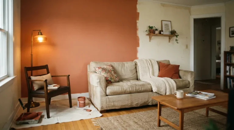
A warm greige base paired with terracotta accents creates one of the most adaptable living room colour schemes available, since greige sits between grey and beige without leaning too cool or too flat on its own.
Terracotta introduces warmth through cushions, a rug, or a single accent chair, giving the room a Mediterranean, sun-baked quality without committing to a fully orange or red scheme. This combination works particularly well in north-facing rooms, where greige can otherwise look slightly cold without a warmer accent to lift it.
2. Sage Green and Cream
Sage green walls against cream trim and soft furnishings create a calm, nature-inspired living room palette that has remained consistently popular because the two tones sit close enough in warmth to never clash.
Sage works well as either a dominant wall colour or a secondary accent through curtains and cushions, depending on how bold you want the final result. Most homeowners find this pairing particularly forgiving of natural light changes throughout the day, since sage doesn’t shift as dramatically under artificial lighting the way some blues and greys can.
3. Navy Blue and Brass Accents
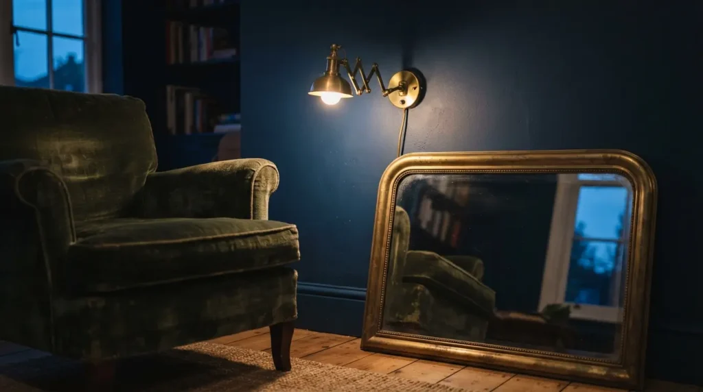
Navy blue walls or upholstery paired with brass or warm gold hardware and lighting fixtures gives a living room a formal, slightly moody elegance that reads as considered rather than dark for the sake of it.
The brass accents are doing real work in this combination, since without a warmer metallic contrast, an all-navy room can feel flat and heavy. A common mistake is pairing navy with cool silver or chrome fixtures instead, which removes the warmth that makes this colour combination living room favourite actually feel inviting rather than austere.
4. Charcoal and Burnt Orange
Charcoal grey as the dominant tone with burnt orange accents through cushions or art creates a bold, contemporary living room colour scheme that suits homes wanting real personality without going fully saturated across every surface.
This pairing works best when charcoal stays confined to one wall or the sofa upholstery, with burnt orange used sparingly as the accent layer rather than competing for equal visual weight. Used in roughly equal amounts, the combination can tip toward feeling more autumnal seasonal decor than a permanent scheme, so keeping the orange to accessories rather than large furniture pieces tends to age better.
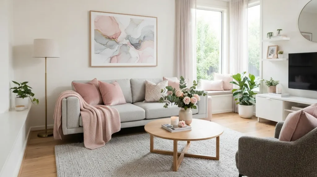
5. Soft Blush and Warm Grey
Soft blush paired with warm grey gives a living room a gentle, understated warmth, avoiding the overly feminine association blush sometimes carries when it’s the sole dominant colour in a room.
Warm grey as the larger surface area, whether on walls or a sofa, keeps the scheme grounded, while blush works through cushions, an accent chair, or curtains to add softness. This combination reads considerably more sophisticated than blush paired with white, since the grey adds a layer of depth that pure white can’t provide.
6. Olive Green and Rust
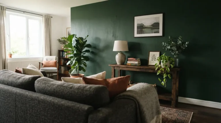
Olive green and rust together create one of the more distinctly 2026-forward living room colour schemes, moving away from the cooler sage and blue palettes that dominated recent years toward something richer and more grounded.
Olive works well as a full wall colour or through colour drenching, where walls, trim, and even ceiling share the same tone for a more enveloping effect, while rust comes through in a rug, throw, or accent chair. Expect to pay roughly £30 to £60 per 2.5 litre tin for a quality emulsion in either shade, with a standard living room needing two coats and a weekend to complete if you’re painting yourself. A common mistake with this pairing is choosing a rust that leans too orange rather than a deeper, more brick-toned rust, which sits better against olive’s muted, earthy base than a brighter orange would.
7. Deep Burgundy and Gold
Deep burgundy walls or a burgundy sofa paired with gold accents through lighting and frames creates a rich, jewel-toned living room colour scheme suited to homes wanting a more dramatic, formal atmosphere.
This combination reads darker and more enclosed than most schemes on this list, so it tends to suit larger rooms or spaces with strong natural light better than a small, already dim living room. Burgundy also shows a genuine trade-off worth knowing before committing a full wall to it. It can look almost black in low evening light, which some homeowners love for its moody atmosphere and others find frustrating if they wanted a colour that stays vivid around the clock.
8. Black, White, and Natural Wood
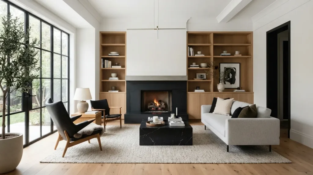
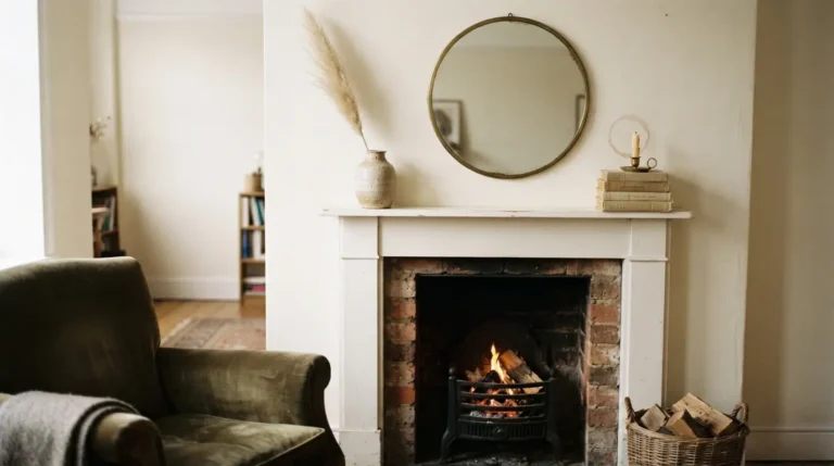
A black and white base layered with natural wood tones through flooring or furniture creates a timeless, high-contrast living room colour scheme that works across both traditional and contemporary interiors without feeling tied to a specific trend cycle.
Black is best used sparingly here, typically through window frames, a fireplace surround, or furniture legs, rather than full walls, since black used at scale in a room with limited natural light can feel oppressive rather than sophisticated. This scheme genuinely photographs well and lives well long term, largely because black and white don’t fade or date the way trend-driven colours can, though black surfaces do show dust, scuffs, and fingerprints more visibly than most other options on this list, so factor slightly more regular cleaning into the trade-off.
9. Duck Egg Blue and White
Duck egg blue paired with crisp white trim gives a living room a fresh, coastal-adjacent palette that reads as calm and bright without tipping into a full nautical theme.
This combination suits rooms with good natural light particularly well, since duck egg can look slightly grey and flat in darker conditions compared to how vivid it appears on a paint chip. White woodwork against the duck egg walls keeps the scheme feeling crisp rather than washed out, and it’s one of the more budget-friendly options on this list since it relies mainly on paint rather than statement furniture pieces.
10. Warm Taupe and Chocolate Brown
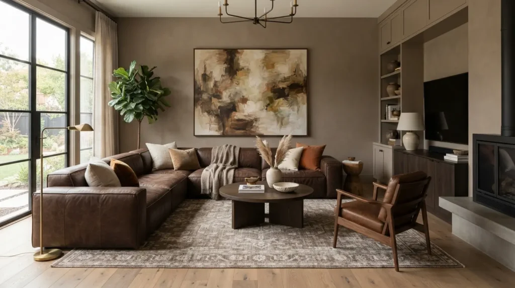
Warm taupe walls paired with chocolate brown furniture or accents create a grounded, cosy living room colour scheme that has grown in popularity as homeowners move away from the flatter beige and grey neutrals of recent years.
Chocolate brown works particularly well through a leather or velvet sofa against lighter taupe walls, giving the room clear tonal depth without needing a separate accent colour at all. This pairing suits both traditional and modern interiors, since the warmth of both tones reads as timeless rather than tied to any single design era.
11. Mustard Yellow and Navy
Mustard yellow accents against navy blue walls or furniture create a confident, mid-century-leaning living room colour scheme, using strong contrast rather than tonal closeness to create visual energy.
This is one of the bolder combinations on this list, and it works best when one colour clearly dominates rather than splitting the room evenly. Most homeowners find navy walls with mustard accents through cushions and a rug more successful long term than the reverse, since a mustard wall with navy accents can feel visually heavier and harder to balance with typical furniture pieces. Testing both a navy and mustard swatch directly on the wall under your room’s actual lighting is worth the extra step here, since mustard in particular can shift noticeably between daylight and warm evening bulb light.
12. Dusty Pink and Sage Green
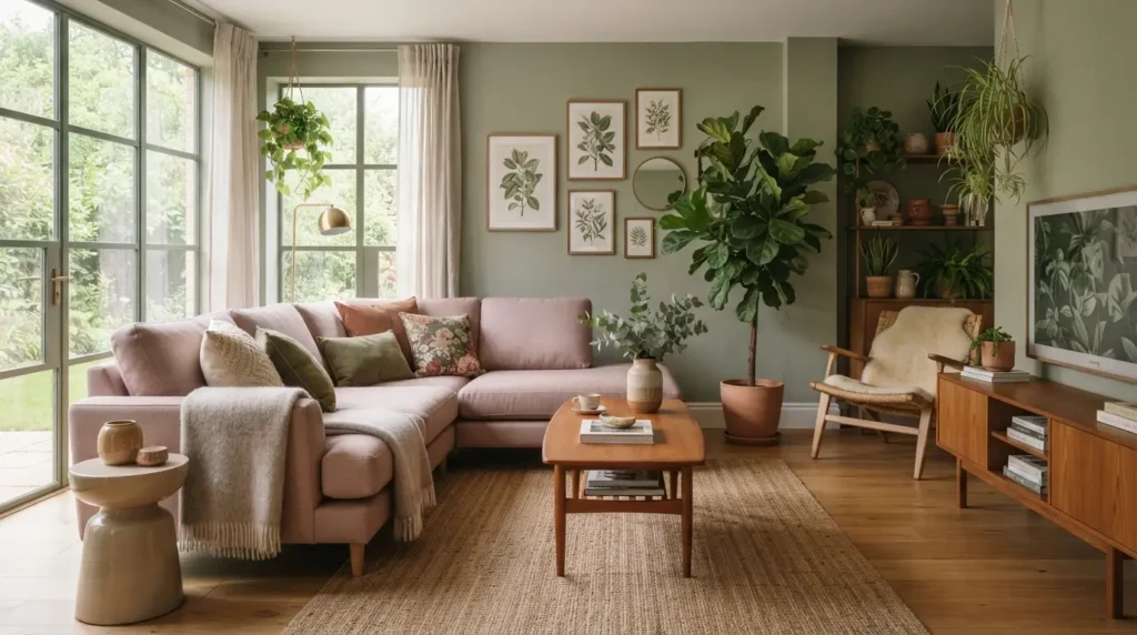
Dusty pink and sage green together create a soft, botanical-leaning living room colour scheme, pairing two muted, closely related tones rather than relying on strong contrast for visual interest.
This combination suits homeowners wanting a colour scheme that feels gentle and lived-in rather than a bold design statement. Because both colours sit at a similar, fairly muted saturation level, the room needs a genuine tonal split, a lighter sage on the walls with dustier pink through furniture, or the reverse, to avoid the flat look that happens when two similar-strength colours sit side by side with no clear hierarchy.
13. Stone Neutral and Emerald Green
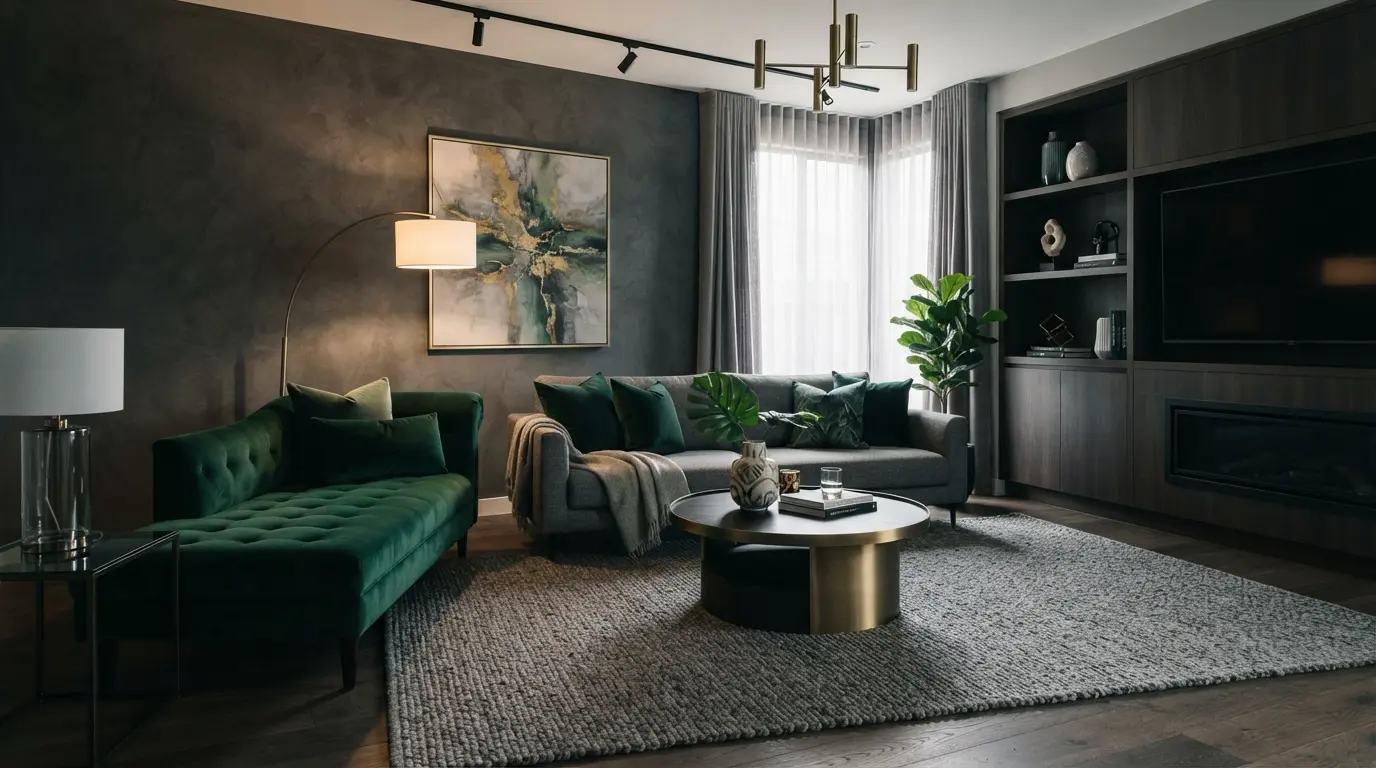
A stone or oatmeal neutral base paired with emerald green accents creates a sophisticated, adaptable living room colour scheme, using the neutral to keep the room calm while emerald delivers a genuine statement moment.
Stone as the dominant wall and floor tone gives maximum flexibility for swapping accent pieces over time, while emerald comes through a velvet sofa, curtains, or an accent chair as the room’s clear focal colour. This pairing works especially well for anyone wanting the option to update their accent colour later without repainting, since a neutral base outlasts most other elements in a room’s overall lifespan.
14. Two-Tone Blue with Light and Navy
A two-tone blue living room colour scheme uses a pale, sky-toned blue on the main walls with navy reserved for trim, a feature wall, or furniture, creating tonal depth within a single colour family rather than introducing a second hue entirely.
This approach suits homeowners who like the idea of a bold navy statement but aren’t ready to commit an entire room to a dark colour. The lighter blue keeps the room feeling open and bright, while the navy accents anchor the scheme and stop it from feeling too pale or under-defined.
15. Earthy Clay, Cream, and Black
Earthy clay paired with cream and small black accents creates a warm, contemporary living room colour scheme that leans into the richer, more saturated palette shift happening across current interior design trends.
Clay works as either a full wall colour or through colour drenching for a more immersive effect, with cream softening the scheme through larger furniture pieces and black grounding it through smaller details like light fixtures, picture frames, or furniture legs. This three-tone approach gives more flexibility than a strict two-colour pairing, since each element, cream, clay, and black, can be adjusted independently as the room evolves over time.
Living Room Colour Scheme Comparison
[Comparison Table: Colour Scheme Mood and Best Use]
| Colour Scheme | Overall Mood | Best Suited Room Type | Light Requirement |
| Warm greige and terracotta | Warm, adaptable | Any size, especially north-facing | Works in low light |
| Sage green and cream | Calm, natural | Family living rooms | Flexible |
| Navy and brass | Formal, elegant | Larger or well-lit rooms | Needs good light or lighting plan |
| Charcoal and burnt orange | Bold, contemporary | Rooms wanting a strong focal point | Flexible |
| Black, white and wood | Timeless, high contrast | Modern or traditional interiors | Needs some natural light |
| Mustard and navy | Confident, mid-century | Rooms with strong architectural lines | Flexible |
| Stone and emerald | Sophisticated, adaptable | Rooms wanting a changeable accent | Flexible |
| Earthy clay, cream and black | Warm, contemporary | Rooms following 2026 colour trends | Flexible |
Common Colour Scheme Mistakes to Avoid
The most common mistake across nearly every pairing on this list is choosing two colours of similar saturation and depth with no clear dominant tone, which flattens the whole room rather than creating the contrast that makes a colour scheme feel intentional. A good rule of thumb is deciding which colour will cover roughly 60 to 70 percent of the room before choosing the accent, rather than trying to split two colours evenly.
The second frequent issue is testing colour combinations only on paper or a small swatch rather than on the actual wall in the room’s real lighting conditions. Several of the bolder pairings above, particularly mustard and navy or burgundy and gold, shift noticeably between daylight and evening artificial light, and a colour combination living room owners loved on a swatch card can look completely different once it’s covering a full wall at 8pm with the lamps on.
Conclusion
The best living room colour scheme ideas all follow the same underlying logic, one dominant tone, a complementary secondary colour, and a confident accent used with intention rather than evenly split across the room. Whether you’re drawn to a calm sage and cream palette or a bolder navy and mustard pairing, test your chosen combination directly on the wall under your room’s actual lighting before committing to a full repaint. Pick a scheme that matches how you actually want the room to feel, not just how it looks in a photo, and it will hold up long after the current colour trends move on.
FAQs
What colours go well together in a living room?
Warm neutrals with an earthy accent, such as terracotta, rust, or olive, tend to work reliably, along with classic pairings like navy and brass or sage and cream for a calmer effect.
What is the most popular living room colour scheme?
Warm, earthy neutrals paired with a richer accent colour like olive green, clay, or rust have become the most requested living room palette as flatter beige and grey schemes fall out of favour.
How do I choose a colour palette for my living room?
Pick one dominant neutral or muted tone first, then choose a secondary colour that complements it in warmth, and add a bolder accent colour used sparingly through cushions, art, or a single piece of furniture.
Can I mix warm and cool colours in a living room?
Yes, as long as one clearly dominates the room, since mixing warm and cool tones in roughly equal amounts tends to create visual tension rather than balance.
What living room colour schemes are timeless rather than trendy?
Black, white, and natural wood, along with warm taupe and chocolate brown, tend to age better long term than more saturated trend-driven pairings like specific 2026 colour combinations.
Is it better to use bold colours on walls or in accessories?
For bolder or riskier colours, using them through accessories and accent pieces first is generally the safer approach, since they’re far cheaper and easier to change than repainting a full wall.