7 Warm Grey Paint Ideas for a Cosy and Neutral Interior

Warm grey paint ideas focus on greiges that feel cosy rather than cold, giving a neutral interior that still has softness and depth. These seven approaches use mid-tone and lighter greiges on walls, woodwork and feature areas so the room feels calm without looking unfinished. Each idea includes the practical checks that decide whether the colour will still work after the first winter.
1. Whole-Room Warm Greige for a Soft Neutral Base
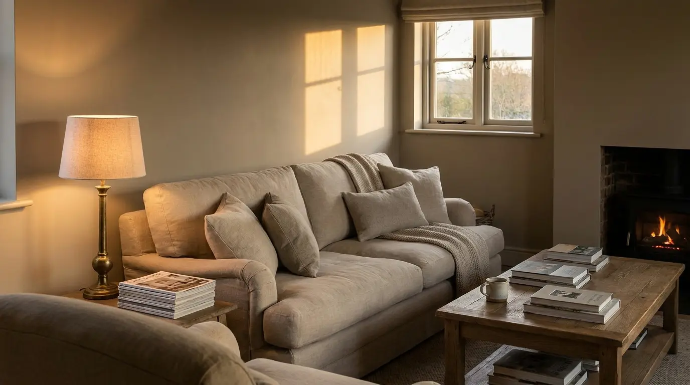
Painting all walls in a mid-tone warm greige such as Elephant’s Breath creates an enveloping, cosy feel that works in living rooms and bedrooms. The colour hides everyday marks better than a pure white and pairs easily with linen, oak and brass. Test the sample against your floor first; a pink undertone can look mauve next to cool tiles. 10 calming paint colour ideas for a stress-free home shows similar soft neutrals in use. Keep the ceiling a step lighter so the room still has definition.
2. Lighter Greige on Walls with Deeper Grey Woodwork
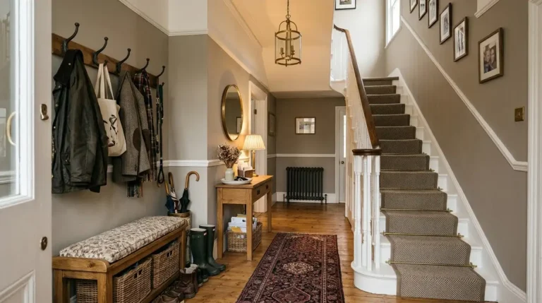
Use a light warm greige on the walls and a deeper greige or soft charcoal on the skirting, doors and window frames. This adds structure without the stark contrast of white woodwork against grey walls. It works well in period properties where full colour drenching feels too modern. Check the depth difference; too close and the woodwork disappears, too dark and the room can feel heavy. Sample both colours side by side before ordering.
3. Warm Greige Feature Wall Behind the Sofa or Bed
A deeper warm greige on one wall creates a gentle focal point without the drama of a true dark colour. Place it behind the sofa or headboard so the colour anchors the furniture. The other walls stay lighter. This approach suits smaller rooms where a full dark scheme would feel oppressive. Measure the wall carefully and mask the edges cleanly so the colour change looks intentional. A good quality matt finish hides any slight texture differences.
4. Colour Drenching in a Soft Greige
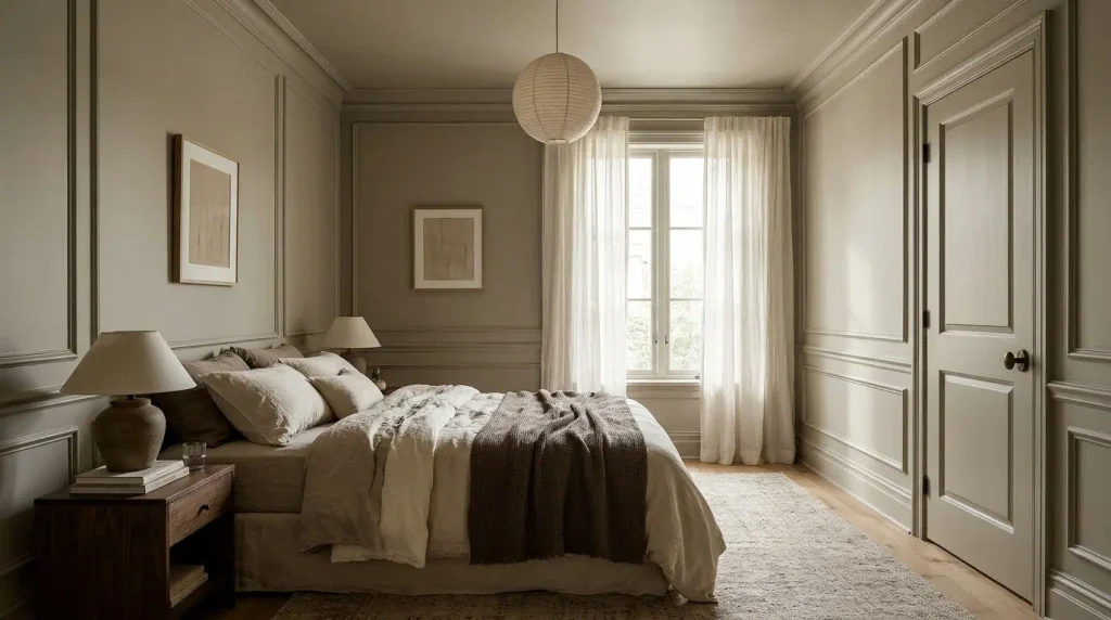
Carry the same warm greige across walls, ceiling and woodwork for a seamless, cosy effect. The room feels larger because there are no visual breaks. It works particularly well in bedrooms and snugs. Choose a greige with enough warmth that the ceiling does not look grey and flat. Test a large sample that includes a section of ceiling if possible. This method needs careful preparation because any unevenness shows more clearly when everything is the same colour.
5. Warm Greige in a North-Facing Room
North-facing rooms benefit from a warmer greige that counteracts the cooler light. A colour with beige or slight pink undertones keeps the space feeling soft rather than grey. Avoid pure cool greys here; they turn flat and cold. Paint a large sample and check it on an overcast day, because that is when the room is at its coolest. Pair with warm lighting and natural materials to reinforce the cosy feel.
6. Greige Walls with Natural Wood and Brass Accents
Warm greige walls make oak floors, wooden furniture and brass fittings look richer. The colour acts as a quiet backdrop rather than competing. This combination feels modern yet comfortable and works in living rooms, kitchens and bedrooms. Check the greige against the specific wood tone; yellow oak can push a pink-undertone greige towards beige. Brass adds warmth; black metal keeps the scheme sharper if you prefer more contrast.
7. Soft Greige in Open-Plan Spaces for Flow
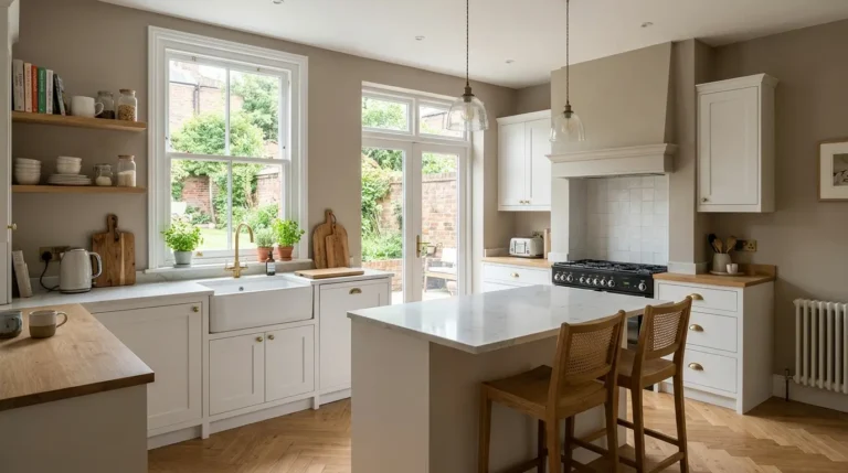
Use the same warm greige across an open-plan living and kitchen area so the spaces feel connected. The colour unifies the different zones without making the area feel monochrome. Choose a mid-tone that still reflects enough light in the darker parts of the room. Test samples in both the living and kitchen zones because light levels often differ. This approach makes the whole floor feel larger and more considered than painting each area a different colour.
Practical Checks for Any Warm Grey Idea
Always test large samples for a week. Check undertones against flooring and fixed finishes. Order enough paint from the same batch. Choose a matt finish for walls and eggshell for woodwork. In high-traffic areas, confirm the paint is scrubbable. Measure coverage carefully and add extra for touch-ups. These steps apply to every idea above and prevent the colour from looking different once the room is in daily use.
How to Adjust if the Colour Feels Wrong After Painting
If the finished walls look slightly cooler or warmer than expected, small changes can help before you repaint. Switching to warmer bulbs softens a greige that feels a little flat. Adding more natural wood or brass warms the scheme further. A lighter ceiling paint increases the sense of space if the walls feel heavy. If the undertone is noticeably pink or green, the only reliable fix is to repaint with a different greige. Keep the sample boards so you can compare the finished result against what you tested. Most people who test properly rarely need to repaint, but having the option of a small adjustment in lighting or accessories is useful.
Working With Existing Fixed Elements
Take the colour of your kitchen worktop, bathroom tiles or fireplace into account before choosing the grey. A greige with a pink undertone can look mauve next to cool grey stone. A green undertone can look muddy next to warm oak. Bring a sample of the fixed material to the paint shop if possible, or photograph it under the same light as your sample boards. Designers often adjust the greige by half a step lighter or darker so it sits cleanly beside these permanent elements rather than fighting them. This step is especially important in open-plan spaces where the same grey has to work next to both living room flooring and kitchen surfaces.
Warm grey paint ideas work when the greige has enough warmth to feel cosy and enough neutrality to stay quiet. Whole-room colour, feature walls, colour drenching and open-plan flow all succeed when you test samples properly and account for light and materials. A well-chosen warm grey becomes the calm base that makes the rest of the interior feel intentional and comfortable year round.
FAQs
What makes a grey feel warm rather than cold?
A beige, taupe or slight pink undertone keeps the grey from looking blue or flat in British light. Pure cool greys often feel colder once painted.
Can I use warm grey in a small room?
Yes. A lighter warm greige or colour drenching can make a small room feel larger and softer rather than closed in.
How do I stop warm grey looking beige?
Test the sample next to your floor and furniture. Choose a greige with a clearer grey note rather than a strong beige undertone, and keep the ceiling lighter.