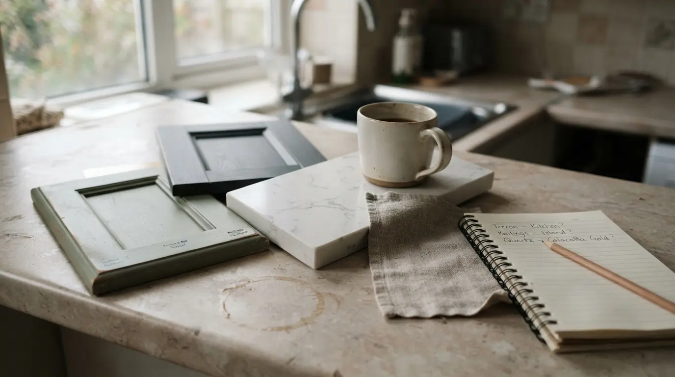
How to Choose the Right Colour Scheme for a Kitchen

The right kitchen colour scheme starts with the elements you cannot easily change, your worktop, flooring and cabinetry, not with a paint chip. Pick a dominant colour from those fixed materials, build a supporting palette of two or three more tones, then add contrast and texture last. Get that order right and the room stays calm rather than chaotic.
Most people do this backwards. They fall for a paint colour on Pinterest, order it, then spend the next two years fighting it because it clashes with the worktop they already had or the oak floor that runs through from the hallway. Once cabinetry is fitted and stone is templated, undoing a colour mistake costs real money and real time, not just a weekend with a roller.
Start with what you cannot easily change
Before you look at a single paint chart, take stock of everything in the room that is expensive or difficult to swap: worktop, flooring, any exposed brick or original joinery, and existing appliances if you are keeping them. These fixed elements dictate more of the final palette than most people expect.
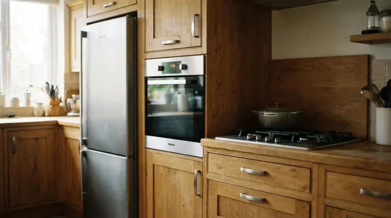
A worktop with blue-grey veining pulls the whole scheme cooler, while a warmer, creamier stone or a butcher’s block worktop calls for taupes, warm whites and natural timber. Oak flooring introduces a golden undertone that a stark cool white will fight against; walnut adds depth that plays well with richer, more saturated cabinet colours. If you are still choosing a worktop, pick it before you pick a wall colour. Paint is the cheapest, most flexible thing in the room to change later, so it should be the last major decision, not the first.
Choose your dominant colour before anything else
Once the fixed materials are settled, decide which single colour will cover the most visual area. In the large majority of kitchens this is the cabinetry, because it sits at eye level and frames everything else in the room, including appliances and worktop.
The question to ask is not “what colour do I like” but “what do I want this room to feel like on a Tuesday morning.” A warm white or soft taupe cabinet reads as classic and forgiving of daily wear. A deeper shade like navy, charcoal or olive gives a bright, well-lit kitchen real structure and works particularly well where there is enough natural light to stop it feeling heavy. In a smaller or darker room, a lighter dominant colour with a warm undertone will do more for the space than a cool white, which can turn flat and slightly clinical without much daylight to animate it.
Build a supporting palette, not a colour explosion
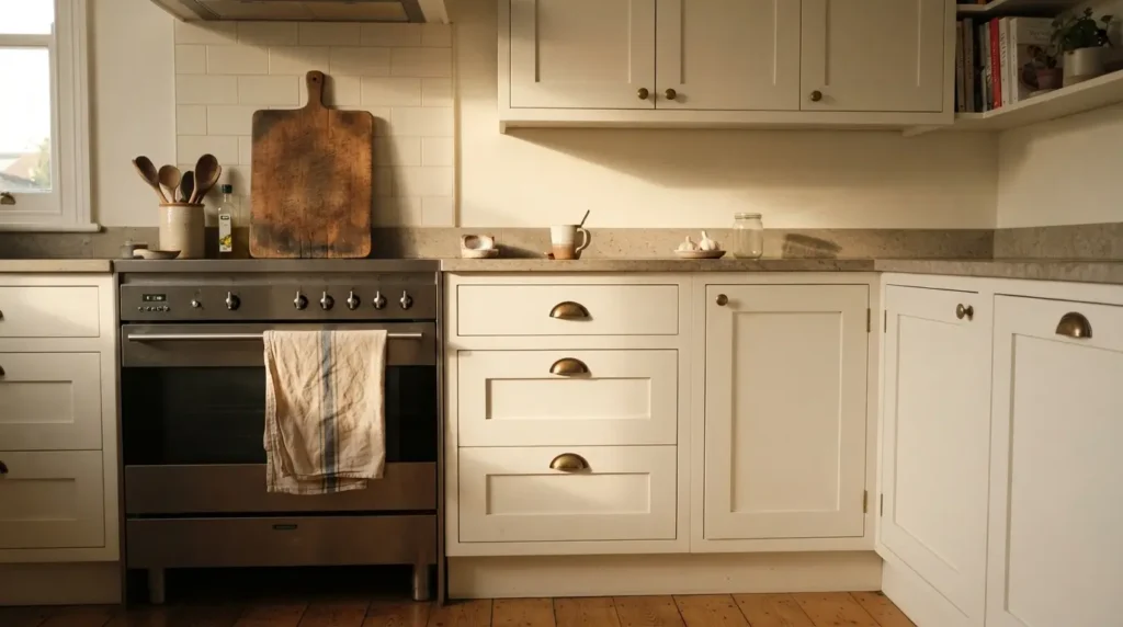
After the dominant colour, add no more than two or three supporting tones. This is where a lot of kitchens go wrong, not because any single colour is ugly, but because too many compete for attention at once.
A widely used shortcut in interior design is the 60:30:10 rule: roughly 60 percent of the room in your dominant colour, 30 percent in a secondary tone, and the final 10 percent as a bolder accent. In a kitchen, that typically plays out as cabinetry or flooring for the 60 percent, a worktop or wall colour for the 30 percent, and hardware, pendant lighting or small appliances carrying the accent. It is a guideline rather than a rule you need to measure with a tape, but it is a useful sanity check when a scheme starts to feel busy.
| Proportion | Typical kitchen element | Example |
| 60% (dominant) | Cabinetry, flooring, or walls | Warm white cabinets |
| 30% (secondary) | Worktop, splashback, or a contrasting run of units | Honed grey stone worktop |
| 10% (accent) | Hardware, lighting, small appliances | Brushed brass handles and pendants |
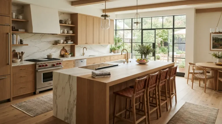
The supporting colours should relate to each other rather than match exactly. Warm white cabinetry with oak and aged brass feels relaxed. Sage green with marble and antique bronze feels classic without being predictable. What you want to avoid is every surface being a slightly different shade of the same neutral with no relationship between them, which tends to read as flat rather than calm.
Get undertones right before you commit
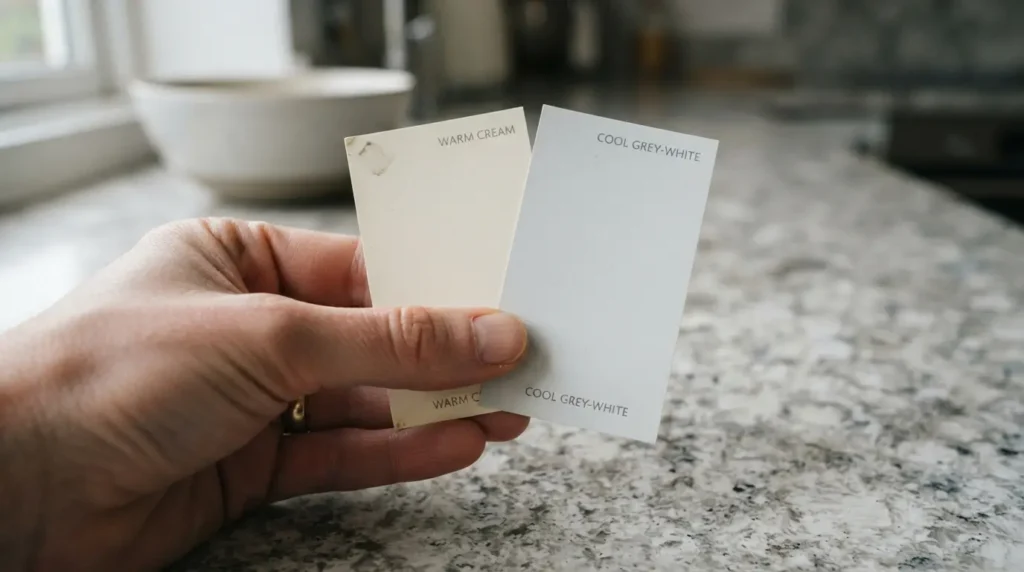
This is the step that trips up more kitchens than any other, and it rarely announces itself as a problem until the units are fitted. White is not one colour. It can lean warm, cool, chalky, creamy or faintly pink depending on its undertone, and the same is true of beige, grey and even green.
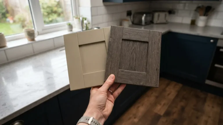
A warm cream cabinet can look elegant against limestone and oak, then look strangely flat next to a cool grey quartz worktop. A cool white worktop with visible blue-grey veining generally wants a crisper, cooler cabinet colour to sit alongside it; a warmer stone with creamy movement wants taupes and natural wood instead. The practical way to check this is to hold two or three candidate colours next to each other rather than judging them in isolation, since undertones only really show up in comparison. Problems most often happen when undertones are almost aligned but not quite, which is a harder mismatch to spot than two colours that are obviously different.
Metal finishes carry undertones too. Mixing a warm brass with a cooler brushed nickel can work, but mixing them without intention, alongside cabinetry and stone that already disagree on temperature, adds one more thing for the eye to reconcile.
Decide between tonal, contrast and complementary schemes
Once undertones are under control, decide which type of relationship you actually want between your colours, since this shapes how the room reads far more than the individual shades do.
A tonal scheme uses variations of one colour family: cream cabinetry, a slightly darker taupe wall, and a warm stone worktop, for example. This tends to read better in an open-plan space that flows into a living or dining area, because strong contrast can feel choppy when it is competing with the sightlines into another room. A contrasting scheme uses genuine differences for definition, such as white perimeter cabinets with a charcoal island, or black hardware against warm oak. This works well in larger kitchens with the architectural scale to carry it. A complementary scheme pairs colours that sit opposite each other on the colour wheel, like dusty blue with copper, or muted green with warm terracotta. These can be striking but need softening; a fully saturated complementary pairing tends to feel loud in a room full of hard, reflective surfaces, so a muted or chalky version of each colour usually works better than the pure hue.
Match the scheme to your room’s size and light
The same colour behaves completely differently depending on the size of the kitchen and how much daylight it gets, so layout should shape how you use colour rather than ruling any colour out entirely.
Small or narrow kitchens generally benefit from a more continuous palette, where cabinets, walls and worktop sit close in tone so the eye moves around the room without hard stops. This does not mean you are stuck with white; it means avoiding several abrupt colour changes in a tight space. A two-tone approach with darker base units and paler wall units above can still add depth without making a small room feel boxed in. Larger kitchens can absorb more contrast and darker, more saturated tones, because there is enough floor and wall area to stop a bold colour from dominating the whole room.
Light orientation matters as much as room size. A north-facing kitchen with cooler, flatter daylight generally suits a white or neutral with a warm undertone rather than a cool, blue-based white, which can turn grey and lifeless without strong sun to animate it. A south or west-facing room with plenty of warm afternoon light can carry cooler tones and deeper, more saturated colours comfortably. Artificial lighting changes things again: warm LED bulbs, typically in the 2700K to 3000K range, bring out the richness in warm neutrals and timber, while a cooler bulb temperature can expose blue or grey undertones you did not notice in daylight.
Test properly before you commit
The single most common expensive mistake is choosing a final colour from a small paint chip, a phone screen or a showroom sample, none of which show you how the colour will actually behave in your kitchen.
Get the largest sample size you reasonably can, and test it standing up, not lying flat on a worktop, since a vertical surface catches and loses light differently than a horizontal one. Place it directly against your actual worktop, flooring and any hardware finish you are considering, and look at it at more than one time of day. A colour that looks calm and elegant at midday can shift considerably by evening once your kitchen lighting switches on, particularly with white, grey, green and blue, which are all more reactive to changes in light than warm neutrals or deep, saturated colours. Leave the sample up for at least a few days, ideally a week, rather than judging it after twenty minutes.
Common colour mistakes worth avoiding
Most kitchen colour regrets trace back to decisions made in isolation rather than as a system. A handful of patterns come up again and again.
Choosing the wall paint before the worktop and cabinetry is the most frequent mistake, because paint is genuinely the easiest thing to change later and should be the last decision, not the first. Undertone clashes are the second, where a cool grey worktop, a warm cream cabinet and a yellow-toned floor are all individually attractive but never quite settle together in the same room. A third common issue is too many feature moments at once: a bold cabinet colour, a heavily veined worktop, patterned splashback tiles and a contrasting island can each be lovely on their own, but stacked together they compete rather than complement. As a rough guide, one or two strong gestures in a kitchen is usually enough; if the worktop is the star, let the cabinetry sit back and support it.
Chasing a fashionable colour without checking it suits your specific light and materials is a slower-burning mistake, since cabinetry is a long-term cost. A trend colour needs to earn its place in your actual kitchen, not just look good in a magazine spread. And repainting an entire small kitchen a single stark white without any warmth or texture, while it photographs cleanly, can feel cold and slightly clinical in person, especially in a room with limited natural light or north-facing windows.
Conclusion
Choosing the right colour scheme for a kitchen is less about finding one perfect shade and more about building a small, coherent system: fixed materials first, a dominant colour second, a restrained supporting palette third, and genuine testing before anything gets ordered. Skip the order and you risk an undertone clash that no amount of styling will fix once the units are fitted. Follow it, and even a simple two or three colour kitchen will still look considered in ten years, not just on installation day.
FAQs
How many colours should a kitchen have?
Most kitchens work best with around three: a dominant colour, a supporting secondary tone, and a smaller accent through hardware or lighting. Natural materials like wood grain and stone veining add variation on top of that without counting as extra “colours” in the scheme.
Should kitchen cabinets be lighter or darker than the walls?
Either can work well. Lighter cabinets create a softer, more open feel; darker cabinetry adds definition and grounds the room. What matters more is that the undertones of both relate to each other and that the level of contrast suits the room’s size and natural light.
What is the most timeless kitchen colour scheme?
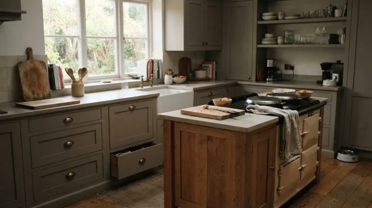
Warm neutrals and natural materials tend to age best: warm white, greige, sage and dusty blue paired with oak, walnut, limestone or marble and aged brass hardware. These combinations connect easily to different architectural styles, which is why they outlast trend-led colours.
Do darker kitchens feel smaller?
Not necessarily. A dark kitchen with good lighting, a paler worktop and some warm timber can feel intimate and sophisticated rather than cramped. Painting a naturally dark room stark white to compensate for low daylight often backfires, since a cool white with little sun to soften it can look flat rather than bright.
How do I stop my white kitchen looking cold?
Choose a white with a warm undertone rather than a cool, blue-based one, and bring in at least one warm natural material, timber, brass hardware or a stone worktop with visible movement. A single warm element is usually enough to stop an all-white scheme feeling clinical.
Should I match my kitchen colour to the rest of my house?
It should feel like a continuation of your home’s overall palette rather than an unrelated space, particularly in an open-plan layout where the kitchen is visible from other rooms. That does not mean an exact match; repeating a metal finish, a wood tone or a general colour temperature across the connected spaces is usually enough.
How do I choose between warm and cool colours for my kitchen?
Let your fixed materials decide. A worktop or floor with warm undertones generally wants warm-leaning cabinetry and paint; cooler-veined stone or grey-toned flooring pairs better with cooler neutrals. Your room’s light orientation and how much natural daylight it gets should also factor into the decision.