Living room paint ideas15 Best Paint Colours for a Living Room in 2026

The best paint colours for a living room in 2026 are warm, not cool: greige, clay, sage, and a few deeper jewel tones, used as a full wall colour rather than a one-wall accent. Cool grey still shows up in older guides, but the rooms that read current this year sit in mushroom, terracotta, and muted green.
Most living room paint ideas fail at the chip. A colour that looks calm under shop lights turns pink at 4pm, or grey at night, once the lamps come on. The 15 colours below are the ones that keep coming up on working rooms this year, with the light, trim, and cost notes that the photo roundups skip.
1. Accessible Beige by Sherwin-Williams
Accessible Beige is the safe warm neutral. It sits between beige and greige, so oak, walnut, linen, and stone all sit against it without a fight. In north light it can lean a little greyer. In south light it warms up. That shift is useful in a living room that changes through the day.
A 2.5 litre tin of standard trade emulsion in a comparable warm beige is often about £25 to £45. A designer brand in the same family is more often £55 to £75 for 2.5 litres. Prices vary by country and finish. One coat rarely covers a strong old colour. Budget two coats, plus primer if the walls are patched.
2. White Dove by Benjamin Moore
White Dove is the off-white that does not go cold. Pure white makes a living room feel unfinished once the sofa and the floor are in. This one has enough cream that brass, oak, and stone look settled.
Use it when the room is small or north-facing and you still want light. Pair the walls with a slightly deeper trim only if the architecture is strong. Matching trim in the same white is calmer and is what most open-plan rooms need.
3. Agreeable Gray by Sherwin-Williams
Agreeable Gray has been a top-selling neutral for years because it reads beige in warm light and soft grey in cool light. That is also the risk. In a room with blue LED downlights it can look like the cool grey everyone is trying to leave.
If you use it, fit warm lamps, around 2700K, before you judge the sample. A large swatch on the wall for two days tells you more than a fan deck.
4. Universal Khaki by Sherwin-Williams
Universal Khaki (SW 6150) is Sherwin-Williams’ 2026 colour of the year, an earthy mid-tone tan with a yellow undertone. It works as a living room colour when the room has decent daylight. In a dark terrace lounge it can feel heavy by evening.
This is a better hall-to-living-room colour than a bright white, because the two spaces can share one family without a hard line at the door. Sample it next to your sofa fabric. Khaki and a cool grey sofa fight. Khaki and oatmeal, rust, or olive get along.
5. Revere Pewter by Benjamin Moore
Revere Pewter (HC-172) is a greige with a quiet green-grey base. Light reflectance is in the mid-50s, so it is not a dark colour, but it is not a white either. It suits period skirtings and newer plaster equally.
The trade-off is furniture. A cool blue sofa can make the green undertone louder. Warm wood and stone keep it quiet. Expect a living room of about 4 by 5 metres to take roughly 5 to 7 litres for two coats, depending on porosity. A 5 litre tin of mid-range emulsion often lands around £40 to £70.
6. Dead Salmon by Farrow & Ball
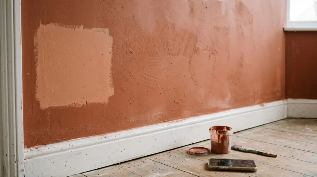
Dead Salmon is a dusty terracotta pink with grey in it, so it rarely reads as pink on a full wall. Against white trim and warm brass it feels soft rather than sweet. It is one of the clay colours showing up across 2026 living room schemes.
Farrow & Ball Estate Emulsion is typically in the £60 to £80 range for 2.5 litres, and coverage can be lighter than a trade vinyl matt, so plan an extra tin. The colour is strong enough that a sample pot on bare plaster is not a fair test. Paint a board and move it from the window wall to the sofa wall.
7. Setting Plaster by Farrow & Ball
Setting Plaster is the pink-neutral version of the same idea: warm, a little dusty, easy to live with next to jewel-tone cushions. Country Living has been showing it as a 2026 living room backdrop for that reason. It flatters mixed woods and old paintings.
It marks more than a harder finish if you use a flat emulsion. In a room with children or a dog, use a wipeable matt or eggshell on the lower wall, or accept touch-ups. Flat looks better. Eggshell cleans better. That is the real choice.
8. Potter’s Clay by Benjamin Moore
Potter’s Clay is a warmer terracotta than Dead Salmon, closer to fired clay. It suits a living room you use at night, because warm lamps make it glow rather than dull it. Linen, rattan, and unstained oak are the easy partners. High-gloss black metal can look harsh against it.
Do not use it on one feature wall behind the television and leave the rest white. The break makes the room feel smaller. If you want clay, paint the four walls, and keep the ceiling a warm white.
9. Caramelized by Sherwin-Williams
Caramelized is a honey-amber that behaves like late daylight. Design write-ups have grouped it with the 2026 warm shift, away from stark neutrals. It is bold. A small living room can take it if the ceiling stays light and the sofa is pale.
Test it at night. Amber colours shift a lot under warm bulbs and can look orange if the lampshade is cream. A white shade and a dimmer give you control.
10. Dry Sage by Benjamin Moore
Sage is the green that keeps appearing in 2026 living room paint ideas. Dry Sage is muted, so it does not go acid. It sits well with cream, terracotta, and oak. A stronger bottle green is a different job. This one can be the main wall colour without taking over the furniture.
Green shows undertone fast. A yellow-based sage and a blue-based cushion will clash. Hold the fabric on the sample before you buy 10 litres.
11. Calke Green by Farrow & Ball
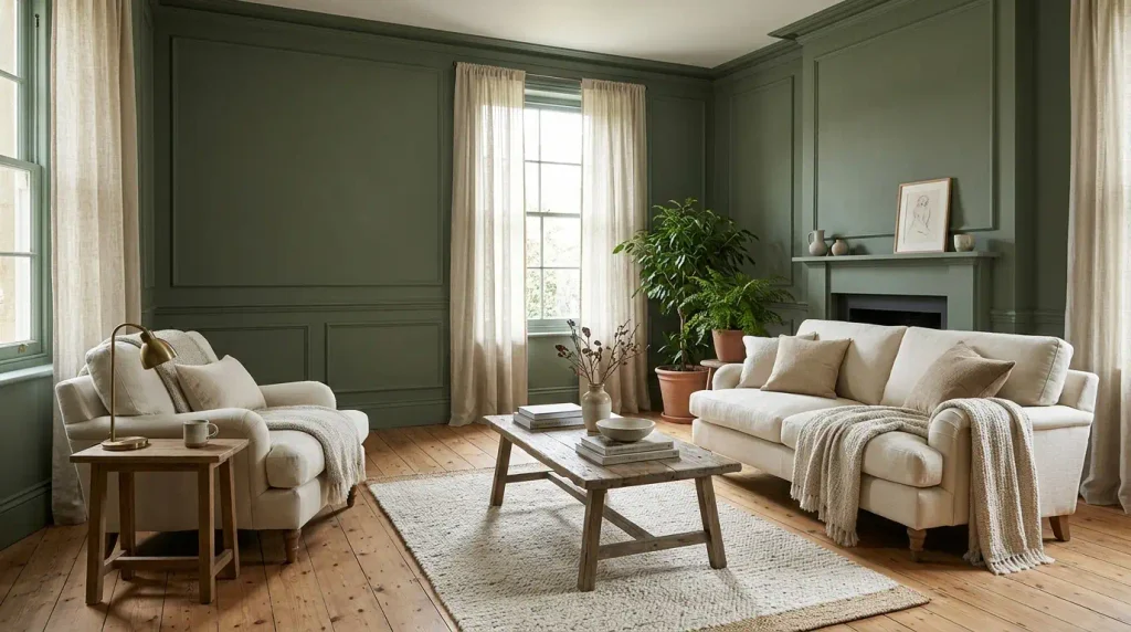
Calke Green is the deeper, dustier green, useful when the living room already has pattern or a gallery wall and you want the walls to recede. It has been used as a contrast to golden yellow in recent country schemes. On its own, with cream upholstery and a timber floor, it reads calm rather than themed.
Darker greens need more light. Two or three lamps at seat height matter more than a single ceiling fitting. Budget the lighting with the paint, not after.
12. Pigeon by Farrow & Ball
Pigeon is a soft blue-grey that still works in 2026 if the rest of the room is warm: terracotta textiles, timber, brass. Used with cool grey furniture it slips back into the last decade. Colour-drenching it, walls and woodwork together, is how recent rooms are using it, so the blue does not stop at the dado.
Blue-greys fail in north light more often than beiges do. If the only window faces north, prefer a khaki or a clay.
13. Endless Sea by Sherwin-Williams
Endless Sea is a deep blue-green used on walls, joinery, and even fire surrounds in current living rooms. It is a jewel tone, not a neutral. Paint the whole room or do not start. A single chimney breast in this colour, with white everywhere else, looks like an unfinished idea.
Coverage on a deep colour is the hidden cost. Deep bases often need a tinted primer and two or three top coats. A living room can move from a £80 paint job to £200 once primer, extra tins, and brushes are in. Those figures are typical trade-counter ranges in the UK and will differ elsewhere.
14. Hale Navy by Benjamin Moore
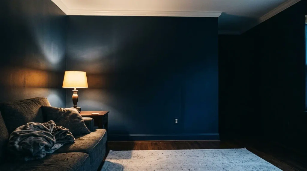
Hale Navy is a classic deep navy that stays blue rather than black. It anchors a living room with white trim, linen, and a pale rug. It also shows roller marks and patches, so cut in carefully and keep a wet edge.
Navy is a poor choice if you rely on one overhead light. The walls drink it. Add a floor lamp and a table lamp before you decide the room is too dark. Most people who hate dark paint hated the lighting, not the colour.
15. Alabaster by Sherwin-Williams
Alabaster is the warm white to use when you are not ready for clay or green, including on tall ceilings. Country Living has shown it on walls and a high barn ceiling for that calm, soft white look. It is not a statement. It is the colour that lets the sofa and the art do the work.
If the trim is already a yellowed white, paint the trim in the same Alabaster. Mixed whites are the usual reason a “simple white room” looks off.
What to spend, and how long it takes
| Job | Typical cost (GBP, approximate) | Time |
| Sample pots, 3 colours | £8 to £20 | 2 days of looking |
| Living room, two coats, trade emulsion | £50 to £120 in paint | 1 to 2 days |
| Same room, designer brand | £120 to £250 in paint | 1 to 2 days |
| Deep colour plus tinted primer | Add 30 to 50 percent | Add half a day |
| Professional labour, one living room | £250 to £600, varies by country | 1 to 2 days |
A weekend is realistic for a clear room, two coats, and a helper. Drying time, not the rolling, is what pushes it into a second day.
Finish, light, and the mistakes that waste a tin
Eggshell or a wipeable matt is the practical living room finish. Flat hides flaws and looks softer, and it marks at the light switch. Gloss belongs on woodwork only if you want that sharp line. Most rooms look calmer with trim in the same colour, a step lower in sheen.
Paint a patch at least 30 cm square on the actual wall. Look at it in the morning, at mid-afternoon, and with the lamps on. Two days is enough. A chip under shop lights is not.
Open-plan living and dining should share a colour, or two close shades in one family. A hard change at the island makes both rooms feel smaller. That is the gap in a lot of trend lists: they name a colour and never say what happens at the doorway.
If the shortlist is still wide, start with how to choose the right paint colour for your living room, then decide whether dark paint belongs in the room at all. The paint and colour guide covers the wider choice, and the living room colour scheme still has to agree with the sofa and the floor.
Conclusion
The best paint colours for a living room in 2026 are the warm ones you can live with at night, not the cool grey that looked tidy in a photo. Start with three samples, including one neutral and one clay or sage, and judge them on the wall you actually sit opposite. The right tin is the one that still looks calm when the lamps are on.
FAQs
What is the most popular living room paint colour for 2026?
Warm neutrals and earthy tones lead, with sage and clay close behind. Accessible Beige and White Dove are still the safe popular living room paint choices. Universal Khaki is the named 2026 direction from Sherwin-Williams, not a rule for every room.
What paint finish should a living room use?
A wipeable matt or eggshell. Flat marks. High gloss on walls shows every bump and feels harsh in daylight.
Can I use the same colour in the living room and the hall?
Yes, and in an open plan you should. A shared warm neutral, or the same colour at a lower strength in the hall, keeps the route into the room quiet.
Do I need a feature wall?
Usually no. One strong wall behind the sofa dates faster than four walls in a mid-tone. If you want depth, paint the chimney breast the same colour as the walls and change the finish, not the hue.
How do I stop a dark colour feeling gloomy?
Keep the ceiling light, add lamps at seat height, and use a pale rug. Dark green and navy fail when the only light is a ceiling spot.