The Best Grey Paint Colours Recommended by Interior Designers

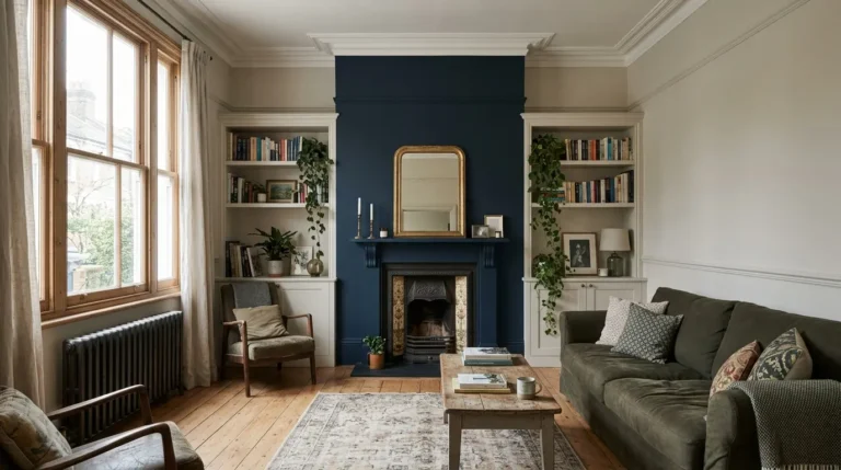
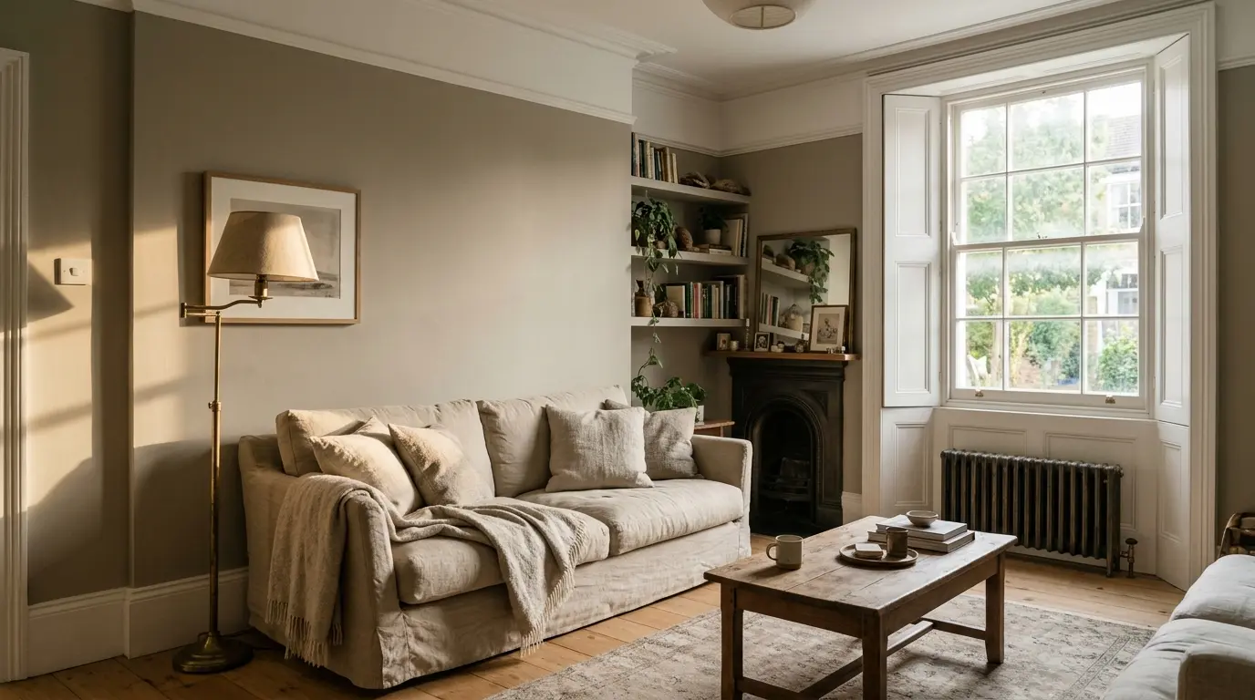
Interior designers in the UK keep returning to a small group of grey paints because they handle British light better than the cool blue-greys that dominated the last decade. The favourites sit in the greige family: warm enough to feel comfortable on a grey day, muted enough not to compete with furniture or artwork. Elephant’s Breath from Farrow & Ball remains one of the most specified mid-tone greiges, with its subtle pink-beige undertone that softens rather than chills a room. Cornforth White and Skimming Stone offer lighter options that still read as grey rather than pure white, while Little Greene’s French Grey family gives a more architectural, slightly cooler alternative that still avoids the flatness of a pure grey.
Why Designers Prefer Warm Greys Over Cool Ones
Cool greys with blue or green undertones look crisp in a showroom under bright lights but turn cold and flat in a typical UK north-facing room. Designers now recommend greiges with beige, taupe or slight pink undertones because they bounce the warmer light of afternoon and artificial lamps more kindly. How to use colour psychology to choose paint explains the practical side of this shift. A warm grey still feels modern but does not make a room feel institutional or unfinished.
Farrow & Ball Greys That Designers Specify Most
Elephant’s Breath No.229 is the standout mid-tone greige. It has enough depth to hide everyday marks yet enough warmth to work with oak floors and linen upholstery. Cornforth White No.228 sits lighter and reads almost as a soft stone in south light, making it a frequent choice for open-plan living areas. Skimming Stone No.241 is another designer staple: a warm off-white that still carries a grey note, useful when you want the calm of grey without the heaviness. These three cover most residential briefs because they respond well to changing daylight and pair cleanly with both brass and black metal fittings.
Little Greene and Dulux Options Designers Also Use
Little Greene French Grey is often specified when a slightly more tailored, less pink greige is needed. It sits well in period properties where a pure Farrow & Ball greige can feel too soft. Dulux Heritage ranges offer closer budget equivalents; Quartz Grey and Pebble Grey appear regularly in designer moodboards when cost is a factor. 15 best Farrow and Ball paint colours for every room shows how these greys sit alongside stronger colours in full schemes.
Undertones Matter More Than the Name
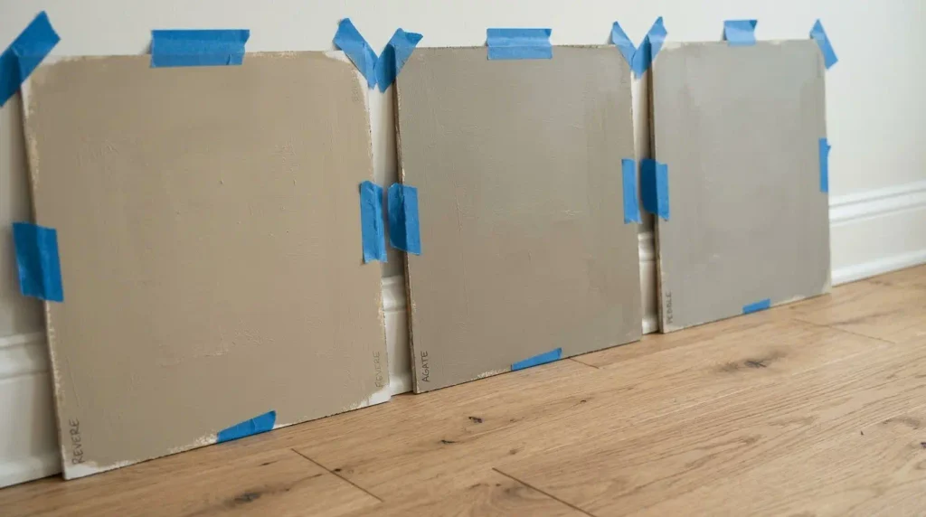
Two greys that look identical on a chip can diverge once painted. A pink undertone softens in warm light and can look slightly mauve next to cool stone. A green undertone stays quieter beside plants and oak. Designers check undertones by comparing the sample against a pure white and against the existing flooring or kitchen worktop. Always request a large sample board rather than relying on a small pot, and view it at different times of day. North light will cool any grey; south and west light will warm it. This is the single biggest reason people end up re-painting a room they thought was perfect in the shop.
Practical Checks Before You Order
Order sample pots of at least three greys and paint A2 or larger boards. Leave them on the wall for a week. Check them under your actual lighting, not just daylight. Measure the room’s light reflectance needs: darker greys absorb more light, so a hallway or north room may need a lighter LRV than a south-facing living room. Confirm the finish. Most designers use Estate Emulsion or equivalent matt for walls and eggshell for woodwork. Check coverage rates on the tin; greiges can need two full coats over a good primer, especially if covering a strong previous colour. Finally, buy enough for the whole room at once so batches match.
How Light Changes Grey Paint in UK Homes
UK light is rarely the bright, even light of a showroom. North-facing rooms receive cooler, flatter light that can push even a warm greige towards blue-grey. South-facing rooms get warmer light that brings out beige or pink undertones. East light is cooler in the morning and warmer later; west is the opposite. Designers account for this by testing samples at 9am, 1pm and 7pm under both daylight and the room’s own lamps. A grey that looks perfect at midday can look dull or pink at night. Artificial lighting matters too. Warm 2700K bulbs soften greiges further; cooler 4000K LEDs can make them look more grey. Match the sample test to the bulbs you actually use.
Pairing Greys with Other Colours and Materials
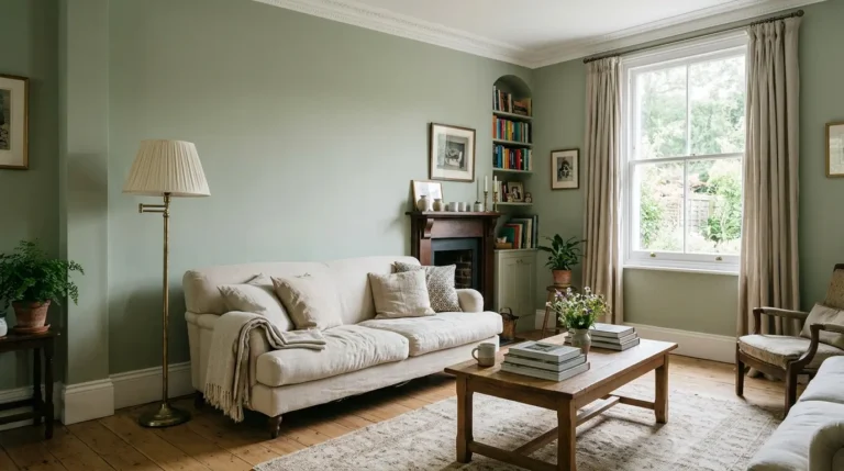
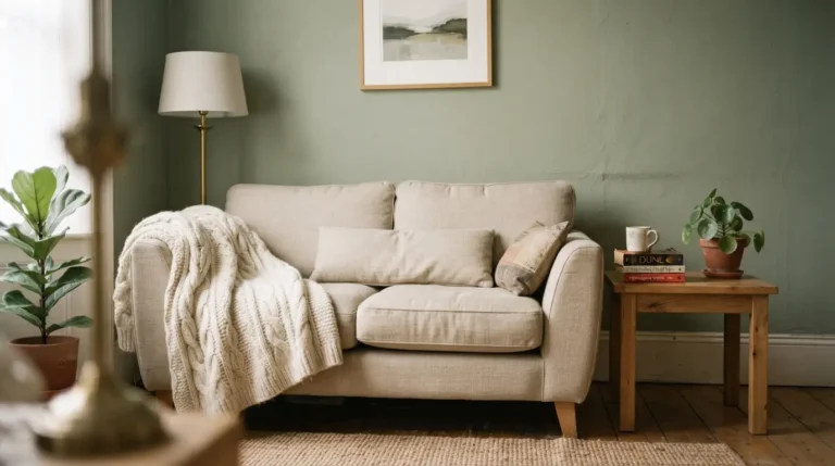
Warm greys work as a base for stronger colours. They sit comfortably beside sage green paint ideas and deeper forest greens without clashing. Brass and aged gold fittings warm them further; black metal keeps them sharper. Natural oak, linen and wool look richer against a greige than against a cool grey. For a feature wall, a darker greige or charcoal can create depth while the main walls stay lighter. Colour drenching a whole room in one greige, including woodwork, is another designer approach that removes the visual breaks and makes small rooms feel larger.
Coverage, Finish and Ordering Practicalities
Most quality emulsions cover around 10 to 12 square metres per litre per coat. A typical living room of 20 square metres of wall needs roughly 4 to 5 litres for two coats, plus extra for cutting in. Always order 10 percent more than calculated so you have the same batch for touch-ups. Matt finishes hide imperfections better and look softer; eggshell or satin on woodwork is more wipeable. For high-traffic hallways or kitchens, some designers specify a more durable scrubbable matt. Check the drying time and recoat window on the tin; most need two to four hours between coats in normal conditions. Store leftover paint correctly so it remains usable for future repairs.
The most frequent error is choosing a cool grey because it looked sophisticated online. In real British light it often looks grey-blue and flat. Another is failing to test against the floor. A warm greige next to cool grey tiles can look pink; next to yellow oak it can look beige. Skipping the large sample is costly. A third mistake is matching the grey too closely to the ceiling white, which makes the room feel unfinished rather than calm. Designers usually keep the ceiling a step lighter or pure white so the walls have definition.
Conclusion
The best grey paints recommended by UK designers are almost always warm greiges rather than pure cool greys. Elephant’s Breath, Cornforth White, Skimming Stone and Little Greene French Grey appear repeatedly because they handle variable light, hide marks and sit comfortably with natural materials. Test large samples in your own rooms, check undertones against your floors and lighting, and order full batches together. Done properly, a well-chosen grey becomes the quiet foundation that makes every other colour and material in the house look considered.
FAQs
What is the most popular grey paint among UK designers?
Elephant’s Breath by Farrow & Ball is the most frequently specified mid-tone greige. Its warm undertone works across most rooms and light conditions without looking cold.
Are cool greys still used?
Cool blue-greys are less common for main walls in 2026. Designers still use them for specific modern or coastal schemes, but warm greiges have largely replaced them for everyday rooms.
How do I test a grey paint properly?
Paint large boards or sections of wall, leave them for several days, and view them in morning, afternoon and evening light. Compare against your flooring and furniture before ordering full tins.