15 Best Farrow and Ball Paint Colours for Every Room

Farrow and Ball colours remain the reference point for UK interiors because the pigments sit differently under our changeable light and the finishes hide the small imperfections found in older plaster. Choosing well means matching the shade to the room’s aspect, the existing joinery, and how much wear the surface takes, rather than picking the name that looks nicest on a card. This guide covers the fifteen colours that consistently deliver results across living rooms, bedrooms, kitchens, bathrooms and hallways once you test them properly on the wall.
1. Skimming Stone
Skimming Stone is a warm greige that reads as a soft neutral rather than a grey. It works in north-facing rooms where cooler whites turn flat, and it pairs cleanly with oak flooring and black iron fittings. Use Estate Emulsion on walls and Estate Eggshell on skirting so the sheen stays consistent. Test a large sample for a week; the undertone shifts warmer in afternoon light. Many UK homes use it as the main wall colour and then pick a deeper Farrow and Ball shade for the feature wall, which you can see in our guide to how to choose the right Farrow and Ball colour for your home.
2. Ammonite
Ammonite is a light true grey with no strong green or pink cast. It sits well on modern plaster and makes small rooms feel larger without looking cold. Coverage is good; two coats usually suffice over a mist coat on new plaster. Avoid it in very dark hallways where it can read muddy. Pair it with white woodwork if you want contrast, or drench the room if you prefer a seamless look.
3. Hague Blue
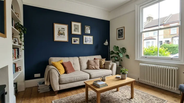
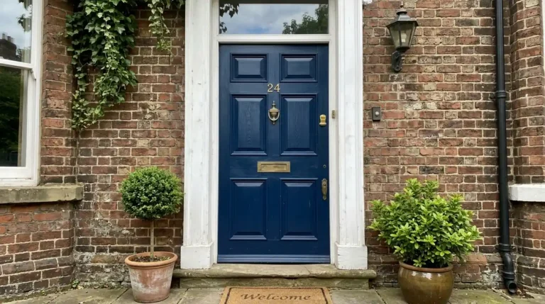
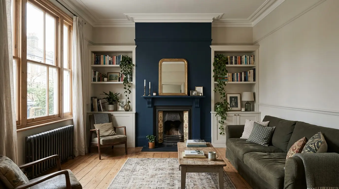
Hague Blue is a deep, slightly green-leaning navy that holds its colour under both daylight and warm bulbs. It is a strong choice for chimney breasts, kitchen islands and front doors. On walls it needs three coats if you are covering white, and the finish shows roller marks if the nap is too long. Use a short-pile roller and keep a wet edge. It looks especially effective when the remaining walls stay light; see our living room paint colour guide for how aspect affects deep blues.
4. Green Smoke
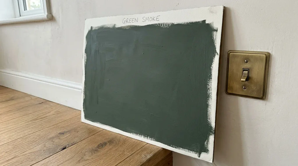
Green Smoke is a muted mid-green with grey undertones that feels calm rather than leafy. It works in bedrooms and snugs where you want depth without drama. The colour deepens on north walls, so sample both aspects if your home has mixed orientations. Estate Emulsion gives the softest result; Modern Emulsion is more wipeable for family rooms.
5. Dead Salmon
Dead Salmon is a dusty pink with brown undertones that never looks sugary. It brightens north-facing bedrooms and dining rooms and sits well with dark wood furniture. Two coats are usually enough. It can look slightly orange under cool LED bulbs, so check the lighting plan before ordering full tins. Many people use it as a feature wall opposite a window for the softest effect.
6. Railings
Railings is a soft blue-black that reads as charcoal rather than pure black. It is the standard choice for external doors, skirting and window frames in period properties. On interior walls it creates a dramatic feature but needs careful cutting-in around switches and sockets. Use eggshell or full gloss on woodwork for durability; the flat emulsion marks easily on high-traffic surfaces.
7. Pigeon
Pigeon is a mid blue-grey with green undertones that has become one of the most specified kitchen colours. It sits between grey and green so it bridges modern and traditional schemes. It covers well and hides minor plaster imperfections better than pure whites. Sample it next to your worktop; the green can pull stronger against stone than against wood.
8. Inchyra Blue
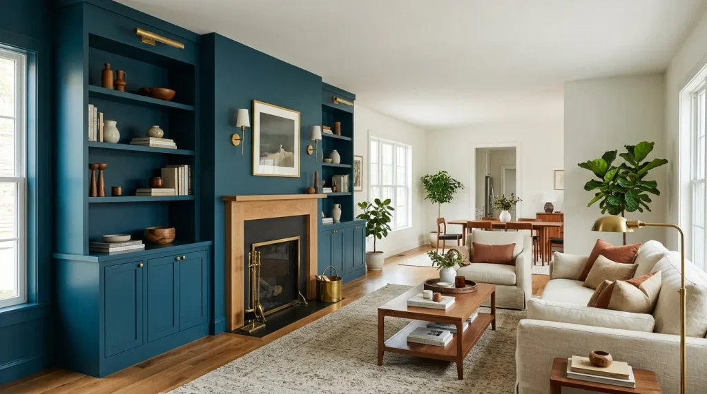
Inchyra Blue is a rich teal-blue that remains popular for living room feature walls and cabinetry. It holds its saturation in both morning and evening light. Expect three coats over pale bases. It pairs cleanly with warm woods and brass. If you are painting an open-plan space, keep the colour to one wall so the room does not feel enclosed; our feature wall ideas page covers placement in more detail.
9. Setting Plaster
Setting Plaster is a soft pink-beige that mimics the colour of raw plaster. It works especially well in north-facing rooms and bedrooms where you want warmth without yellow. The pigment is fine, so the finish looks smooth even on older walls. Two coats usually give full coverage. It is a safer alternative to pure pinks if you are unsure about stronger colour.
10. Cornforth White
Cornforth White is a cool-leaning off-white with grey undertones. It brightens dark hallways and works as a ceiling colour when the walls are deeper. It can look slightly blue in north light, so test it if your main rooms face that way. Use it on ceilings and woodwork when the walls are in a stronger Farrow and Ball shade for a cohesive scheme.
11. Elephant’s Breath
Elephant’s Breath is a warm mid-grey with brown undertones that avoids the cool cast of many greys. It suits living rooms and bedrooms in both traditional and contemporary homes. Coverage is reliable. It pairs well with natural oak and linen. Sample it beside your flooring; the brown can strengthen against red-based woods.
12. Stiffkey Blue
Stiffkey Blue is a deep, slightly green navy that works on feature walls and cabinetry. It is darker than Hague Blue and creates a more enclosed feel, so it suits snugs and dining rooms better than open living spaces. Three coats are common. The colour looks richer under warm lighting, so check your bulbs before committing.
13. Olive
Olive is a yellow-green that sits between sage and khaki. It is useful in kitchens and studies where you want a natural tone without strong blue undertones. It can look muddy in very low light, so it performs best in rooms with some daylight. Estate Emulsion keeps the finish soft; eggshell on woodwork matches the colour without adding shine.
14. Peignoir
Peignoir is a soft grey-pink that works as a gentle alternative to pure neutrals. It brightens bedrooms and hallways without looking cold. Two coats usually cover. It pairs cleanly with white woodwork and pale floors. Test it in both natural and artificial light because the pink can strengthen under warm bulbs.
15. All White
All White is a clean, slightly warm white that works as a ceiling colour and as a full-room scheme when you want maximum light. It is brighter than many off-whites and can look stark on north walls if the rest of the scheme is warm. Use it on ceilings when walls are in deeper colours, or as the main colour in very small rooms where any depth would close the space.
Conclusion
The best Farrow and Ball colours for your rooms are the ones that still look right after a week of testing on the actual wall, under your existing lighting and next to your flooring and joinery. Order sample pots, paint large areas, and check them at different times of day before you buy the full tins. That step saves more money than any discount on the paint itself.
What is the most popular Farrow and Ball colour in the UK?
Hague Blue, Green Smoke and Skimming Stone appear most often in UK specifications. Hague Blue is favoured for doors and feature walls, Green Smoke for bedrooms and snugs, and Skimming Stone as a versatile neutral.
Do I need special primer for Farrow and Ball paint?
On previously painted walls in good condition a mist coat of the same paint diluted 10–20 percent is usually enough. On new plaster or bare patches use the recommended primer or a diluted first coat so the finish does not flash.
How many coats do Farrow and Ball colours need?
Most mid-tones need two coats over a prepared surface. Deep colours such as Hague Blue, Railings and Stiffkey Blue often need three coats for even coverage, especially over white.