12 Front Door Colour Ideas to Boost Your Home’s Kerb Appeal

Front door colour ideas work best when chosen to match your property’s actual character, brick tone, and even the climate it sits in, rather than picked purely because a shade looks appealing on a paint chart. The 12 ideas below cover the pairings and honest practical considerations worth knowing, since a front door genuinely acts as the visual anchor for the whole facade, and getting the colour right does real work lifting a tired exterior.
1. Deep Green for a Victorian or Edwardian Terrace
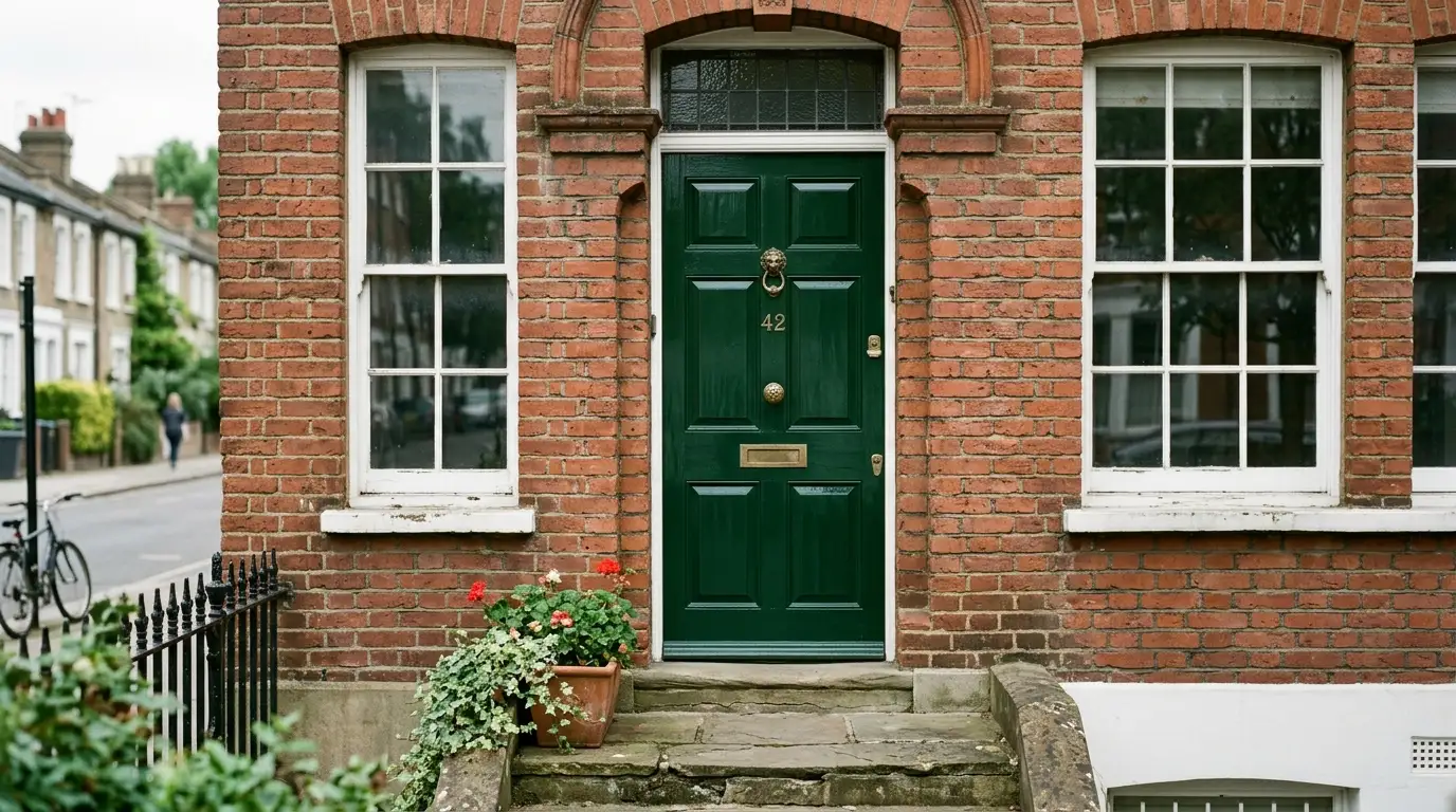
A rich, deep green complements original brickwork and sash windows beautifully on a period terrace, reading as genuinely heritage-appropriate rather than a modern imposition on an older property. This shade works particularly well alongside brass or polished ironmongery, tying the door hardware into the same considered, traditional look.
2. Oxford Blue for Period-Appropriate Boldness
A confident navy or Oxford blue brings genuine boldness to a period property without straying outside what feels historically appropriate, sitting comfortably alongside natural stone and original brick detailing. This suits a terrace or period semi where you want the door to stand out from neighbouring properties while still respecting the street’s overall character.
3. Gloss Black for Traditional Formality
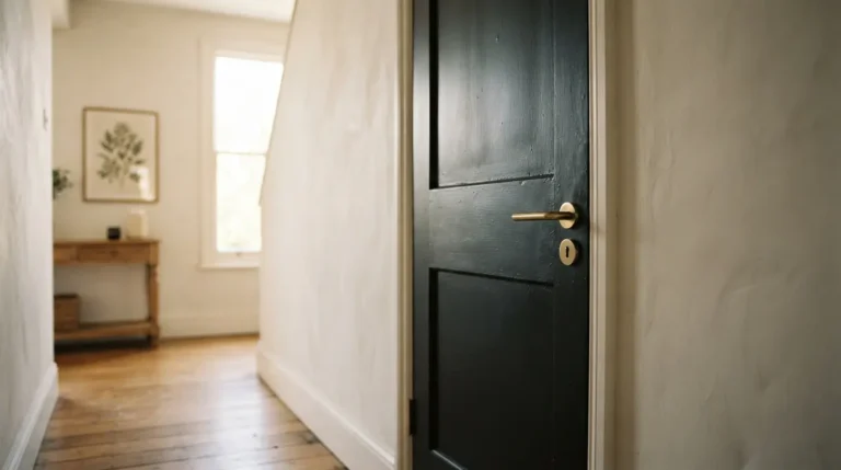
Black in a genuine gloss finish remains one of the most consistently popular choices across period properties, and it earns that popularity through real versatility, working on a Victorian terrace just as convincingly as a Georgian townhouse. The gloss specifically matters here, since it delivers the polished, formal look this colour is chosen for, while a flatter finish reads as considerably more casual.
4. Anthracite Grey for a Sharp, Modern Build
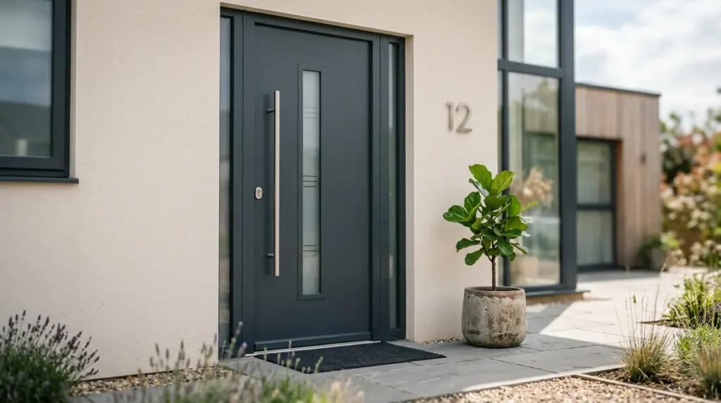
A newer property can genuinely handle more adventurous colour choices than a period one, and anthracite grey delivers a sharp, contemporary feel that suits a modern new-build particularly well. This shade has grown increasingly common on newer developments precisely because it adds real individuality against the neutral tones most volume housebuilders default to.
5. Mustard Yellow or Burnt Orange for a Confident Contemporary Statement
If your modern home already sits among a run of similar properties, a mustard yellow or burnt orange front door genuinely sets yours apart without looking out of place, since contemporary architecture generally handles bold colour more comfortably than a traditional facade does. This is worth choosing deliberately as a statement, rather than a colour you’re unsure about, since its whole purpose is standing out.
6. Duck-Egg Blue or Sage Green for a Rural Cottage
Soft, nature-inspired tones like duck-egg blue or sage green suit a rural cottage or countryside property particularly well, sitting comfortably within the surrounding landscape rather than competing with it. These muted shades also weather gracefully over the years, ageing into their surroundings rather than looking abruptly dated the way a more fashion-led colour sometimes can.
7. Soft Cream for a Natural, Stone-Cottage Look
A soft, off-white cream brings gentle warmth to a stone or rendered cottage without overpowering the natural material tones already present in the building itself. This suits a property where you want the door to feel like part of the overall material story rather than a separate, contrasting decision layered on top of it.
8. Match Green to Red Brick for a Reliable Classic Pairing
A sage or heritage green door against red brick is one of the most consistently reliable combinations across UK housing stock, and it works because the green genuinely complements the brick’s warmth rather than competing with it. This pairing suits nearly any red-brick property, whether period or more recent, and it’s a genuinely safe choice if you’re unsure where else to start.
9. Black or Navy Against Yellow London Stock Brick
Yellow London stock brick, common across many period properties in and around London, pairs particularly well with a black or deep navy door, the cooler, darker tone providing genuine contrast against the brick’s warmer, paler colour. This combination reads as considered and classic rather than accidental, precisely because the two tones sit at genuinely different ends of the colour temperature spectrum.
10. Anthracite or Bold Yellow Against White Render
A white or off-white rendered property gives you real freedom to go either direction, anthracite grey for a considered, contemporary contrast, or a genuinely bold yellow if you want the door to feel like a deliberate, cheerful statement against the pale backdrop. Both work because the render’s neutrality lets the door colour do all the visual work without competing for attention.
11. Check Conservation Area and Listed Building Rules Before You Choose
This is worth confirming honestly before you fall in love with any specific colour. If your property is listed, changing the front door colour can require formal listed building consent, and properties within a conservation area may be restricted to an approved palette set by the local council, sometimes based on genuine heritage research into what colours the area’s buildings would historically have used. Check with your local planning authority before committing to a colour if there’s any chance your property falls into either category, since repainting outside permitted guidelines can mean being asked to repaint again in a compliant shade.
12. Weigh Climate and Orientation Honestly Before Committing
This is the detail most colour guides skip, and it genuinely affects how well your choice holds up over the years. Darker colours absorb more heat, which on a south-facing timber door specifically can contribute to expansion and contraction over time, occasionally leading to minor warping or stress at the joints. Lighter colours reflect heat more effectively but show road dust, algae, and general grime considerably more readily, particularly in an urban or high-traffic area. If your home is in a coastal location, salt-laden air genuinely accelerates paint breakdown regardless of colour, so choosing a paint specifically rated for exterior durability matters even more there than in a sheltered inland setting.
Final Thoughts
The best front door colour ideas match your property’s actual character, brick tone, and real-world conditions, not just a shade you liked on a swatch. Consider your home’s period or style, check any conservation or listed building restrictions before committing, and weigh how your climate and the door’s orientation will affect the paint’s longevity, and the colour you choose will genuinely boost your home’s kerb appeal for years, not just until the first UK winter tests it.
FAQs
What front door colour suits a Victorian terrace?
Deep green, Oxford blue, and gloss black all suit a Victorian or Edwardian terrace particularly well, complementing original brickwork and sash windows without looking like a modern imposition on the property’s period character.
Do I need permission to change my front door colour?
Most homeowners don’t, but listed buildings often require formal listed building consent, and properties within a conservation area may be restricted to an approved colour palette. Check with your local planning authority if either applies to your property.
What colour front door works with red brick?
Sage or heritage green is one of the most reliable pairings with red brick, complementing its natural warmth rather than competing with it, and it works across both period and more recent red-brick properties.
Does front door colour affect how long the paint lasts?
Indirectly yes, darker colours absorb more heat and can contribute to expansion and contraction on a south-facing timber door, while lighter colours show dust and grime more readily, particularly in urban areas. Coastal locations accelerate paint breakdown regardless of colour due to salt-laden air.