How to Create a Moody and Dramatic Interior with Dark Paint

Creating a moody, dramatic interior with dark paint comes down to committing fully to a genuinely deep colour rather than testing the water with one cautious accent wall, then balancing that depth with real light, texture, and reflective detail. Done properly, a dark room feels cosy and sophisticated rather than small or oppressive, the fear that puts most people off dark paint in the first place.
Choose a Genuinely Deep Colour, Not Just “Dark”
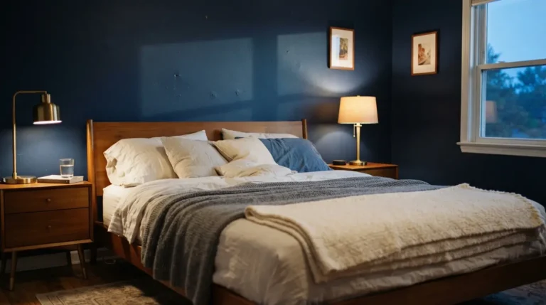
Charcoal, navy, deep forest green, and burgundy are the reliable starting points for a moody scheme, each carrying enough depth to feel genuinely dramatic without reading as simply black. These colours give you real richness to work with, and they pair naturally with warm accents, ivory cushions, a soft beige rug, brass fittings, that stop the room tipping into heaviness. Whichever family you choose, go for a shade with genuine depth rather than a mid-tone that’s merely darker than what you had before, a half-committed dark colour is one of the more common reasons a moody scheme falls flat.
Commit Fully Rather Than Painting a Single Accent Wall
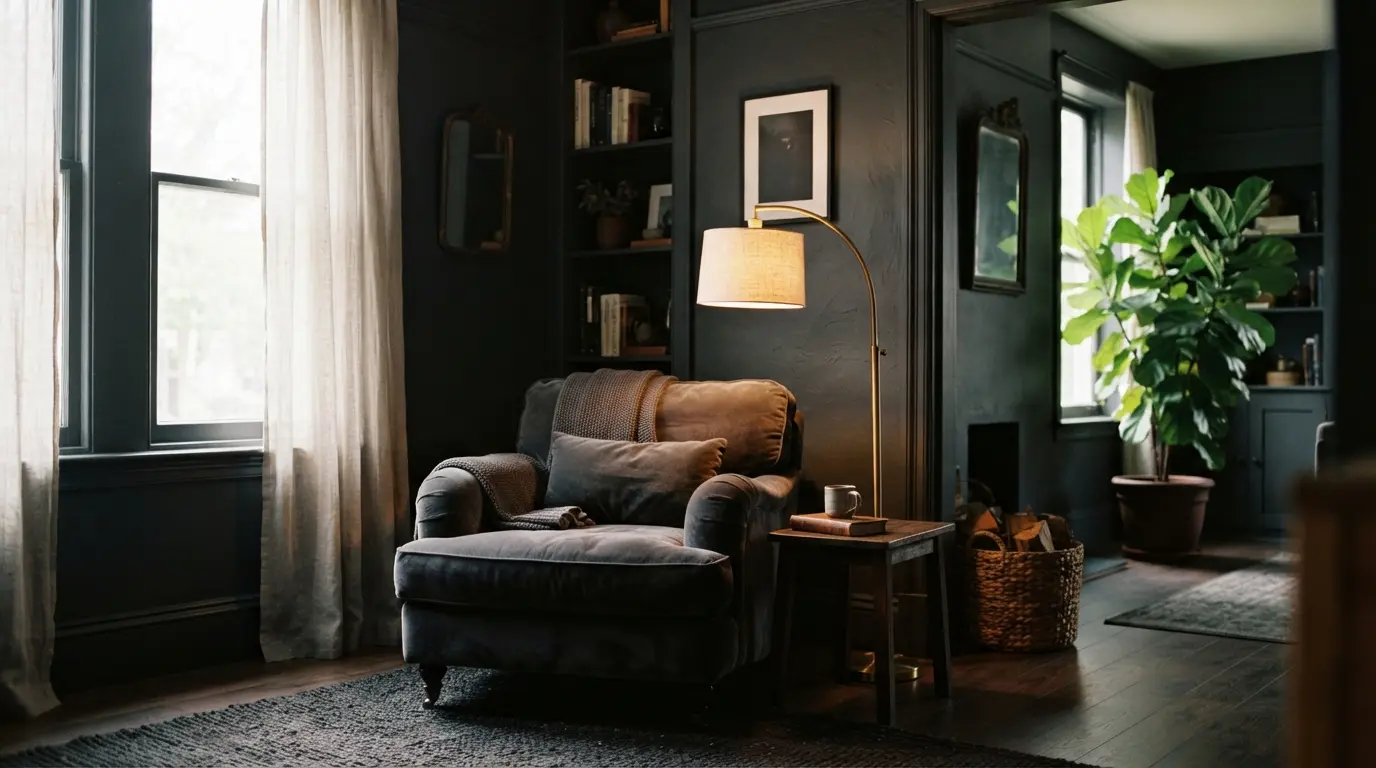
This is worth saying plainly: a lone dark wall against three lighter ones often looks tentative rather than intentional, and in a smaller room it can genuinely make the space feel more cramped than painting every wall the same depth of colour would. Painting the whole room, walls and often the woodwork too, in one confident colour reads as a deliberate embrace of the aesthetic rather than a nervous experiment. If you’re worried about scale, it’s worth remembering that the size of the room matters less here than how fully you commit, a small room painted entirely in one deep, considered colour tends to feel intimate and cocooning rather than cramped, provided the rest of the space, lighting, texture, reflective surfaces, is doing its job.
Decide Whether to Take the Ceiling Dark Too
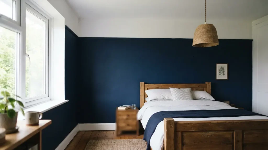
This is a genuine point of disagreement among people who work with dark interiors regularly, and it’s worth understanding both sides rather than following one rule blindly. Some professional decorators recommend keeping the ceiling light or white specifically, since this draws the eye upward and makes the room feel taller and less boxy, even while the walls stay deep and dramatic. Others recommend taking the same dark colour all the way up onto the ceiling and woodwork, known as colour drenching, which removes the visual break a paler ceiling creates and makes the whole room feel more genuinely enveloping and immersive. Neither approach is wrong, they simply prioritise different things: a light ceiling protects a sense of height and openness, while a fully drenched dark ceiling maximises the intimate, cocooning effect. Choose based on what your room actually needs, a lower-ceilinged room benefits more from the light-ceiling approach, while a room with generous height can usually afford to go fully dark without feeling oppressive.
Maximise Natural Light Rather Than Blocking It Out
One of the most persistent myths about dark interiors is that they automatically make a room feel small or closed in. In reality, a dark room can feel just as open as a pale one provided you make full use of whatever natural light it has. Keep windows uncovered or dressed in sheer fabric that filters light through rather than blocking it, and use mirrors deliberately to bounce daylight back into the room and visually extend the space. If the room genuinely lacks natural light, lean more heavily on the reflective and lighting techniques below rather than trying to force daylight the room doesn’t have.
Layer Your Lighting for Warmth After Dark
A single central ceiling light does a dark room no favours, since flat, harsh lighting works against the warmth and depth you’re trying to create. Combine overhead lighting with floor lamps, table lamps, and wall sconces, so the room has genuine layers of light to draw on rather than one binary on-off switch. Dimmable fittings are worth prioritising here specifically, since they let you shift the room’s intensity through the day, brighter for practical use, softer for evening atmosphere, and candles add a genuine flickering warmth that fixed lighting can’t quite replicate.
Bring In Texture So the Room Doesn’t Feel Flat
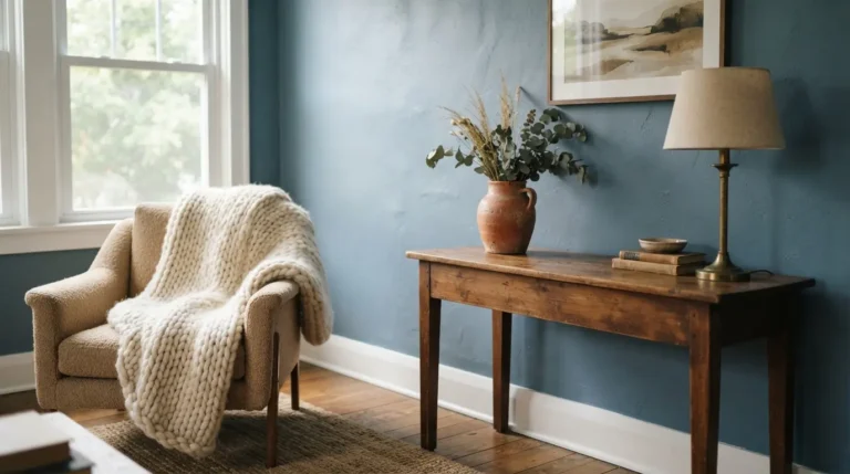
Colour alone isn’t what makes a moody room feel rich, texture does at least as much of the work. Velvet, wool, and silk all add a tactile depth that a flat-painted wall on its own can’t achieve, a plush velvet sofa in a deep navy or emerald genuinely elevates the whole scheme, and layering in textured cushions, a substantial throw, and a soft rug builds the room into something genuinely multi-dimensional rather than a single block of colour. This matters more in a dark room than a pale one, since texture is what stops a deep, uniform colour from reading as visually flat.
Use Metallic and Wood Accents to Stop the Room Feeling Heavy
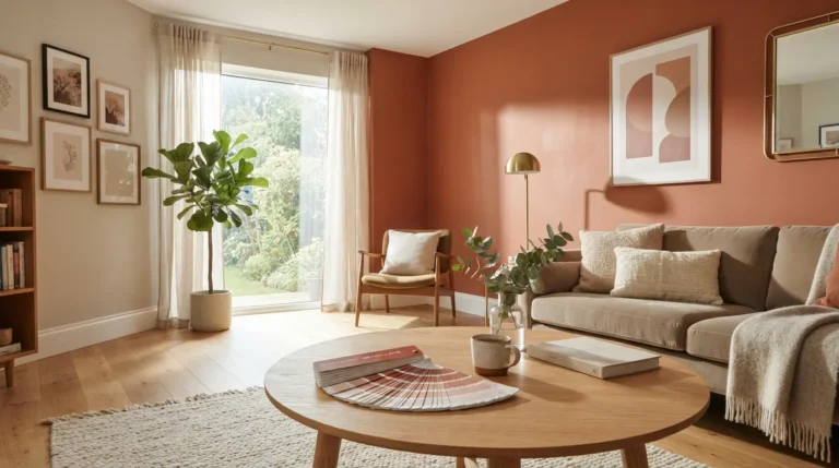
Brass, copper, and gold fittings introduce genuine reflective surfaces that bounce available light around a dark room, adding a sense of glow and dimension that flat, matte surfaces alone can’t provide. Wood does complementary work from a different angle, a natural wood coffee table or a wooden accessory brings warmth and organic texture that grounds the scheme and stops it feeling purely cold or severe. Balancing reflective metal with warm wood, rather than leaning entirely on one or the other, tends to give the most convincing result.
Break Up the Dark With Greenery and Art
Plants bring genuine life and colour contrast into a dark room, the combination of lush green foliage against deep walls reads as striking rather than clashing, and a large, sculptural plant makes a real statement without needing to compete for attention with anything else in the room. Dark walls also make an unusually effective backdrop for art, whether that’s a bold, colourful piece or a considered black-and-white photograph, since the depth of the wall colour lets artwork stand out with genuine presence rather than getting lost against a paler, busier background.
Final Thoughts
Creating a moody, dramatic interior with dark paint really comes down to committing fully to a genuinely deep colour and then balancing that depth with real light, layered lighting, texture, and reflective detail, rather than hedging with a single cautious accent wall. Choose your colour with intention, decide deliberately whether the ceiling goes dark or stays light, and the room will feel like a considered, sophisticated retreat rather than the small, gloomy space most people fear dark paint will create.
FAQs
Does dark paint make a small room feel smaller?
Not necessarily, and committing fully to one dark colour across a small room often reads as intentional and cosy rather than cramped, provided you maximise natural light, layer your lighting properly, and use reflective and textural details to add depth.
Should the ceiling be dark or light in a moody room?
Both approaches are genuinely valid and prioritise different things. A light ceiling keeps a sense of height and openness, particularly useful in a lower-ceilinged room, while taking the same dark colour up onto the ceiling creates a more immersive, enveloping effect, which suits a room with generous height particularly well.
Is a single dark accent wall a good idea?
It can work, but a lone dark wall against paler surrounding walls sometimes looks tentative rather than intentional, and in a smaller room it can occasionally make the space feel more cramped than committing to the whole room in one colour would.
What finish of paint works best for a dark room?
A slightly more reflective finish, rather than a completely flat matte, helps bounce available light around the space and adds a sense of depth and glow. This matters more in a dark scheme than a pale one, where flat finishes are generally more forgiving.
Do I need more coats of paint for a dark colour?
Often yes, particularly if you’re painting over a much paler existing colour. Budget for at least two coats, sometimes three, for genuinely even, rich coverage, since a patchy dark colour is considerably more visible than a patchy pale one.