How to Choose the Perfect Colour Scheme for Your Living Room

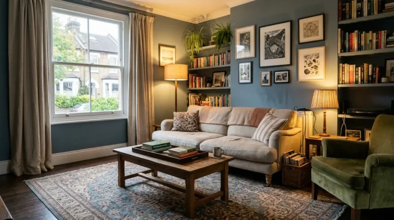
Choosing the perfect colour scheme for your living room starts with your room’s natural light, then builds outward using a simple ratio of dominant, secondary, and accent colours rather than picking paint first and hoping it works. Get the light and the ratio right, and almost any colour palette holds together.
Most people choosing living room colours end up overwhelmed by paint swatches, worried about picking something too bold, or stuck repainting the same wall three times because a colour that looked perfect on the tester pot turned out completely different once it dried on the wall. This guide walks through exactly how to choose a colour scheme guide that actually works in your specific room, not just in the paint shop.
What Is a Colour Scheme in Interior Design?
A colour scheme is the planned combination of colours used across a room’s walls, furniture, and accessories, typically built from a dominant colour, a secondary supporting colour, and one or two accent colours. It’s the structure that stops a room’s colours from feeling random or clashing.
A room with no real colour scheme usually isn’t lacking colour. It’s lacking a plan for how those colours relate to each other. Once you understand the basic roles each colour plays, choosing living room colours becomes a lot less about guessing and a lot more about filling in a structure you already understand.
How Do You Choose a Colour Scheme Based on Natural Light?
Choosing a colour scheme based on natural light means checking which direction your living room faces, since north-facing rooms need warmer tones to counteract cooler light, while south-facing rooms can handle cooler shades without feeling cold. This single factor changes how any colour actually reads on your walls.
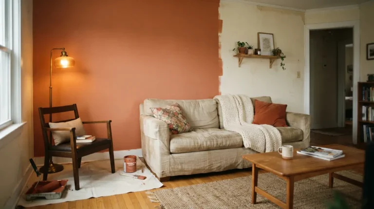
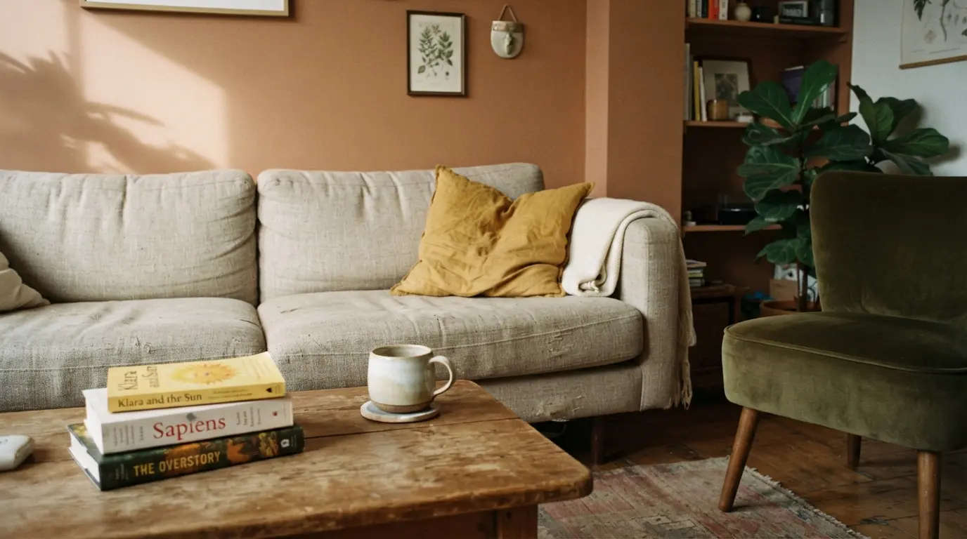
North-facing living rooms receive flatter, cooler daylight throughout the day, which can make blues, greys, and greens look duller or more muted than they appeared on the swatch. Warming these rooms up with tones that lean slightly yellow or red underneath, such as a warm terracotta or a soft clay, usually balances that cooler light out. South-facing rooms get warmer, more golden light for most of the day, which gives you far more flexibility, including cooler tones like sage green or soft blue that would otherwise feel chilly in a north-facing space. A common mistake homeowners make is choosing a colour purely from a small paint chip under shop lighting, then wondering why it looks completely different once it’s on a full wall in their own room’s specific light. Testing on the actual wall, at different times of day, is the only reliable way around this.
The 60-30-10 Rule: How Do Professional Designers Balance Colour?
The 60-30-10 rule splits a room’s colour scheme into 60 percent dominant colour, usually the walls and largest furniture, 30 percent secondary colour for items like curtains, rugs, or an accent chair, and 10 percent accent colour used in cushions, art, or small decor pieces.
This ratio is one of the most reliable tools for choosing living room colours that actually feel balanced rather than either too matchy or too chaotic. The dominant 60 percent sets the room’s overall mood and usually includes the wall colour along with your sofa if it’s a large neutral piece. The 30 percent secondary tone should relate to the dominant colour without matching it exactly, often a deeper or lighter shade from the same family, applied through curtains, an area rug, or a statement armchair. The final 10 percent is where you can afford to take the biggest risk, since accent colours in cushions or artwork are the cheapest and easiest to change if a bold choice doesn’t work out long term.
How Do You Choose the Best Colour for a Small or Dark Living Room?
The best colour for a small or dark living room is usually a lighter, warmer neutral or a soft mid-tone shade, since very dark colours can make a small space feel more enclosed unless the room also has strong natural light to balance it.
That said, a well-lit small room can actually handle a bolder, darker colour surprisingly well, since darkness alone doesn’t shrink a room the way people assume. What genuinely makes a small room feel cramped is poor contrast between walls, trim, and furniture, not the depth of the wall colour itself. A good rule of thumb for a genuinely dark room with limited natural light is sticking to warmer neutrals like a soft greige or warm white, since these reflect available light without looking flat or clinical the way a cool white sometimes can in low light conditions.
Warm vs Cool Colour Schemes: Which Suits Your Living Room?
Warm colour schemes use reds, oranges, yellows, and warm neutrals to create a cosy, inviting feel, while cool colour schemes use blues, greens, and greys for a calmer, more spacious feeling. The right choice depends on your room’s light, size, and the mood you want the space to have.
[Comparison Table: Warm vs Cool Colour Schemes]
| Factor | Warm Colour Scheme | Cool Colour Scheme |
| Best for room facing | North-facing, cooler light | South-facing, warmer light |
| Overall feeling | Cosy, energetic, inviting | Calm, spacious, restful |
| Works well in | Smaller rooms, family spaces | Larger rooms, quieter reading spaces |
| Common shades | Terracotta, warm clay, deep red | Sage green, soft blue, cool grey |
| Risk if overdone | Can feel heavy or dated | Can feel cold or flat |
Neither option is objectively better, and plenty of successful living rooms mix both, using a warm neutral wall with cooler accent pieces, or the reverse. The comparison matters most when you’re stuck choosing between two shortlisted colours and need a clearer way to decide which one actually fits your room’s conditions.
How Do You Test Paint Colours Before Committing?
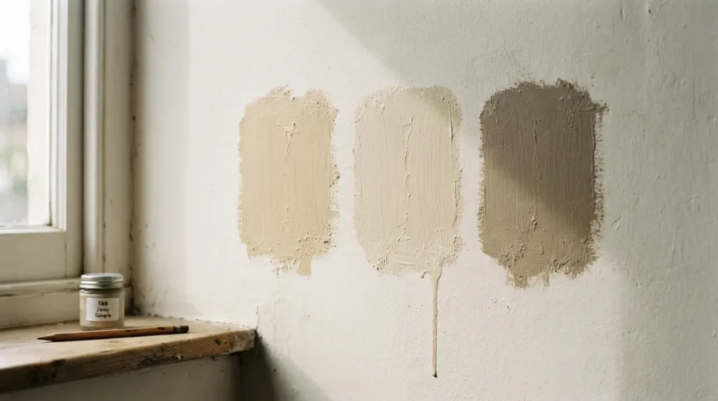
Testing paint colours properly means painting a large sample, at least A2 size, directly onto the wall in two or three different spots around the room, then observing it across a full day rather than judging it in a single moment of light.
A small tester pot and swatch card, generally costing £5 to £10 per colour, is a worthwhile spend before committing to a full room’s worth of paint at £30 to £60 per tin depending on brand and finish. Painting directly onto the wall, rather than onto paper or card, matters more than most guides admit, since wall texture and the wall’s existing colour underneath both affect how a new shade actually reads once dry. A common mistake first-timers make is testing a colour only in daylight and skipping the evening check under artificial lighting, when warm bulb tones can shift a cool grey toward green or a soft white toward yellow in ways that surprise people once the whole room is painted.
How Do You Build a Colour Scheme Around Existing Furniture?
Building a colour scheme around existing furniture means treating a large piece like a sofa as your fixed dominant colour, then choosing wall and accent colours that complement it rather than starting from a blank canvas and hoping the furniture will match later.
Pulling one existing colour already present somewhere in the room, whether from a rug, a piece of art, or upholstery pattern, and using it as your wall colour or a key accent creates a far more cohesive look than choosing paint in total isolation. This approach also solves one of the most common frustrations homeowners run into, which is falling in love with a paint colour that then clashes badly with a sofa or rug they’re not ready to replace.
What Are the Living Room Colour Trends for 2026?
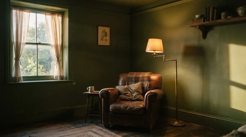
Living room colour trends for 2026 are moving toward richer, more saturated shades like olive green, deep indigo, and burgundy, replacing the flat beige and grey neutrals that dominated the past several years, alongside a continued rise in colour drenching a full room in one cohesive tone.
Colour drenching, where walls, trim, and even ceiling are painted in the same or closely related shade, is becoming a popular way to make a smaller room feel more enveloping rather than choppy with contrasting trim. Softer neutrals haven’t disappeared entirely, but they’re increasingly paired with richer, earthier accent tones like clay, rust, or chocolate brown rather than standing alone as the room’s only colour statement. Whether these trend shades suit your specific living room still comes back to the same fundamentals covered above, since a bold olive green will read completely differently in a bright south-facing room than in a darker north-facing one.
Common Colour Scheme Mistakes to Avoid
The most common mistake is choosing every colour in a scheme from the same intensity or saturation level, which flattens the whole room and removes the contrast that makes a colour scheme feel intentional rather than accidental. Mixing a deeper dominant tone with lighter secondary and accent shades almost always reads better than three colours of similar strength competing for attention.
A second frequent issue is ignoring the room’s flooring and existing woodwork when choosing wall colour, then discovering the new paint clashes badly with an oak floor or a set of pine skirting boards that aren’t being replaced any time soon. Holding your paint swatch against the actual floor and trim before buying a full tin avoids this exact problem, and it takes only a few minutes compared to the cost and time of a full repaint.
Conclusion
Choosing the perfect colour scheme for your living room comes down to understanding your room’s light, applying the 60-30-10 ratio, and testing properly before committing to a full repaint. Whether you land on a warm terracotta, a cool sage green, or one of the richer 2026 shades like olive or indigo, the same fundamentals apply regardless of which colour you’re drawn to. Test on the actual wall, check it against your existing furniture and flooring, and build outward from there. That process will get you a living room colour scheme that still looks right in a year, not just on the day you finish painting.
FAQs
How do I choose a colour scheme for my living room?
Start with your room’s natural light direction, then use the 60-30-10 rule to split dominant, secondary, and accent colours rather than choosing paint before considering the room’s existing conditions.
What is the best colour for a living room?
There’s no single best colour, since it depends on your room’s light and size, though warm neutrals and richer earthy tones like olive green and clay are currently popular and suit a wide range of rooms.
How do I know if a colour will look good in my room?
Paint a large test patch directly on the wall and observe it across a full day, including evening artificial light, since paint chips under shop lighting rarely match how a colour looks in your actual space.
Should living room walls be light or dark?
Either can work depending on the room’s natural light and size, and a well-lit small room can often handle a darker colour better than people expect, as long as contrast with trim and furniture is considered.
How many colours should be in a living room colour scheme?
Most successful schemes use three main colours, a dominant tone, a secondary supporting colour, and one accent colour, following the 60-30-10 ratio for balance.
Do I need to match my wall colour to my sofa?
Not exactly, but pulling one colour already present in your existing sofa, rug, or artwork into your wall or accent choices helps the whole room feel more cohesive.