10 Colour Drenching Ideas to Transform a Room in One Coat

Colour drenching transforms a room by covering walls, ceiling and woodwork in a single colour so the space feels continuous and intentional. The ideas below focus on practical UK applications: which rooms suit which depth of colour, what finishes hold up, and what to check before you order full tins. Each idea can be achieved with standard emulsions once the surfaces are prepared. The continuous colour removes the usual visual breaks at the ceiling line and skirting, which is why the technique feels more considered than a single feature wall.
1. Soft Sage for a Calming Bedroom
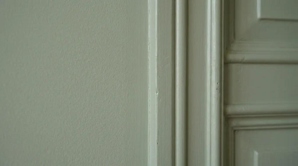
A muted sage green on walls, ceiling and woodwork creates a restful bedroom without feeling leafy. The colour stays calm under both daylight and warm bulbs. Use a durable matt so the finish hides minor plaster marks. Test the shade on the ceiling as well as the walls because it often reads deeper overhead. This approach works especially well in north-facing bedrooms where cooler colours can feel flat. Pair it with natural linen and pale wood so the scheme stays soft rather than high-contrast.
2. Warm Terracotta for a Dining Room
A soft terracotta or clay tone drenches a dining room in warmth and suits evening use. The colour pairs cleanly with wood tables and linen. Eggshell on the woodwork adds durability around chairs. Sample it under your dining lighting; warm bulbs strengthen the orange undertone. Keep the floor light if you want the room to feel open rather than enclosed. This works particularly well in rooms used mainly after dark, where the warmth is most noticeable.
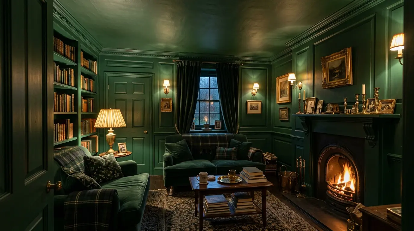
3. Deep Green for a Snug or Study
A rich bottle green or forest shade turns a snug into a cocoon. Include the ceiling so the colour wraps fully. The effect is strongest in rooms with limited daylight. Use a high-opacity paint so two coats cover; deep greens often need three over white. Pair with brass or dark wood rather than chrome so the scheme stays coherent. Add layered lighting so the colour does not feel flat once the daylight fades.
4. Soft Blue-Grey for a Hallway
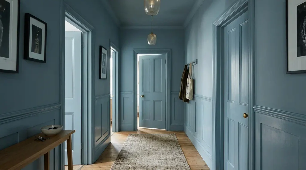
A mid blue-grey on walls, ceiling and doors makes a hallway feel continuous and less chopped by door frames. The colour is practical because marks show less than on pure white. Choose a wipeable finish for the lower walls and woodwork. Test it in the actual hallway light, which is often cooler and lower than in main rooms. Our cloakroom ideas page shows how small spaces benefit from continuous colour. Include the door frames so the colour flows past the openings.
5. Warm Off-White for a Bright Living Room
A warm off-white or soft cream drench keeps a living room light while removing the hard line between walls and ceiling. It works in south-facing rooms and open-plan spaces where deeper colour would feel heavy. The key is testing so the white does not turn cold. Use the same finish on woodwork so the scheme stays seamless rather than highlighting the joinery. This is a useful option if you want the benefits of drenching without committing to a strong colour.
6. Dusty Pink for a Bedroom or Dressing Room
A dusty pink with brown undertones feels gentle rather than sweet when used across all surfaces. It brightens north-facing bedrooms and pairs well with natural wood. Two coats usually cover. Check the colour under your bedroom lighting because warm bulbs can strengthen the pink. Keep artwork and textiles simple so the continuous colour remains the focus. Avoid very pale pinks if the room faces north, as they can look washed out.
7. Charcoal for a Dramatic Cloakroom
A soft charcoal or blue-black on every surface turns a small cloakroom into a considered space. The continuous colour hides the usual breaks around the basin and door. Use a durable matt or eggshell so the finish can be wiped. Deep colours need full coverage; plan for three coats. A single lighter element such as a mirror or towel rail prevents the room feeling too dark. This is one of the most effective uses of drenching in a small UK home.
8. Olive for a Kitchen or Utility
An olive or muted green on walls, ceiling and cabinetry creates a natural kitchen scheme. The colour sits well with wood worktops and stone. Use a moisture-resistant finish in the cooking zone. Sample next to your worktop because the green can shift against different stones. This works better in kitchens with some daylight; very dark kitchens can make olive look muddy. Include the ceiling so the scheme feels complete rather than stopping at the wall.
9. Soft Yellow for a North-Facing Room
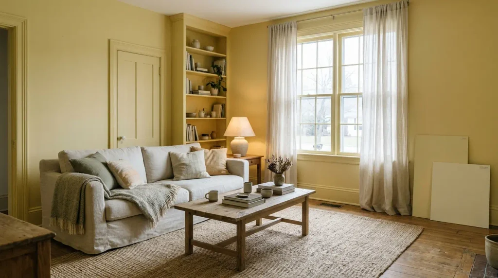
A buttery or soft yellow drench warms a north-facing room without looking bright. The colour reflects light and reduces the cool cast. Keep the shade muted so it does not feel nursery-like. Test large samples because yellow shifts more than many colours under different bulbs. Pair with natural materials so the scheme stays calm rather than high-contrast. This is particularly useful in rooms that feel cold for most of the year.
10. Mid Blue for a Bathroom or Ensuite
A mid blue on walls, ceiling and woodwork makes a bathroom feel calm and continuous. Choose a moisture-resistant emulsion suitable for bathrooms. Include the ceiling so steam marks are less visible. Test the colour in the actual bathroom light, which is often cooler. A single contrasting element such as a white basin or brass fittings keeps the scheme from feeling flat. Our bathroom paint colour ideas page covers moisture-resistant options in more detail. Ensure the paint is suitable for the humidity levels in your bathroom.
What to Check Before Ordering Paint
Calculate the full surface area of walls, ceiling and woodwork and add 10–15 percent for touch-ups. Confirm the paint is suitable for every surface you plan to cover. Order sample pots first and leave them in place for several days under both natural and artificial light. Check that the colour still works next to flooring, fixed joinery and any existing furniture you will keep. Only then order the full quantity so you avoid mismatched batches or running short mid-job.
Conclusion
Each of these colour drenching ideas works when the shade is tested on every surface, the finish matches the room’s use, and the preparation is complete before painting starts. The continuous colour removes visual breaks and makes the room feel more deliberate. Start with sample pots on walls, ceiling and woodwork, then order full tins only when the colour still looks right after several days.
Which rooms work best for colour drenching?
Bedrooms, snugs, dining rooms, hallways and cloakrooms suit the technique best. Large open-plan living spaces can feel heavy if the colour is deep, so mid or pale tones are safer there.
Do I need special paint for colour drenching?
No special formula is required, but the paint must be suitable for the surfaces you are covering and durable enough for the room. A good-quality emulsion with strong opacity reduces the number of coats.
Can I drench only the walls and leave the ceiling white?
Yes, but the result is closer to a traditional scheme than full drenching. Including the ceiling creates the continuous effect that defines the technique.