15 Feature Wall Paint Ideas to Create a Stunning Focal Point

A feature wall paint idea works when the colour, placement and finish create a clear focal point without overwhelming the rest of the room. The ideas below cover practical UK options: which walls suit which treatments, how depth of colour affects light, and what to check before you order paint. Each can be achieved with standard emulsions once the surface is prepared and the edges are masked cleanly.
1. Deep Navy Behind the Sofa
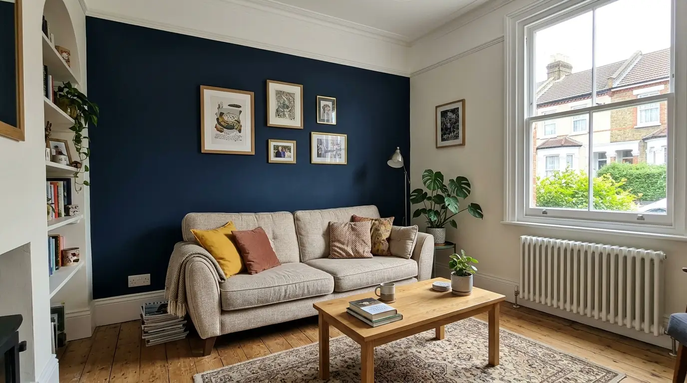
A deep navy on the wall behind the sofa creates an instant focal point and anchors the seating. The colour works in both traditional and contemporary rooms. Use three coats over white for solid coverage and a short-pile roller for a smooth finish. Keep the remaining walls light so the navy stays the focus. Test the shade in the room’s afternoon light, which can warm or cool the blue.
2. Soft Sage on a Chimney Breast
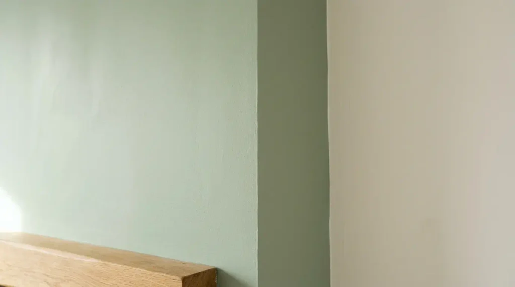
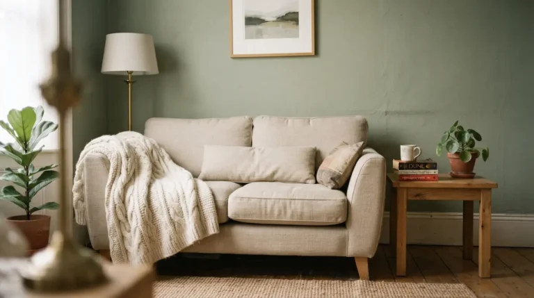
Painting only the chimney breast in a muted sage draws the eye to the fireplace without colouring the whole room. The colour pairs well with stone or brick surrounds. Matt emulsion hides minor surface texture. Mask the edges carefully where the breast meets the surrounding walls. This is one of the simplest ways to add colour in a period living room.
3. Warm Terracotta in a Dining Alcove
A soft terracotta on the end wall of a dining alcove or bay creates a warm backdrop for the table. The colour suits evening lighting. Eggshell on any adjacent woodwork matches the warmth. Sample it under your pendant lights because warm bulbs strengthen the orange. Keep the floor and table light if the alcove is small.
4. Charcoal Feature Wall in a Bedroom
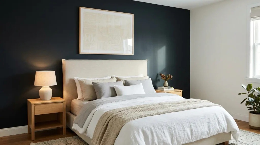
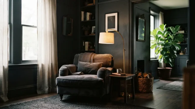
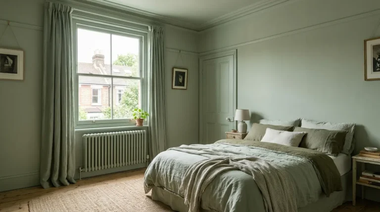
A soft charcoal or blue-black on the wall behind the bed creates a cocooning effect. The colour works best when the other walls stay pale. Use a durable matt so the finish can be wiped. Deep colours need full opacity; plan for three coats. A single lighter element such as a headboard or artwork prevents the wall feeling too heavy.
5. Dusty Pink Opposite a Window
A dusty pink with brown undertones on the wall opposite a window catches the light and brightens a north-facing room. The colour stays gentle rather than sweet. Two coats usually cover. Test it at different times of day because the pink can shift under changing light. Pair it with natural wood and linen so the scheme stays calm.
6. Olive Green on a Study Wall
An olive or muted green on one wall of a study or home office adds focus without distraction. The colour sits well with wood desks and bookshelves. Matt emulsion keeps the finish soft. Sample it next to your existing furniture because the green can pull stronger against certain woods. This works well in rooms with mixed light.
7. Soft Blue-Grey in a Hallway
A mid blue-grey on one long wall of a hallway adds depth and makes the space feel less flat. The colour is practical because marks show less than on white. Use a wipeable finish on the lower section. Test it in the hallway’s actual light, which is often cooler. Our feature wall ideas page covers placement in narrow spaces in more detail.
8. Warm Off-White with a Deeper Border
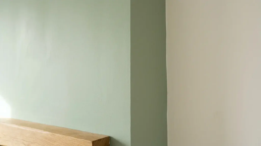
Paint the main wall in a warm off-white and add a deeper band or panel in a related tone for a subtle feature. The contrast is gentle and suits period homes. Mask the line carefully for a crisp edge. This approach works when you want a focal point without a strong colour. Check the two shades together on the wall before ordering full tins.
9. Deep Teal Behind a Media Unit
A rich teal on the wall behind a television or media unit creates a backdrop that makes the screen less dominant when off. The colour holds its saturation under both daylight and lamps. Use a high-opacity paint for even coverage. Keep the surrounding walls lighter so the teal remains the feature. Test it with the television in place if possible.
10. Soft Yellow on a North Wall
A muted yellow or buttery tone on a north-facing wall warms the room without looking bright. The colour reflects light and reduces the cool cast. Keep the shade soft so it does not feel high-contrast. Test large samples because yellow shifts more than many colours. Pair it with natural materials for a calm result.
11. Bottle Green in a Snug
A deep bottle green on one wall of a snug creates an enveloping feel while leaving the rest of the room lighter. The colour suits evening use. Three coats are common over white. Pair with brass or dark wood. Add layered lighting so the green does not feel flat once daylight fades.
12. Mid Blue in a Bathroom
A mid blue feature wall in a bathroom adds calm without colouring the whole room. Choose a moisture-resistant emulsion. The wall behind the bath or basin works well as the focal point. Test the colour in the bathroom’s actual light. Our bathroom paint colour ideas page covers finishes suitable for humidity.
13. Warm Grey on a Living Room Wall
A warm mid-grey with brown undertones on one wall adds depth without feeling cold. The colour works with both traditional and modern furniture. Matt emulsion hides minor marks. Sample it next to your flooring and sofa because the grey can shift against different materials. This is a useful middle ground between neutral and bold.
14. Soft Terracotta Behind a Bed
A soft terracotta or clay tone on the wall behind the bed creates a warm focal point in a bedroom. The colour suits both daylight and evening lighting. Two coats usually cover. Keep the other walls pale so the terracotta remains the feature. Test it under your bedside lighting.
15. Deep Plum in a Dining Room
A rich plum or aubergine on one wall of a dining room adds drama for evening meals. The colour works best when the rest of the room stays lighter. Use a high-opacity paint for solid coverage. Sample it under your dining lights because the shade can look different under warm bulbs. Pair with wood and linen for balance.
Conclusion
These feature wall paint ideas succeed when the wall is chosen carefully, the colour is tested in the actual room, and the edges are finished cleanly. Match the depth of colour to the light and the use of the space, then prepare the surface properly before painting. The result is a clear focal point that feels deliberate rather than experimental.
Which wall should be the feature wall?
Usually the first wall you see on entering the room, or the wall that already anchors the main furniture such as the sofa, bed or fireplace. Avoid walls broken by multiple openings.
How many coats does a feature wall need?
Most mid-tones need two coats. Deep colours such as navy, charcoal or bottle green often need three coats for even coverage over a pale base.
Can I use the same paint on woodwork next to the feature wall?
Yes, if you want the colour to continue. Many people keep woodwork in a lighter or contrasting finish so the feature wall stays distinct. Match the durability to how much the woodwork is touched.