10 Grey Kitchen Ideas for a Sleek and Timeless Space

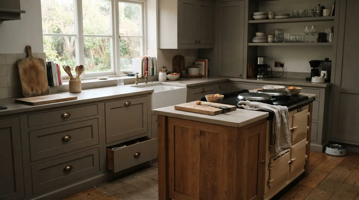
A grey kitchen works because the shade sits between the starkness of white and the commitment of a dark colour, giving you a calm, adaptable backdrop that pairs with almost anything from brass to black granite. The trick is picking the right undertone and pairing it with enough warmth that it never tips into the flat, cold look that gave grey kitchens a bad name a decade ago.
That reputation is the real hurdle. Plenty of homeowners still associate grey with builder-grade rental flooring and the slightly sterile, overly cool kitchens that were everywhere a decade ago. Done properly, with the right undertone and some genuine texture and warmth layered in, grey is one of the most durable colour choices a kitchen can have.
1. Mix grey cabinets with wood accents for warmth
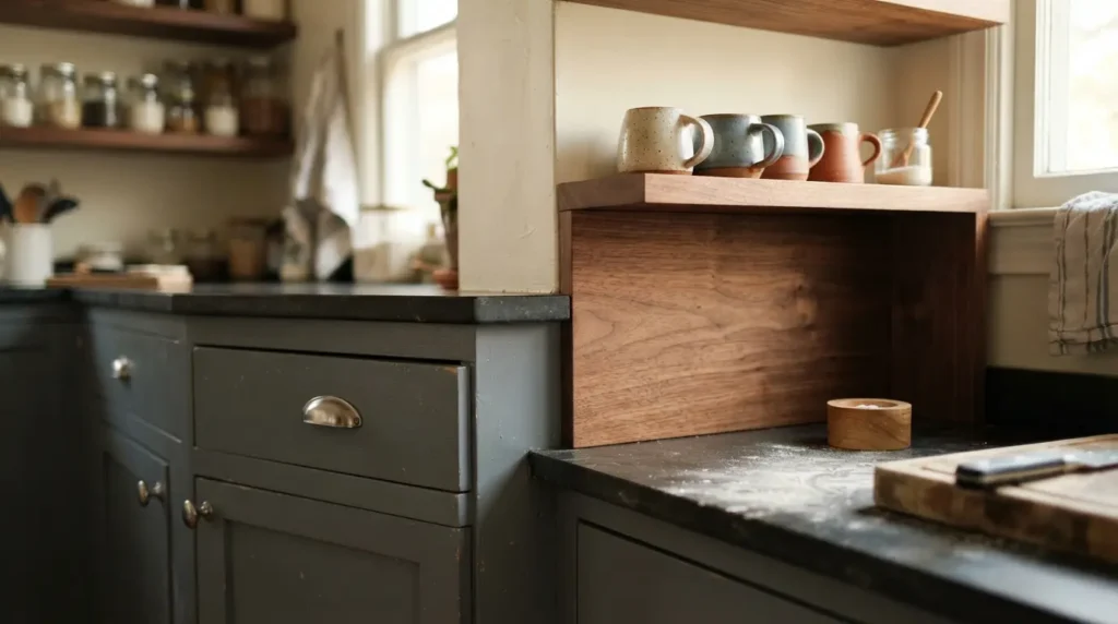
Grey on its own, especially a cooler-toned grey, can make a room feel chilly if there is nothing to counter it. Bringing in a wooden island, flooring, or open shelving solves this instantly, since timber’s natural warmth balances grey’s coolness without diluting the sophistication of the scheme.
A mid-tone grey with a warm undertone works particularly well against oak or walnut, since it avoids the two elements fighting each other on temperature. If your kitchen already has warm materials nearby, such as a creamy tiled splashback or a plaster range hood, choose a grey with a similarly warm lean rather than a cool, blue-based one, so nothing in the room feels at odds with everything else.
2. Let a statement range or worktop lead the palette
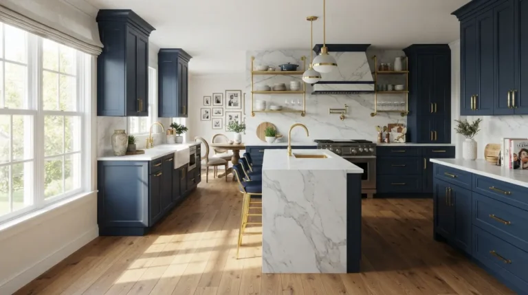
If your kitchen has one genuinely striking feature, a dramatic range cooker, a heavily veined marble worktop, an original brick chimney breast, grey cabinetry is one of the best backgrounds you can give it. A quieter neutral lets the statement piece do the talking instead of competing with it.
The order matters here. Choose the statement material first, then pick a grey that coordinates with its undertones rather than the other way round. A cooler-veined marble or a charcoal range generally wants a grey with a similarly cool lean; a warmer stone or a copper-toned range asks for a grey that leans slightly warm, so the two elements read as considered rather than accidental.
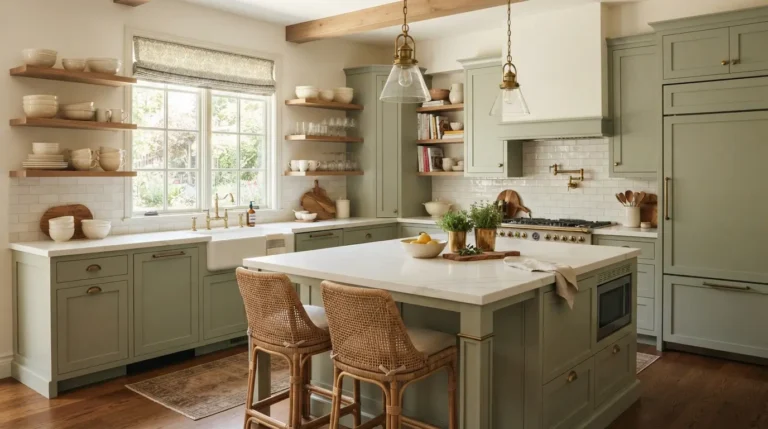
3. Choose green-grey for a softer, more inviting tone
Not all greys sit on the cool end of the spectrum. Shades that lean toward green rather than blue read as considerably warmer and more organic, and they tend to blend into a scheme rather than announce themselves, which is useful if you want colour without a strong visual statement.
This softer green-grey works particularly well running from cabinetry into an open-plan space, since a colour that blends rather than contrasts helps a kitchen feel like part of the wider room instead of a separate zone. It also pairs naturally with white or off-white zellige tiles, where the tile’s natural colour variation picks up the grey and green in the paint without needing to match exactly.
4. Go two-tone with a darker perimeter and lighter island
Most two-tone kitchens put the darker colour on the island and keep the perimeter pale, but flipping that arrangement, dark grey walls of cabinetry with a paler island, gives a scheme a more traditional, almost unfitted feel, as though the island is a separate piece of furniture rather than part of a fitted run.
This works best in a kitchen with enough floor area for the island to genuinely read as freestanding. In a smaller galley layout, a dark perimeter on both sides can close the room in rather than opening it up, so this idea suits a more generously proportioned space rather than a tight, narrow one.
5. Drench a small kitchen in one grey for a cohesive look
In a small kitchen, several different colours and materials competing for attention can make the room feel busier and smaller than it is. Painting cabinetry, and sometimes trim and walls, in a single warm-toned grey removes those visual breaks and lets the eye move around the room without interruption.
A soft, warm grey rather than a cool or dark one is the safer choice for this approach, since colour drenching in a small space relies on the shade feeling calm rather than heavy. Pair it with rich wooden worktops or warm brass hardware to stop the monochrome scheme from feeling flat, and add a few vintage or characterful pieces, since a single-colour room benefits from some texture and personality breaking up the surface.
6. Add a contrasting grey island for depth
If your main cabinetry is a lighter, more muted colour, whether that is pale green, soft blue or off-white, a darker grey island introduces contrast and grounds the room without requiring a full colour change. It is one of the lowest-risk ways to add depth to a kitchen that otherwise feels a little flat or washed out.
Keep the connecting elements consistent so the two tones feel related rather than random. Matching the hardware finish across both the island and the perimeter cabinetry, silver, brass or black, is usually enough to tie a two-colour scheme together even when the shades themselves sit fairly far apart.
7. Use pale grey walls to soften darker cabinetry
Grey does not have to live on the cabinets at all. Painting the walls a very light, almost imperceptible grey creates a gentle backdrop that takes some of the visual weight off dramatic cabinetry, marble or a dark worktop, without introducing a second strong colour into the room.
A warm, stony light grey on the walls tends to pick up the subtlest grey tones already present in stone worktops or splashback tiles, which is what makes this approach feel cohesive rather than like an afterthought. Because the wall colour is so pale, it often does not read as “grey” at all to a casual glance, it just makes the rest of the kitchen feel calmer.
8. Go dark and dramatic with charcoal or near-black grey
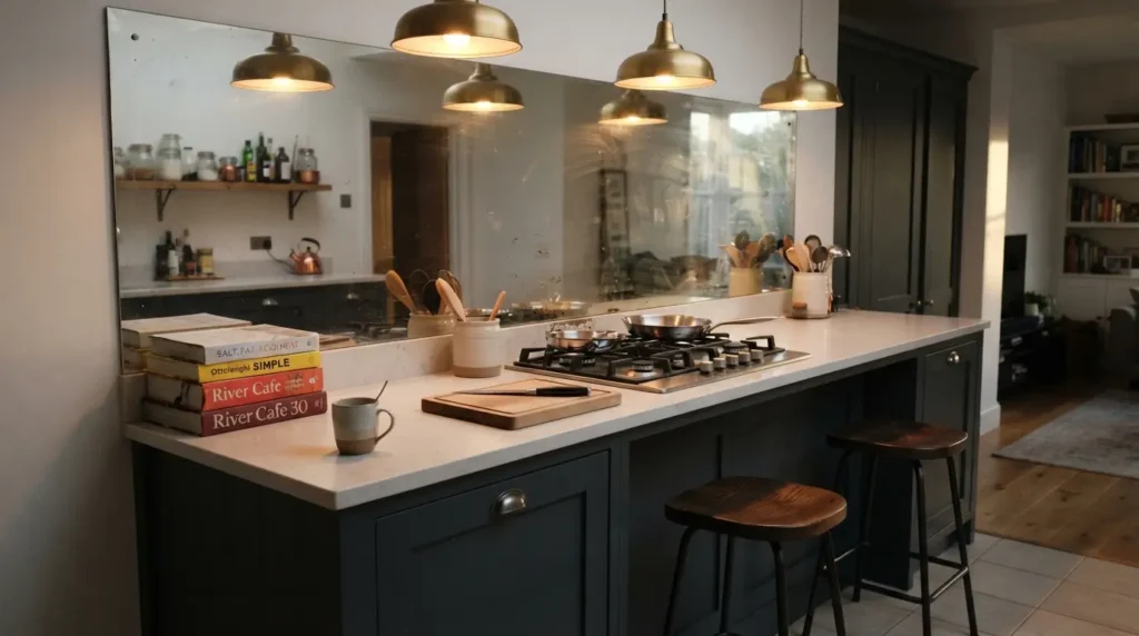
Not every grey kitchen needs to be soft and calming. A genuinely dark grey, close to charcoal or near-black, gives a kitchen a moodier, more architectural feel and works particularly well in a room with plenty of natural light to stop the depth of colour feeling oppressive.
| Grey depth | Best paired with | Effect on the room |
| Light, barely-there grey | White walls, brass or chrome hardware | Opens up a small or dark kitchen |
| Mid-tone grey | Marble worktops, oak or walnut accents | Balanced, versatile, works in most sizes |
| Charcoal to near-black | Reflective splashbacks, jewel tones, brass | Dramatic, best in larger or well-lit rooms |
A reflective element, a mirrored splashback, polished metal hardware, or a glossy stone worktop, helps bounce light around a dark grey kitchen and stops it feeling cave-like. In a room with limited daylight, a very dark grey is a harder colour to live with day to day, so this idea suits kitchens with strong natural light more than a north-facing galley with a single small window.
9. Pair grey with an unexpected accent colour
Grey’s reputation as a neutral is exactly what makes it such a flexible partner for a genuine pop of colour. Mustard yellow, terracotta, dusty blue or even a bright jewel tone all sit comfortably against grey because the grey does not compete for attention the way a bolder neutral like cream or beige sometimes can.
A mid-tone grey generally handles an accent colour better than a very pale or very dark one, since it has enough presence to feel intentional next to a bold hue without either colour washing the other out. This pairing works well introduced through an accent wall, open shelving styled with colourful ceramics, or bar stools, rather than committing the whole cabinet run to two colours at once.
10. Bring grey in through worktops and surfaces, not just paint
Grey does not have to arrive via a tin of paint at all. Marble with grey veining, honed granite, concrete worktops or grey-toned tile all introduce the colour through material and texture rather than a flat painted surface, which tends to add more visual depth than paint alone can manage.
This route suits homeowners who like the idea of grey but are wary of committing an entire run of cabinetry to it, since a worktop or splashback is easier to build a scheme around and, in some cases, easier to change later than painted or factory-finished doors. Balance is still the key concern: a strongly veined grey marble worktop generally wants a simpler, warmer cabinet colour around it, while a plainer grey concrete surface can handle busier or more colourful cabinetry without the two elements clashing.
What a grey kitchen actually costs
Grey itself does not carry a price premium over any other colour in most ranges, since it is a standard finish rather than a specialist one. Costs are driven far more by construction quality, door material and how much of the kitchen you are painting or fitting new.
| Tier | Typical supply-only range | What you get |
| Entry MDF, painted grey, flat-pack | Around £3,000 to £6,000 | Standard grey finish, foil or painted MDF, basic hinges |
| Mid-range rigid units, painted or foil | Around £8,000 to £16,000 | Better carcass construction, soft-close as standard, wider grey shade range |
| Bespoke hand-painted or solid timber | £18,000 upwards | Custom colour matching, solid wood or hardwood frames, bespoke sizing |
Figures are approximate, exclude worktops and appliances, and vary considerably by country and supplier. Installation typically adds 20 to 40 percent on top of the cabinet cost. If you are simply repainting existing cabinetry in a new grey rather than replacing units, a professional respray or hand-paint typically costs a fraction of full replacement, though the timeline still runs to several days once doors are removed, sprayed, dried and rehung.
On timing, a full grey kitchen from measure to installation generally runs six to ten weeks for a standard rigid or made-to-order range, with fitting itself taking five to eight working days for an average kitchen.
The maintenance reality of a grey kitchen
Grey is genuinely one of the more forgiving colours for daily wear, which is part of why it has stayed popular this long. It hides light marks, water spots and general daily grime better than a pure white, and it does not show grease and fingerprints as obviously as a very dark charcoal or black finish does.
That said, a matte grey paint finish still shows knocks and chips more visibly than a laminate or foil finish, since the paint sits as a coating rather than being part of the material itself. Keep any manufacturer’s touch-up paint pot on hand for this reason. A genuinely dark, near-black grey behaves more like a black kitchen in terms of maintenance: fingerprints and water spots on cabinet fronts near the sink and hob show up more than they would on a mid-tone grey, so an anti-fingerprint or super-matte finish is worth the small extra cost if you are going dark.
Undertones can also shift subtly over time under strong sunlight, particularly with cooler blue-based greys, which can occasionally take on a slightly different cast after several years of UV exposure near a bright window. This is a slow, cosmetic change rather than a structural issue, but it is worth knowing before committing a south-facing kitchen to a very cool-toned grey.
Common mistakes worth avoiding
Choosing a grey with the wrong undertone for the room’s light is the single most common regret. A cool, blue-based grey in a north-facing kitchen with limited daylight can look genuinely cold and grim rather than sophisticated, while the same shade in a bright, south-facing room might look perfectly fine. Test a large sample in the actual room, at different times of day, before committing to a full cabinet order.
Pairing grey with only cool-toned materials is the second trap. All-grey, all-cool kitchens, grey cabinets, cool white worktop, chrome hardware, grey flooring, can end up feeling exactly like the flat, sterile spaces that gave grey its bad reputation. At least one warm element, timber, brass, a warm-toned worktop, is usually what separates a grey kitchen that feels considered from one that feels like a rental.
Finally, treating grey as one single colour rather than a huge family of shades is a mistake that leads to disappointment at the paint counter. Warm greys, cool greys, green-greys, blue-greys and greige all behave completely differently once they are on a cabinet door rather than a swatch. Comparing two or three candidate shades side by side, rather than judging one in isolation, is the only reliable way to catch an undertone that will not sit well with your existing worktop or flooring.
Conclusion
A grey kitchen earns its long-standing popularity by sitting comfortably between the starkness of white and the commitment of a bold colour, but the shade only works when the undertone is right for the room’s light and there is enough warmth in the materials around it. Test large samples against your actual worktop and flooring before committing, lean toward a warm-leaning grey if your kitchen gets limited daylight, and bring in at least one genuinely warm material, whether that is timber, brass or a warm stone. Get that balance right and a grey kitchen will still look considered and current well beyond the trend cycle that first popularised it.
FAQs
Are grey kitchens still in style?
Yes. Designers widely agree grey remains a classic, versatile neutral, and its staying power has more to do with how it is used than the colour itself. A grey chosen with the right undertone and paired with some warmth ages considerably better than the flat, uniformly cool grey kitchens that were common a decade ago.
Do grey kitchens make a room feel cold?
Only if every other element in the room is also cool-toned. A grey with a warm undertone, paired with timber, brass hardware or a warm-toned worktop, avoids the cold, sterile look that gives grey kitchens their reputation.
What colour goes best with grey kitchen cabinets?
Warm wood tones like oak and walnut are the most reliable pairing, along with brass or bronze hardware. For a bolder look, yellow, terracotta, dusty blue and deep jewel tones all sit comfortably against grey because it does not compete with them the way some other neutrals can.
Should I choose a light or dark grey for a small kitchen?
A lighter, warm-toned grey generally suits a small or low-light kitchen better, since it reflects more light and avoids making the room feel boxed in. That said, colour drenching a small kitchen in one consistent mid-tone grey, rather than mixing several colours, can also work well and often feels more intentional than defaulting to pale grey out of caution.
Is grey or white better for a kitchen?
Neither is objectively better; the right choice depends on your worktop, flooring and how much natural light the room gets. Grey tends to hide daily marks and fingerprints slightly better than a pure white, while white can make a small or dark room feel brighter, provided it has a warm rather than a stark, cool undertone.
Do grey kitchens date quickly?
Grey itself has proven fairly durable as a kitchen colour over the past decade, but specific cool, flat grey shades tied closely to one particular trend period can feel dated faster than warmer, more nuanced greys like greige or green-grey. Choosing a shade for its undertone and pairing, rather than because it is currently trending, is the safer long-term bet.