15 Kitchen Colour Schemes That Always Look Stunning

A great kitchen colour scheme pairs a dominant cabinet tone with a worktop, wall and hardware finish that share the same warmth or coolness, so the whole room reads as one considered decision rather than a collection of separate choices. The fifteen kitchen colour scheme ideas below cover neutrals, bold statement shades and two-tone pairings that hold up in daily use, not just in photographs.
If you have ever stood in a paint aisle holding two swatches that looked identical on the card and completely different on your wall, you already know the real problem with choosing a kitchen colour scheme. It is not a shortage of pretty options. It is that colour behaves differently once it is spread across sixty square feet of cabinetry, hit by three different types of light across a day, and expected to still look good next to your worktop, your floor and whatever pans are drying on the rack. After years of sitting with clients at the cabinet stage of a renovation, I can tell you the schemes that age well share a few things in common: the cabinet colour, worktop and hardware share the same undertone, the palette works in both morning and evening light, and nobody involved chose it purely because it was trending that month.
1. Classic White with Warm Wood Accents
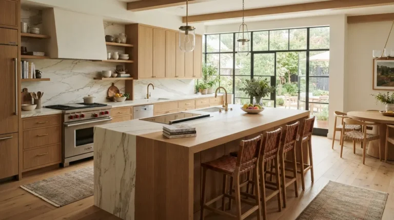
White remains the most requested kitchen colour scheme because it reflects light well and gives you a blank, flexible backdrop for everything else in the room. The trick most people miss is undertone: a bright, cool white suits handleless contemporary cabinetry, while a softer, warmer white sits better in a Shaker kitchen or a period property, so match the white to your kitchen’s overall style before you match anything else.
Pair white cabinetry with a natural stone or quartz worktop, then bring in warmth through open oak shelving, brass or unlacquered bronze pendant lights, and a textured tiled splashback. This is one of the few schemes that genuinely works in a north-facing room with limited daylight, since white bounces what light there is around the space rather than absorbing it. Expect to repaint or refinish cabinetry doors roughly every 8 to 12 years if you go for a painted (rather than laminate or lacquered) finish, since white shows scuffs and cooking splashes first.
2. Soft Grey with Natural Oak
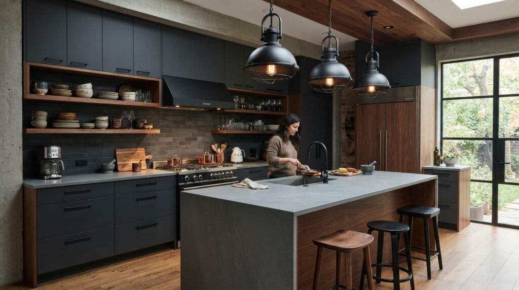
Grey has held its position as one of the most popular kitchen colours for well over a decade because the range within the colour family is so wide. Pale dove greys feel calm and Scandinavian, while deeper charcoal and slate greys bring a more dramatic, grounded feel, and both work well against warm wood tones.
Cooler, blue-leaning greys pair naturally with light oak or limed ash for a fresh, Nordic look, while warmer greige tones sit better against darker walnut or smoked oak for a richer, more layered result. One genuine trade-off worth knowing: flat matt grey shows water spots and fingerprints more readily than a satin or eggshell finish, so if you have young children or do a lot of hands-on cooking, ask your kitchen company for a wipeable finish rather than the flattest option on the sample board.
3. Cream and Ivory for a Softer Neutral
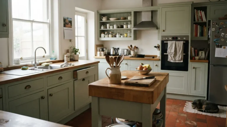
Cream and ivory sit in the gap between the crispness of white and the warmth of beige, which is exactly why they suit traditional, country and period kitchens where pure white can feel clinical. A cream Shaker kitchen with exposed stone flooring and open wooden shelving reads as relaxed and lived-in rather than showroom-new.
Cream is also one of the more forgiving choices for an open-plan kitchen diner, because it bridges into adjoining living space without needing an exact colour match to your existing walls or furniture. It pairs particularly well with sage green, dusty blue and warm brass, giving you room to change accent colours later without repainting the whole kitchen.
4. Navy Blue with Brass Hardware
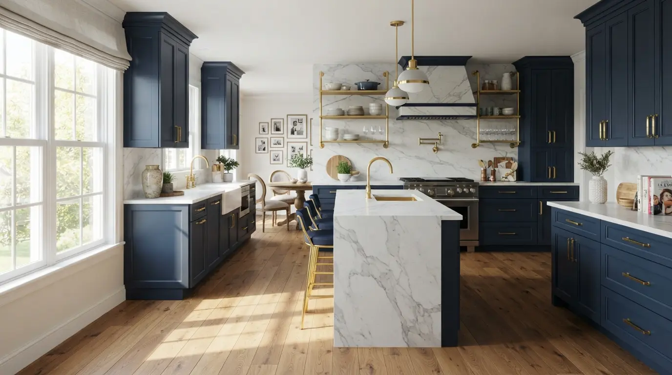
Navy is the boldest colour that still reads as broadly acceptable to future buyers, which is part of why it has become a genuine staple rather than a passing trend. Deep navy cabinetry with aged or unlacquered brass hardware adds real character and works in both traditional Shaker doors and sleek handleless designs.
Navy needs good light to earn its keep. In a well-lit kitchen it reads as rich and sophisticated; in a dim, north-facing galley kitchen it can feel heavy and closes the room in visually. Pair it with a pale quartz or marble worktop to keep the space feeling open, and bring in natural oak flooring or an oak island to stop the scheme feeling cold. As a rule of thumb, keep navy to lower cabinets or a single wall of units in a smaller or darker kitchen, and reserve full navy runs for rooms with strong natural light.
5. Sage and Forest Green
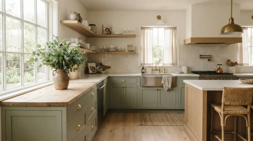
Green is currently one of the most requested colours across the whole kitchen category, and the appeal is easy to understand: it is the one bold colour that still feels calm rather than dramatic. Soft sage and muted olive greens are easy to live with day to day and age well because they sit close to a neutral on the colour wheel. Deeper forest and hunter greens create a moodier, more grown-up atmosphere and suit both country houses and modern townhouses.
If you are working on a kitchen diner colour scheme, sage green cabinetry flows naturally into warm white walls and linen-toned soft furnishings in the dining area, so you don’t need a hard visual break between the two zones. Green also pairs beautifully with either warm brass or classic brushed steel hardware, giving you flexibility depending on the rest of your fittings.
6. Deep Teal and Blue-Green
Teal and blue-green tones sit between classic blue and contemporary green, and that in-between quality is what makes them feel fresh rather than dated. They need decent natural light to look their best, so this scheme suits south or west-facing kitchens more than dim interior rooms.
Pair a teal or blue-green cabinet colour with white marble or pale quartz worktops, warm timber flooring and either brass or brushed stainless hardware. Because the colour itself carries a lot of visual weight, keep your splashback and walls in a simple neutral so the cabinetry stays the clear focal point rather than competing with a patterned tile.
7. Terracotta and Warm Clay Tones
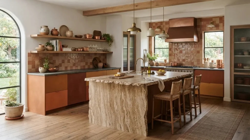
Earthy, warm palettes have been gaining ground as homeowners move away from purely cool neutrals, and terracotta is the clearest expression of that shift. Clay-inspired shades bring genuine warmth and a handmade quality that suits bespoke painted cabinetry particularly well, and they photograph beautifully against natural stone.
Balance terracotta with neutral walls and a plain stone or quartz worktop so the warmth of the cabinetry doesn’t tip into feeling overwhelming across a full run of units. This is a scheme that tends to work best on an island or a bank of lower cabinets rather than wall to wall, since a large expanse of warm orange-red can dominate a room that also needs to feel calm for everyday cooking.
8. Charcoal and Black with Brass Accents
For genuine drama, charcoal or black cabinetry paired with brass or gold hardware reads as luxurious rather than gloomy, provided the room has enough natural light and enough lighter surfaces to balance it. Deep matt shades like charcoal and black photograph and live better than high-gloss finishes, which tend to show fingerprints and reflect kitchen clutter.
Keep worktops, walls or flooring light to prevent the room feeling closed in, and lean on layered lighting, under-cabinet strips as well as pendants, to stop a dark kitchen feeling flat in the evening. This scheme is genuinely one to think twice about in a small, low-light kitchen; it is far more forgiving in an open-plan space with generous windows or bi-fold doors.
9. Warm Greige for Everyday Versatility
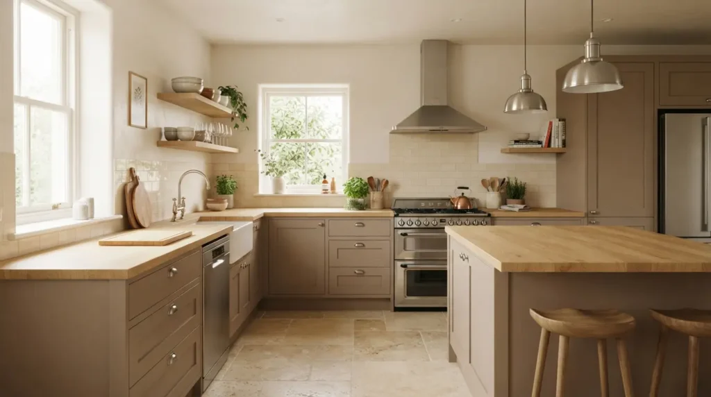
Greige, the blend of grey and beige, has become one of the safest bets in kitchen design because it reads as neither too cold nor too country. A mid-warm greige or mushroom tone pairs with warm white quartz, honed limestone or pale oak worktops, and with brushed nickel, satin chrome or aged brass hardware depending on the rest of your fittings.
Because greige sits so close to true neutral, it is genuinely one of the lowest-risk choices if you expect to sell your home within the next five to ten years, since it appeals to a wide range of tastes without feeling dated the way a stronger trend colour can within a decade.
10. Soft Blue with Off-White
Powder blue, duck egg and dusty cornflower shades bring colour into a kitchen without the commitment of navy or teal, and they suit coastal and country homes especially well. Soft blue pairs with pale quartz, white marble or warm oak worktops, and with brushed chrome, satin nickel or aged brass hardware.
This is a strong choice for a room with good natural light where you want the space to feel relaxed rather than dramatic. It is also one of the more forgiving colours for a small kitchen, since the paler end of the blue spectrum reflects light in a similar way to a true neutral while still giving the room some personality.
11. Two-Tone Cream and Sage
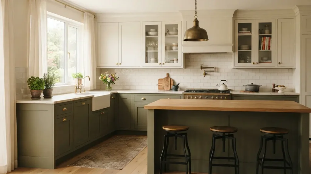
Two-tone kitchens, where upper and lower cabinets are painted in different but complementary shades, let you introduce a bolder colour without covering every surface in it. Cream or ivory uppers paired with sage or muted olive green lowers is one of the most reliable combinations, working equally well in a country kitchen or an open-plan kitchen diner.
The rule that makes two-tone schemes look intentional rather than mismatched is undertone matching: both colours need to lean either warm or cool, not one of each. Pair with honed sandstone, brushed concrete or pale quartz worktops and aged brass or matt gold hardware to tie the two tones together.
12. Monochromatic Grey Scale
Rather than mixing colours, a monochromatic scheme uses different shades and finishes of a single colour family, usually white through to charcoal, to build depth without visual clutter. This is a good option if you’re genuinely undecided on colour or like to refresh accents every few years, since a neutral base pairs with almost any accessory palette.
Texture does the work that colour contrast would otherwise do: combine a matt cabinet front with a glossy stone worktop, or pair brushed and polished metal hardware finishes within the same scheme, to stop an all-grey or all-white kitchen from feeling flat.
13. Black and White for Timeless Contrast
A black and white kitchen colour scheme is about as close to timeless as this category gets, because the contrast itself, rather than any particular shade, is what carries the look. Keep the bulk of your cabinetry and walls white to hold onto brightness, then bring in black through dining chairs, bar stools, pendant lighting, window trim or a single run of lower cabinets.
The main practical consideration is upkeep: black surfaces, especially gloss black, show dust, water spots and fingerprints noticeably more than lighter finishes, so factor in more frequent wiping down if you choose black for anything at counter height or below.
14. Warm Brown and Espresso Tones
Rich, warm brown and espresso-toned cabinetry has moved from a slightly dated choice back into genuinely elegant territory, particularly paired with marble or granite worktops and brass fixtures. Deep, saturated browns read as sophisticated rather than heavy when the room has enough natural light and enough lighter surfaces, stone worktops, pale flooring, to offset them.
This is a colour family worth choosing carefully if you struggle to visualise depth of tone from a small paint sample, since browns can shift noticeably between warm and slightly reddish or slightly grey depending on your kitchen’s lighting, so always test a large sample board on the actual wall before committing to a full cabinet order.
15. Bold Mustard or Ochre as an Accent
For homeowners who want genuine personality rather than a safe neutral, a saturated mustard, ochre or ochre-adjacent yellow works best as an accent rather than a whole-kitchen commitment: think an island, a run of lower units, or open shelving rather than every cabinet in the room. Paired with black, white or warmed neutral surrounding tones, a bold yellow reads as considered rather than overwhelming.
This is the scheme with the shortest realistic lifespan of the fifteen here; strong, trend-forward accent colours are the easiest and cheapest to update later precisely because they’re confined to a smaller area, so treat a bold accent as a five-to-eight-year decision rather than a twenty-year one, and keep your worktops and walls in a neutral that will outlast it.
How Much Does a New Kitchen Colour Scheme Cost?
Costs vary enormously by country, kitchen size and whether you’re painting existing cabinetry or replacing it entirely, so treat the figures below as a rough UK-centric guide rather than a quote.
| Approach | Typical Cost (GBP) | Typical Timeline |
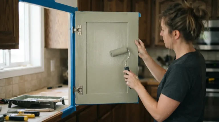
| Repainting existing cabinet doors (DIY) | £150–£400 in materials | 1 long weekend |
| Professional cabinet respray | £1,500–£4,000 for an average kitchen | 3–5 days |
| New cabinet doors, existing carcasses | £2,500–£6,000 | 1–2 weeks |
| Full new kitchen with a bespoke painted finish | £8,000–£25,000+ | 4–8 weeks including fitting |
Costs outside the UK will vary with local labour rates and material availability, so treat these as a starting point for conversation with a fitter rather than a fixed budget.
Choosing Colours That Suit Your Kitchen’s Light
Before you fall in love with a swatch, work out which way your kitchen faces and what kind of light it gets through the day. A north-facing kitchen with mostly indirect, cool daylight will make cool blues and greys read colder and flatter than they appeared on the sample card, so lean towards warmer whites, greiges and creams to compensate. A south or west-facing kitchen with strong warm light in the afternoon can carry cooler tones, navy, slate grey, teal, without them feeling harsh.
The most reliable way to test a colour is to buy a large sample pot, paint a piece of card at least A3 size, and move it around the room at different times of day, including after dark under your kitchen lighting. A swatch the size of a paint chip simply cannot show you how a colour behaves across a full run of cabinetry, and this single step prevents more costly regret than almost anything else in the whole process.
Common Mistakes to Avoid
Choosing a kitchen colour purely because it’s trending is the most common regret. A colour that dominates every Pinterest board this year is often the one that will feel dated within five to eight years, particularly saturated jewel tones and very specific paint-brand greens. That doesn’t mean avoid bold colour entirely, it means understand that a bold, trend-led choice is a shorter-term decision than a neutral one, and budget or plan accordingly.
Matching cabinetry to a single showroom sample without checking undertones against your existing worktop, flooring and wall colour is another frequent misstep. Two “greys” can have completely different undertones, one leaning blue, one leaning green, and clash badly together even though they look similar in isolation. Always bring a sample of your existing worktop or flooring to any colour consultation.
Finally, going too dark in a small or poorly lit kitchen without a plan for artificial lighting is a mistake that’s expensive to fix after the fact. If you love a dark scheme but your kitchen doesn’t get much natural light, invest in layered lighting, under-cabinet, pendant and ambient, at the same time as your cabinetry, not as an afterthought once the units are already fitted.
Conclusion
The best kitchen colour scheme is the one that still looks right at 7am in flat winter light and at 8pm under your kitchen spotlights, not just in a single well-lit photograph. Start with your room’s natural light and layout, choose a primary neutral or muted tone for your largest surfaces, and use bolder shades where they’re easiest to change later. Whichever of these fifteen kitchen colour scheme ideas you’re drawn to, test a large sample in your own space before committing, because that one step does more to guarantee a scheme you’ll still love in a decade than any trend report ever will.
FAQs
What is the most popular kitchen colour scheme right now?
Warm whites and off-whites paired with natural wood accents remain the most requested combination, closely followed by soft greys with brass hardware and sage or forest green. Deep navy and warm greige are also consistently popular because both offer colour without the shorter lifespan of a strongly trend-led hue.
What colours make a kitchen look more expensive?
Deep matt shades, navy, forest green, charcoal, tend to read as more luxurious than the same colours in a high-gloss finish. Warm white paired with brass hardware and natural stone worktops is a reliably high-end combination, and natural wood grain visible against painted cabinetry adds the layered, bespoke look that budget kitchens usually lack. Finish matters as much as colour: matt and eggshell almost always look more expensive than gloss.
Should kitchen cabinets be lighter or darker than the walls?
There’s no fixed rule, but keeping cabinetry slightly darker than the surrounding walls generally creates a more grounded, intentional feel. Very pale cabinetry against white walls can look washed out unless your worktop, flooring or hardware provide enough contrast to define the space. If you do choose dark cabinetry, slightly lighter walls help stop the room feeling heavy.
What is the best kitchen colour scheme for a small kitchen?
Lighter shades, pale greys, soft whites and warm cream, remain the safest foundation for a small kitchen because they help bounce available light around the room. If you want colour, keep it to the paler end of the spectrum, sky blue, blush pink, sage, or confine a bolder shade to a single feature like an island rather than a full run of cabinetry.
How do I stop my kitchen colour scheme looking dated in ten years?
Choose your primary, hardest-to-change surfaces, cabinetry and worktops, in a genuinely neutral or slow-moving colour, and reserve trend-led or saturated colours for elements that are cheap and easy to update later: a feature wall, open shelving, bar stools, or a small run of accent cabinetry. This gives you the personality of a bold colour choice without tying your whole kitchen’s lifespan to a single trend.
Does kitchen cabinet colour actually affect resale value?
Yes, to a measurable degree, though the effect varies by market and buyer taste. Some property data has linked darker, more considered neutral colours like charcoal grey to slightly higher achieved sale prices compared with plain white kitchens, while very bold or unusual colour choices can occasionally put off buyers who would need to repaint before moving in. If resale is a near-term concern, a well-executed neutral with a warm accent is generally the lowest-risk choice.