Gallery Wall Ideas to Transform a Blank Living Room Wall

Gallery wall ideas work best when the concept actually suits your wall’s size and your room’s style, rather than copying the first arrangement you saw online. The 12 ideas below cover genuinely different approaches, dense and eclectic, minimal and modern, no-nail and renter-friendly, along with the practical checks that decide whether the finished wall actually holds up.
1. Classic Salon-Style Wall for a Large, Empty Wall
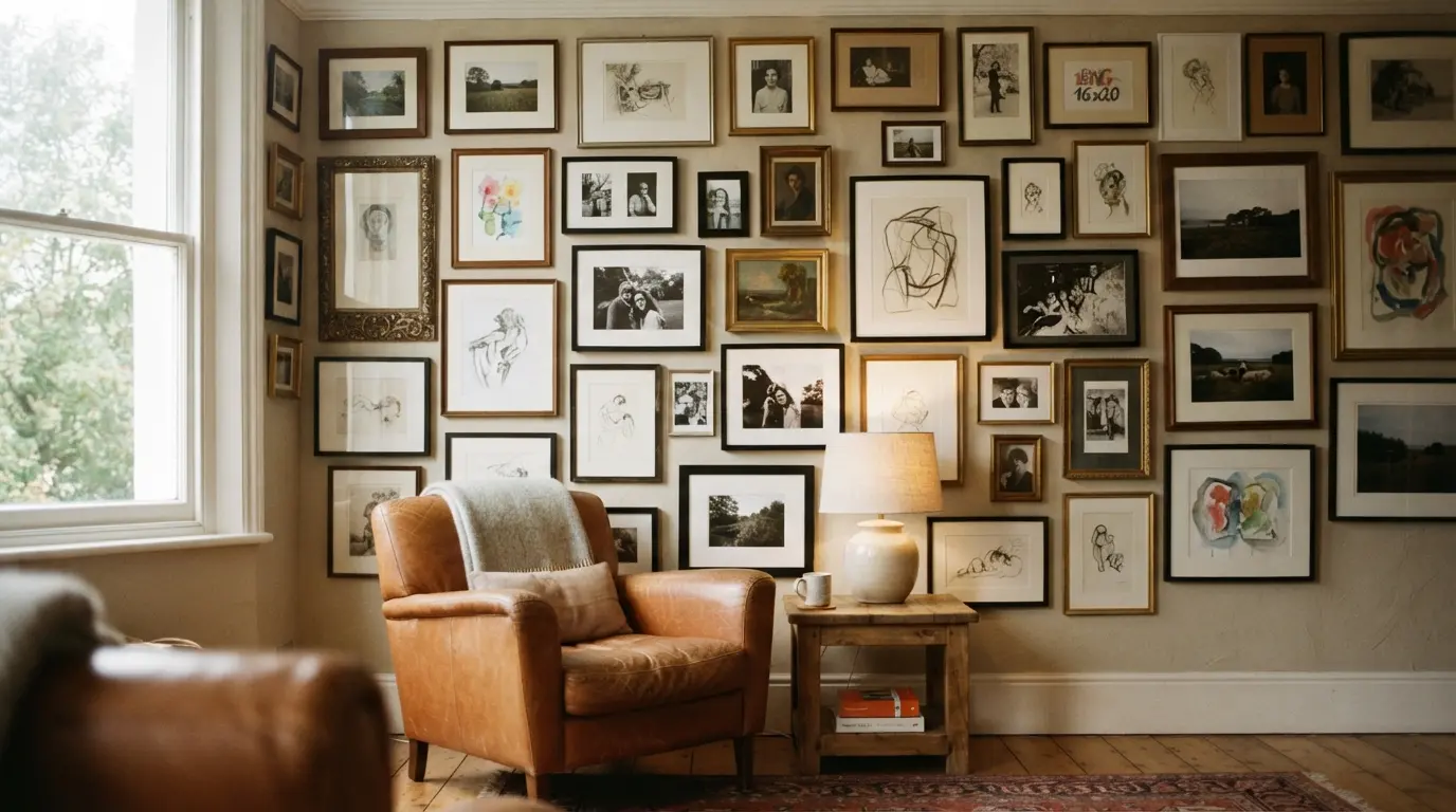
A dense, closely-packed arrangement of varied frame sizes and styles, salon-style, is the strongest answer to a genuinely oversized blank wall that would swallow a smaller, sparser collection. This style takes real confidence to commit to, since it uses considerably more art than most other approaches here, but it fills a large, awkward wall in a way a handful of spaced-out pieces simply can’t. Because it uses so much art, it’s also the idea most worth building gradually rather than buying everything in one go, a salon wall assembled over a year or two of collecting genuinely reads as more considered than one purchased as a matching set in a single order.
2. Leaning Shelf Gallery for a No-Nail, Renter-Friendly Option
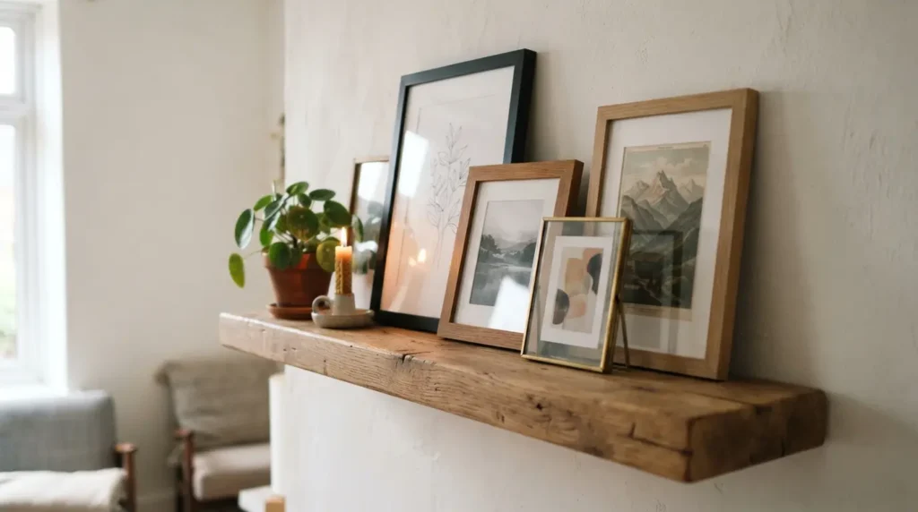
Fitting a floating shelf or two and leaning framed art against the wall instead of hanging every piece gives you a genuine gallery wall look without committing to a permanent arrangement of nail holes. It’s the most flexible idea on this list, you can swap, layer, and rearrange pieces in minutes, and it suits a rental or anyone who updates their art collection often far better than a fully fixed, hung arrangement. Choose a shelf genuinely deep enough to hold several layers of framed art without pieces sliding forward, a shallow, decorative shelf not built for the actual weight of glass and frames is a common reason this look falls short of its potential.
3. Monochrome Black and White Photography Wall
Sticking to black and white photography alone, rather than mixing in colour, gives a genuinely cohesive, gallery-like feel even when the actual subject matter varies widely, family photos, landscapes, architectural shots. This is one of the more forgiving concepts to build over time, since new black and white prints slot in without ever clashing with what’s already up. It’s also a genuinely practical choice if your room’s colour scheme changes over the years, a monochrome wall never fights with a repainted wall or new upholstery the way a brightly coloured art collection eventually might.
4. Grid Layout for a Clean, Modern Look
Uniform frame sizes, evenly spaced in straight rows and columns, gives a wall a genuinely crisp, contemporary feel that reads as more restrained than an eclectic salon-style mix. This suits a minimal or modern living room particularly well, and it’s one of the more forgiving layouts to plan precisely, since the even spacing does most of the visual work rather than relying on an eye for asymmetric balance. It’s worth investing in identical or closely matched frames for this look specifically, since the whole effect depends on genuine consistency, a grid with slightly mismatched frame widths or colours reads as an error rather than a deliberate choice.
5. Wrap the Wall Around a TV So It Blends In
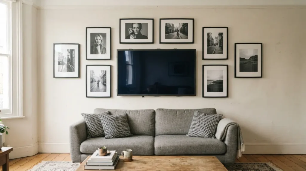
Framing a wall-mounted TV within a gallery arrangement, rather than leaving it as an isolated black rectangle, genuinely changes how the screen reads in the room. Done well with a similar tone and frame palette, the TV all but disappears into the wall when it’s switched off, and the arrangement continues to read as a considered gallery rather than a media wall with some art added around the edges. Keep a slightly larger gap around the TV itself than between the surrounding frames, crowding the screen too tightly makes it read as awkwardly squeezed in rather than genuinely part of the composition.
6. Mix Framed Art With Woven or Textile Pieces
Adding woven wall hangings, a macramé piece, or a textile alongside framed prints and photos brings genuine texture into what can otherwise be a flat wall of glass and frames. This suits a room that already leans toward natural materials, and it’s a particularly good way to introduce warmth into a gallery wall without adding more colour or pattern than the room can comfortably hold. Textile pieces are also genuinely lighter than most framed art of a similar size, worth remembering if you’re working with a wall type that makes heavier fixings difficult, since a woven hanging can fill real visual space without adding much weight to what the wall needs to support.
7. A Single Oversized Statement Mirror Instead of Multiple Pieces
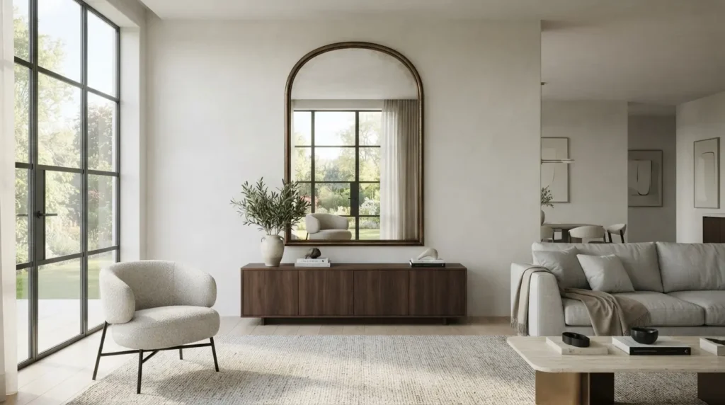
Sometimes the strongest answer to a blank wall isn’t more pieces, it’s one genuinely large mirror. A big, well-framed mirror does real practical work beyond decoration: it bounces natural light back into the room and makes the space feel larger, all from a single purchase rather than curating and hanging a full collection. This suits a wall opposite a window particularly well, where it can actually reflect meaningful daylight back into the room. It’s also worth considering as the more budget-conscious choice over a full gallery collection, one genuinely well-chosen mirror often costs less than sourcing, framing, and arranging a dozen individual pieces, while still making a comparably strong statement on the wall.
8. Family Photo Wall With a Unifying Frame Colour
A wall built primarily from family photographs feels genuinely personal, and the detail that keeps it from looking cluttered is consistency: use the same frame colour and finish throughout, even if the photo sizes and orientations vary. That single unifying choice is what separates a considered family photo wall from a scattered collection of mismatched frames that happen to contain the same people. Mixing genuinely old photographs with recent ones works particularly well within this idea, since the consistent frame treatment gives even a faded, decades-old print the same visual weight as a photo taken last month.
9. Mixed Media Wall Combining Art, Objects, and Plates
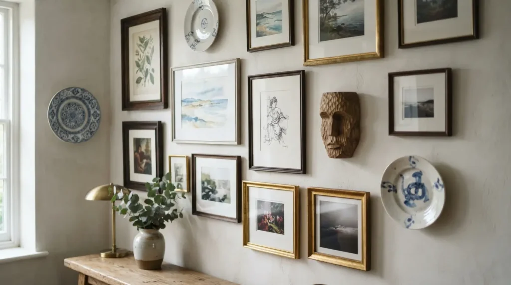
Bringing in decorative plates, small sculptural objects, or a mounted item alongside standard framed art gives a wall genuine dimension and breaks up the grid pattern that an all-framed collection can fall into. This works especially well as an eclectic, collected-over-time look, and it’s worth building gradually rather than trying to source everything in one shopping trip, the best mixed media walls tend to genuinely accumulate over years. Vary the depth of the pieces slightly too, a flat framed print next to a plate or a small three-dimensional object creates genuine shadow and interest that a wall of entirely flat items can’t match.
10. Symmetrical Formal Arrangement for a Period or Traditional Room
A carefully mirrored, symmetrical layout, matching pairs or an evenly balanced central arrangement, suits a period property or a more traditional, formal living room far better than an eclectic salon mix would. This is one of the more precise layouts to execute, since any misalignment is immediately obvious in a symmetrical design, so it’s worth measuring and marking more carefully here than with a deliberately loose, asymmetric arrangement. A pair of matching frames flanking a fireplace or a central feature is one of the simplest versions of this idea to start with, and it scales up naturally into a fuller, mirrored arrangement if you want more coverage later.
11. A Colour-Themed Wall Built Around One Palette
Choosing art and frames that share a consistent colour story, all warm neutrals and terracotta, or a run of blues and greens, ties a wall together even when the subject matter and styles vary considerably. This is a genuinely useful approach if you’re gradually building a collection rather than buying everything at once, since a shared palette lets pieces bought months apart still feel like they belong together. Pull the palette directly from something already in the room, a cushion, a rug, an accent wall, rather than choosing it in isolation, so the gallery wall reads as connected to the rest of the space rather than a separate colour decision made on its own.
12. Check Frame Weight and Wall Type Before You Commit
This is the detail every purely visual gallery wall guide skips, and it matters more than any layout choice on this list. Masonry or brick walls need a different fixing entirely to standard plasterboard, and older properties with lath-and-plaster construction can be more fragile to drill into than a modern stud wall, so it’s worth knowing what’s actually behind the surface before planning a dense, heavy arrangement. Heavier framed pieces, particularly in a salon-style or mixed media wall with real objects included, need a fixing rated for the actual combined weight, not just whatever hook happened to come with the frame, and it’s worth checking this specifically for your wall type rather than assuming one fixing solution works everywhere in the house. If you’re genuinely unsure what’s behind the surface, a stud detector is a worthwhile small investment before committing to a dense, heavy arrangement, it takes the guesswork out of what would otherwise be trial and error with a drill.
Final Thoughts
The best gallery wall ideas match the concept to your actual wall size, room style, and how permanent you want the arrangement to be, a dense salon wall and a leaning shelf display solve very different problems. Choose the idea that genuinely fits your space, check what’s behind the wall before committing to anything heavy, and the finished collection will feel like a considered part of the room rather than an afterthought bolted onto a blank surface. Whichever concept you land on, the strongest gallery walls all share the same quality: they look like they belong to the room they’re in, not like a formula copied wholesale from somewhere else.
FAQs
What is a salon-style gallery wall?
A salon-style gallery wall is a dense, closely-packed arrangement of varied frame sizes and styles, filling a wall edge to edge rather than spacing pieces out. It suits a genuinely large blank wall that a sparser arrangement wouldn’t fill convincingly.
Can I do a gallery wall without putting holes in the wall?
Yes, a leaning shelf gallery is the most straightforward no-nail option, using one or two floating shelves to display and layer framed art without fixing each piece individually. It’s also the easiest style to update or rearrange over time.
Should gallery wall frames match?
Not necessarily. A unifying element, frame colour, a shared palette, or a consistent photography style, ties a mixed collection together more effectively than requiring every frame to match exactly, and it usually looks more considered than a fully uniform set.
What’s the best gallery wall layout for a small wall?
A grid layout or a smaller, tightly composed arrangement generally suits a modest wall better than a sprawling salon-style mix, which needs real width and height to work. Keep the piece count and scale proportionate to the actual space available.
How do I choose art for a monochrome gallery wall?
Stick to black and white photography or prints throughout, regardless of subject matter, family photos, landscapes, architectural shots all sit comfortably together once colour is removed from the equation, which makes this one of the easier concepts to build gradually over time.