15 Bathroom Colour Scheme Ideas That Always Look Stunning

The bathroom colour scheme ideas that actually hold up long-term share one thing in common: they’re chosen against the room’s real light and existing fixed surfaces, not just a paint chip held up in a showroom. The 15 schemes below cover the full range, from safe neutrals to full colour commitment, along with the practical checks (undertone matching, paint finish, testing methods) that most colour guides skip entirely.
| Scheme | Best For | Commitment Level |
| 1. Soft sage green | Most bathrooms, safest starting point | Low-Medium |
| 2. Terracotta and clay | Warm, earthy schemes | Medium |
| 3. Charcoal and warm wood | Larger, well-lit bathrooms | Medium-High |
| 4. Classic grey and white | Any bathroom, any budget | Low |
| 5. Navy with brass | Calm, rich, timeless | Medium |
| 6. Blush pink with warm white | Soft, gentle statement | Low-Medium |
| 7. Emerald or forest green with brass | Luxury, period homes | High |
| 8. Black and white monochrome | Bold, high-contrast rooms | Medium-High |
| 9. Warm cream and wood | Small or light-starved bathrooms | Low |
| 10. Bottle green and gold | Traditional or period properties | High |
| 11. Mustard accent against white | Cloakrooms, small spaces | Low |
| 12. Single-tone colour drenching | Small bathrooms needing depth | Medium |
| 13. Marble-led neutral scheme | Timeless, higher-budget projects | High |
| 14. Dusty or powder blue | Calm, family bathrooms | Low-Medium |
| 15. Two-colour contrast pairing | Confident, characterful schemes | Medium |
1. Soft Sage Green
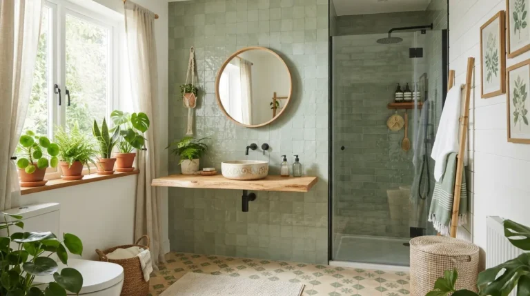
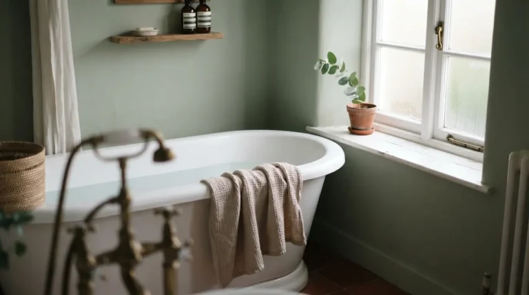
Sage is the closest thing to a neutral that colour gets, reading warm rather than cold under most lighting and working with wood, brass, and white without a fight. It’s the lowest-risk entry point on this list: paint alone, done in a weekend, costs far less than tiling and can be changed again in a few years if your taste shifts.
2. Terracotta and Clay
Warm terracotta and clay tones move a bathroom away from the cold grey schemes that dominated the last decade. They pair naturally with cream tiles and brass fittings, and work particularly well against natural stone or timber. The trade-off: terracotta reads very differently under warm artificial light than under daylight, so it’s worth testing a sample patch at both times of day before committing to a full wall or floor.
3. Charcoal and Warm Wood
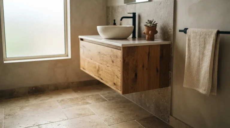
Charcoal walls paired with warm wood furniture and stone surfaces avoid the coldness that dark grey alone can bring. This scheme needs genuinely good lighting, natural or layered artificial, to avoid feeling heavy, so it suits a larger bathroom or one with a decent window more than a small, dim en-suite. Balance the charcoal with lighter stone or a pale floor to keep the room from closing in.
4. Classic Grey and White
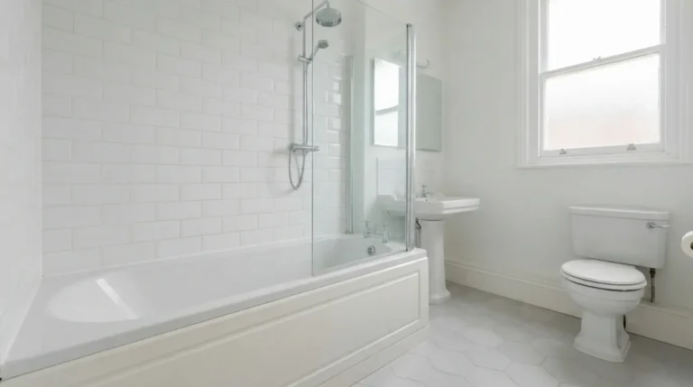
Grey and white remains one of the most enduring bathroom pairings because it’s genuinely flexible: slate and ash undertones read crisp and contemporary, while greige and warmer stone greys feel softer and more enveloping. It also works with almost any fixture finish, chrome, brushed brass, matt black, so it’s a sensible choice if you want freedom to change fittings later without repainting or retiling. Because it’s such a common scheme, the tile and paint options at this shade are usually the most widely stocked and competitively priced of any colour on this list, which makes it a genuinely budget-friendly starting point as well as a flexible one.
5. Navy with Brass
Deep navy walls against brass fittings and white sanitaryware is a genuinely reliable, timeless pairing that reads as rich rather than dark. Navy is forgiving of a north-facing room in a way that some other dark shades aren’t, since its blue undertone stays calm rather than turning muddy in cooler light. Pair it with a paler floor to stop the room feeling enclosed.
6. Blush Pink with Warm White
Soft blush or dusty rose against a warm white base creates a gentle, spa-like feel without committing to a full-colour room. This scheme works especially well introduced through paint and accessories first, tiles and sanitaryware kept neutral, so it’s easy to soften or intensify later without a full retile. Pink undertones can shift noticeably under warm LED bathroom lighting, sometimes reading more orange or coral than the swatch suggested, so it’s worth checking the colour under your actual bathroom bulbs rather than daylight alone before committing to a full wall.
7. Emerald or Forest Green with Brass
A jewel-toned green wall or vanity against white sanitaryware and brass fittings is one of the most consistently striking combinations in bathroom design, but it’s also one of the pricier commitments here if you’re taking it beyond paint into tile or cabinetry. Reserve the full-strength colour for a wall or a vanity rather than every surface, and let white or pale stone do the work of keeping the room from feeling too enclosed. If budget is the deciding factor, a painted vanity in this tone delivers most of the visual impact of a fully tiled jewel-green room at a fraction of the cost, and it’s a far quicker weekend project rather than a multi-day retiling job.
8. Black and White Monochrome
The high contrast of black and white creates visual interest without needing a third colour, which makes it one of the more forgiving schemes to get right. Matt black brassware has given the pairing a sharper, more contemporary edge over the last few years, but it’s worth knowing that matt black shows water spots and limescale more visibly than chrome, so it needs a slightly more frequent wipe-down in a hard water area.
9. Warm Cream and Wood
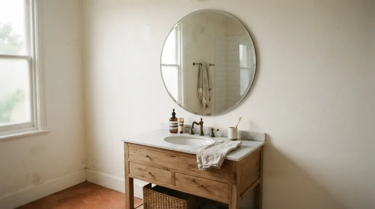
A soft, warm cream (rather than a stark white) paired with natural wood furniture keeps a bathroom feeling bright without the clinical edge that pure white can bring. This is a genuinely safe, resale-friendly scheme, and one of the easiest to update later through towels, accessories, and a change of hardware rather than a full repaint.
10. Bottle Green and Gold
Bottle green cabinetry or tile against gold fittings and lighter walls feels elegant and grounded rather than dated, and it suits period properties particularly well, where the depth of colour adds character rather than fighting the existing architecture. Keep the green to furniture or a feature area and the walls lighter, rather than covering every surface, to keep the scheme from tipping into heaviness.
11. Mustard Yellow Accent Against White
Mustard or ochre is a genuinely underused colour in bathroom schemes, and used as an accent against white tiles or walls, it brings warmth without overwhelming a small space. It’s particularly well suited to a cloakroom or powder room, where you’re more willing to commit to something bold precisely because it’s a smaller, lower-stakes area of the house.
12. Single-Tone Colour Drenching
Colour drenching, running one shade across walls, ceiling, and sometimes woodwork, removes the visual breaks that a skirting board or ceiling line usually creates, which makes a small or awkwardly shaped bathroom feel larger and more enveloping rather than choppy. It costs more in paint and labour than a single wall, since every surface needs the same number of coats, and it’s worth going a shade lighter than you first think for the ceiling in a room with limited natural light, a fully saturated ceiling in a dim bathroom can start to feel oppressive rather than cosy without strong lighting to balance it.
13. Marble-Led Neutral Scheme
Letting veined marble or a marble-effect surface lead the palette, rather than choosing a wall colour first, gives a bathroom a naturally luxurious, timeless quality that rarely dates. Real marble is porous and needs sealing and coaster-level care around any wet product bottles, while a marble-effect porcelain or sintered stone gives a similar look with considerably less maintenance, worth knowing before you commit to one over the other on cost and care grounds alone. Real marble also sits at the top end of the budget range for this list, particularly as a full wall or floor rather than a single vanity top, so it’s worth pricing both the natural and effect versions before deciding, since the visual difference between a good sintered stone and genuine marble is often smaller than the price gap suggests.
14. Dusty or Powder Blue
A softer, smoky blue rather than a bright coastal blue creates a genuinely calming, family-friendly bathroom that doesn’t skew too young or too clinical. It pairs easily with white sanitaryware, chrome or brass fittings, and light wood, and it’s forgiving of most lighting conditions, making it one of the safer bold-ish choices on this list.
15. Two-Colour Contrast Pairing
Rather than one dominant colour, pairing two complementary tones, dusty pink with sage, terracotta with deep green, gives a scheme genuine character without needing a third neutral to hold it together. The key to making a pairing look intentional rather than accidental: keep the split uneven, one colour dominant across the larger surfaces, the second used only on an accent wall, vanity, or accessories, rather than splitting the room fifty-fifty.
Final Thoughts
The bathroom colour scheme ideas that always look stunning share the same discipline underneath the styling: a colour tested properly in the room’s actual light, chosen against the undertones already fixed in place, and applied with a finish that can handle a genuinely humid room. Pick the scheme that matches how confident you want the space to feel, then let the practical checks above make sure it still looks right in five years, not just on the day it’s finished. Start with paint and accessories if you’re unsure, they’re the cheapest and easiest parts of any scheme to change, and save the bigger commitment of tile or a new suite for the colour you’re genuinely confident will earn its place long-term.
FAQs
How many colours should a bathroom colour scheme include?
Most schemes work best with two or three: one dominant colour, one supporting tone, and a metal or material finish (brass, chrome, matt black, or wood) that ties the two together.
What bathroom colour schemes never go out of fashion?
Grey and white, navy with white or brass, and warm neutrals paired with wood are consistently the most enduring choices, since they’re easy to update through accessories rather than needing a full repaint when trends shift.
Should bathroom tiles match the wall colour exactly?
No, and in most cases a slight contrast looks more intentional than an exact match. Neutral tiles against a coloured wall, or patterned tiles against plain paint, both read as more considered than a single matched block of colour.
What’s the best bathroom colour for a small bathroom?
Light neutrals, pale blues, soft sage, and warm whites are the safest choices for making a small room feel open. Darker colours can still work in a small bathroom, but they need confident lighting and reflective surfaces to avoid feeling cramped.
Do bathroom colour choices affect resale value?
Neutral, well-coordinated schemes are generally the safest for resale, since buyers can picture living with them more easily than a bold, highly personal palette. That doesn’t mean plain, a well-executed neutral scheme with good fittings and lighting can look more considered than a bold scheme that’s harder to imagine changing.
How do I stop a bathroom colour scheme from feeling dated in a few years?
Keep the expensive, hard-to-change elements (tiles, sanitaryware) in a fairly classic tone, and introduce anything trend-led through paint, accessories, and textiles, which are far cheaper to update than a full retile.